
Last year I got an email from a first time author who had hired a family friend to typeset his non-fiction book. She had some experience in graphic design but his was a very complex book with many tables, images and endnotes, and his designer did not know typical book typesetting conventions. The author knew enough to realize at the “final proof” stage that that the book she had typeset was not looking like other non-fiction books on his shelf. The lack of justification of the body text was bothering him, among various other things.
He sent me a plea for help and I agreed that the original formatting left a lot to be desired. After he mourned the money he lost on the first typesetting attempt, we started completely from scratch again and designed a book he is proud to have his name on. We started with the cover design in November 2023 and then moved on to full book interior layout as well as ebook adaptation. He released his book in March 2024. Here’s what he had to say when we finished his book:

In the following post I am going to compare the original layout to my final layout and point out some book typesetting basics that need to be in place to end up with a professionally-produced non-fiction book interior. I am thankful I was able to give Drew’s book a professional polish worthy of the five years of labor he put into his manuscript.
Book body text needs to be serif font.
I have written about this extensively over here but generally speaking all non-fiction English books use serif body fonts. This makes them easier to read. The original design (seen below) used a body font that the author liked, but it just wasn’t body font material. I ended up using a typeface called “Miller” which is a bit more modern than some serif fonts, keeping the modern feel the author wanted without losing the readability of serif. We used his brand font for headers, running heads, etc. but just not for the body font.
Book body text needs to be left justified (ie: straight on both the left and right margins).
One of the biggest changes between the original layout and revised layout was that I justified the body text. This was something that the client had already noticed as a problem. Industry standard is to justify body text in a non-fiction book of this nature. The blocks of text are easier on the eyes and simply what we have come to expect in English language books. Below you see the unjustified text and sans serif body font…

…compared to the serif body font and left justified blocks of text. I also used thin lines to separate some headers from body text, which helped distinguish the sections without losing a lot of space like in the original layout.

The most important information on the page should be the most prominent information.
In the original layout the chapter numbers were more prominent than the chapter title, but the opposite should be true…

In the revised design, the titles are easier to read than the chapter numbers, which are much less significant. On a chapter opening page you like see below, the reader’s eye would go first to the chapter title, probably after that to the chapter number, and after that to the opening paragraph (drop cap drawing attention) or the subtitle below. This design provides a much more natural flow for information viewing.

Running headers or footers should appear on both sides of each spread (ie: on both left- and righthand pages).
“Running heads” are the bits of text that usually appear on the tops of the pages that tell you (more often than not) the title of the book and the name of the chapter or section. You will notice that in the original book the running heads were only on righthand pages. This might be permissible in a quirky or artsy book, but in a stardard non-fiction book, there should be running heads on both pages. In this case, the book title on the lefthand pages and the chapter number and title on the right. If you hire an amateur designer this is often an area where they slip up because they don’t know what the conventions are, and if it’s your first book, you may not notice their errors.
Text in the book must be legible without a magnifying glass.
Unless the book comes with a magnifying glass! 🔎 Optimizing caption sizes for the page size, reader’s eye, content, etc. is challenging for a new designer. In the original version of this book, the captions were tiny and while the information was technically there, they were hard to read….

In the revised version, I made the captions small but legible, and gave the graphics a rounded, stylish look to break up all the hard corners in other parts of the book.

The legend on the left of the table below was illegible…

…so I found a better solution. In some places the text needed to stack to fit at a larger point size. I also made the rest of the table easier to understand and added more contrast than in the original graphic.
Weaving the captions in next to the graphics created a much smoother flow in this layout. Below you see the original captions, which stretched out wider than the images and were too small. At the same time, there was a lot of awkward white space around the photos.

…and the new format that I used which incorporated the captions next to the images, and made the captions more legible:

Tables should be styled to fit the book’s page size and margins while still being readable. They should also be styled consistently.
For the tables and charts, I made them easier to read and more consistent in the styling and spacing. Here you see two of the tables from the original book…


And here is what I did with them…


Sometimes the best option for a table is to rotate it 90 degrees. I took various tables in this book and rotated them for a cleaner look. Here is one table that was squished into a half page…
…which I rotated 90 degrees and spread over a whole page.

The original designer took this excel graphic and rotated it 90 degrees, but it was difficult to understand and hard to read...

…so I worked with my assistant designer to create a graphic that fit across two pages, staying within the regular margins on both of those pages.
Note that on the table/chart pages, the editor recommended removing running headers for a cleaner look. This was done consistently on that type of page. Here you see another table…
…which worked a lot better spread over two pages, as seen below.

The following table needed more space to be understandable and manageable:
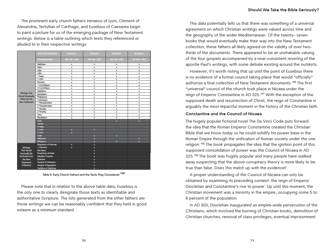
In my final layout, it spread onto two pages but was much more legible. We were able to break the table at a logical point so it did not ruin the reader’s understanding of the information. I also added a small header stating “Table 5, continued” on the second page, saying that the table had been continued from the previous page.


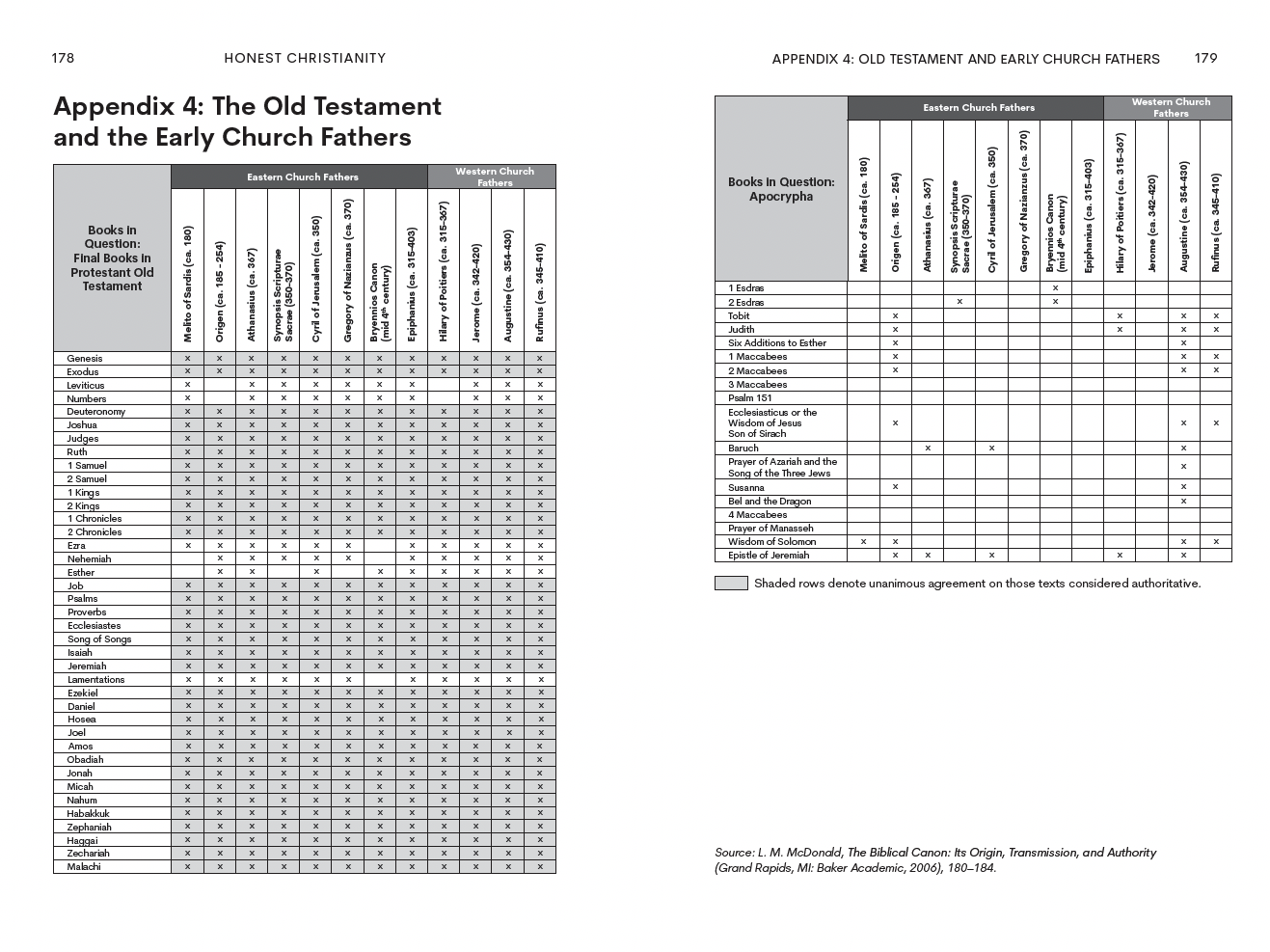
By Appendix 3 at the back of this complex book, I think the previous designer had given up hope of finding good solutions for the complex content and started pasting excel charts into the book file, even on top of other text.

The author hired me to rescue him, so my solution looked like this. It took four pages instead of two to list all of the info from Appendix 3 and Appendix 4, but it was readable and clean:

Endnotes should be legible, clean…and not blue.
The endnotes of a book are not cute on the best of days but the endnotes in the initial design of this book were too small, too close together and the links were blue (a carryover from Word styles) which will not print nicely in a black ink only interior.
I cleaned up the endnotes section, dividing the endnotes into neat chapter sections and even shortening some long URLs if there was an option to make them shorter. (See more about making URLs in your book look good and work well here.)


(One particular link was so long that my software didn’t know how to handle such a long string of text! Here’s a funny email I sent to Drew about the link he sent me, and the shorter link that I was able to find and use!)

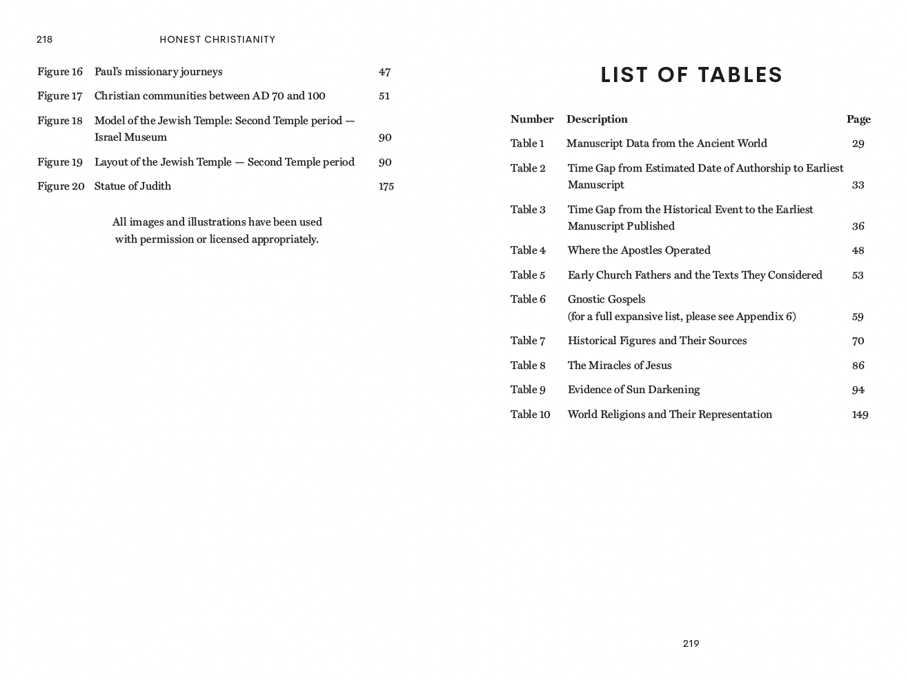
Don’t use tables where tables are not needed.
Sometimes an author provides their manuscript with certain information organized into tables but logic says that there is no special reason that text needs to be in a table. This original layout had the lists of images and tables in table format, but this just made the information harder to look at…

I formatted the lists as lists and it made them simpler and easier to understand.
Whew! Re-doing this book was a months-long endeavor but I think you can see that it was worth it! If you’re working on a complex book, particularly one with lots of tables, images and charts, and want it to have a professional look, be sure to hire someone who can show you complex books in their portfolio. Take a look at my services page if you are looking for a book designer!