Partnering with marketing and communications professionals who are publishing a book independently is one of my favorite things. New authors who already work in communications know what looks and sounds good, but need my expertise in the particulars of book design and layout to help them bridge the gap between a final manuscript and a final printed book that readers can hold.
Working with David Willans from the UK on his book The Patient Parent was a pleasure. He has a great style and eye for detail—and we were able to create a book we were both happy with. Read on to grab a few helpful tips for your own journey to #bookdone.
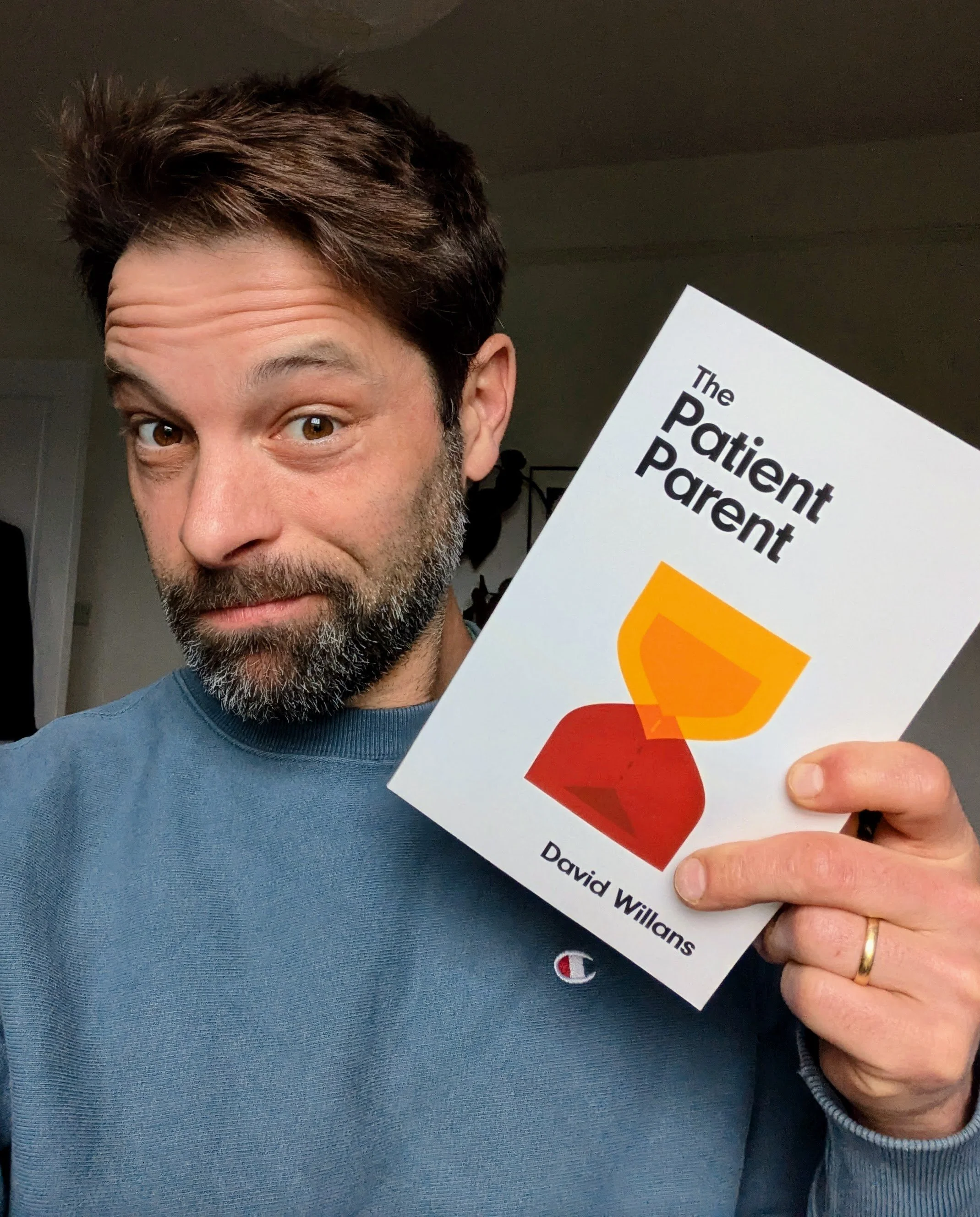
David Willans is a professional writer and the founder of Being Dads, a project born from his personal journey toward becoming a more present, patient father.
After realizing he was struggling with anger, David dove headfirst into research, experimentation, and personal growth. What resulted was The Patient Parent. David had a vision for his first book: a slim volume that is approachable and essential, focused on helping parents be more present in the moments that matter most. This book offers parents practical tools without the overwhelm.
David’s Book Done Timeline
💡 Idea born: Around 2017 (a year into starting Being Dads)
✍️ Writing started: COVID lockdown (circa 2020-2021)
📨 Files ready for design and layout: Summer 2024
✔️ Book done (released): November 2024
David's Book Done Process
Tell me about how you came up with your book's title.
It took a long time! Lots of options, a lot of research into other books in my genre, some keyword analysis, and a general feel of what I would be happy to say to people. Put all that in the mix and out popped The Patient Parent.
Did you self publish, or work with a traditional publisher, and why?

I self-published. I tried to go the traditional publishing route, but after 6 months of trying to get an agent, I got one…and then COVID hit. My agent pulled back, and I decided that rather than spend more time hunting, I should just start writing. The book is published print on demand because (ironically, given the title) I just didn't have the patience to repeat months of working to get a publisher.
I am curious, did you hire both editors and proofreaders to help you with your book content? I ask because I know you are a communications professional.
I did not hire an editor. I guess you could say I did all the editing myself, but I didn’t think of it as editing, I was just refining the manuscript until I was happy with it. I considered every single word, working on flow, rhythm, rhyme in places, clarity, and brevity. I’ve lost count of the number of drafts, but it was over 25. I put the manuscript down (life took over) for several weeks various times. Returning to it with fresh eyes really helped. Ultimately I was only going to publish something I could feel proud of, getting there took a lot of time.
I’ve hired editors for a reports and books before, and they were incredibly helpful at bringing out the core ideas and improving readability, but that was the work I enjoy doing, so I wasn’t going to outsource it. I did have help with the content though; my wife read and reviewed everything and others reviewed various sections.
I did hire a proofreader. A proofreader is a must, because professional proofreaders have an attention to detail that is remarkable. My 128 page manuscript came back with over 600 comments, flagging everything from constancy of tone to grammar, typos and clarity recommendations. So even if you feel you don’t need an editor, as I did, I would always recommend hiring a proofreader.
My day job has taught me how much work it is to make something that seems so simple. Because written content is so ubiquitous, people assume it’s easy to make, and it is, if you don’t care about quality. But if you want quality, it takes real work, thinking and patience. Creating a successful book is like anything in life, doing something well takes a LOT more time, effort, attention to detail and patience than you initially think.
Share your insights about the importance of the information you give to your book cover designer (your cover design brief).

I told Julie that I wanted my book to “feel like a decades old classic”. I love the covers of the 70's and 80's. They are super simple, like A Clock Work Orange, or The Handmaid's Tale, which has been called ”a modern classic”.
The cover design was the part of the project that took longer than I expected. Not only does the writing of a book take a real investment of time and work, but communicating with a designer does as well. Design is like another language, a visual language.
You’re translating an idea first into words, such as: “I want this to come across as serious.” First you have to be clear what you mean by “serious” in words, because it could mean wisdom and experience—the sort of seriousness that comes with expertise. Or it could mean serious as in stern, the sort that comes with authority. Being clear about this is really important because each one of those takes on “serious” has a different visual language. Serious as in wisdom and expertise feels classical—serif type, yellows, blues, depth perhaps through layering of textures, motifs etc. Serious as in authoritative feels heavy and stern—sans serif type, big block colours—black, greys, reds. Authoritative was the feel of the 70’s and 80’s covers I showed to Julie and the direction of the design she came up with.
The best way to communicate your vision to a designer is with both words and collections (sometimes called “mood boards”) of images, colors, and/or type that speak to the direction you want the book to go in. This is sometimes called a “design brief” and sets the direction for the feel of your book cover.
This idea of how you want the book to feel is something that will evolve through the process of conceptualizing and writing it. The sooner you can be clear about what that feel is, the easier the rest becomes because the words, structure, design should align to that.
It's such a hard thing to know what you want, and Julie and I had quite a few rounds of concepts, then rough designs, until we got to the final artwork.
Let’s look at some of the stages of the cover and interior design process.
David provided me with a pdf of other book covers in the anger management / parenting space, which gave both of us an idea of the range of colors and images that were already in use in his genre. A successful book cover needs to communicate that the book is on a similar theme, but still be unique and stand out. Note that a lot of anger management and parenting books use warm colors, some picture children and some do not.

Some of the initial concepts included a balloon (whole on the cover, burst on the background), a parent looking into the child’s eyes (focus on relational aspect), and an egg timer (which doubled as conversation or chat balloons) to convey the themes of parent-child relationship and anger vs. patience. We toyed with having the subtitle, “because they're only little once”, on the cover but ultimately dropped it off for a more minimalist feel.
Once David chose to move in egg timer direction, we explored minimalist typography, strong colors and contrast. I simplified the timer and tightened the leading to get more of the Handmaid’s Tale and Clockwork Orange feel. The cream background that we landed on for the final covers gives a calm background to the stark artwork and wording. The final design is both restrained and authoritative—true to the spirit of the book itself.

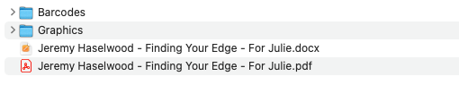
With the cover typefaces and styles established, I typeset the book’s interior to match. Here are a few examples of how the book files looked before and after formatting. I ask my clients to give me their book manuscripts both as a PDF and a Word file, so that I can see how it looked on their computer (PDF) but also easily pull the flowing text and basic formatting from the Word file.

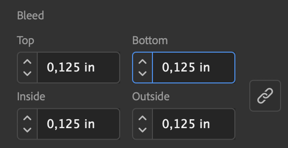
One of the little-understood aspects of book design is the post-production or pre-press portion of design. Once the look of the book cover has been finalized, it needs to be adjusted to print successfully. The final result may not look like the final product. Below you see a screenshot from my pre-press process, making sure the hardcover file has enough edge on all sides to wrap around the hard board of the cover. The pink lines below show the spine and edges of the book, while the blue lines show where the cover will crease. Post-production is one of the reasons it is important to hire an experienced designer for book design, to avoid errors like putting title text in the area that will be creased.

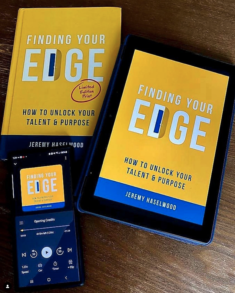
In the end, the deliverables I gave to David were book cover files, book interior files, and ebook files.
Printing a book on demand (with Amazon KDP, Ingram Spark, Lightening Source, etc.) both expands and limits your options as a self-publisher. Can you explain?
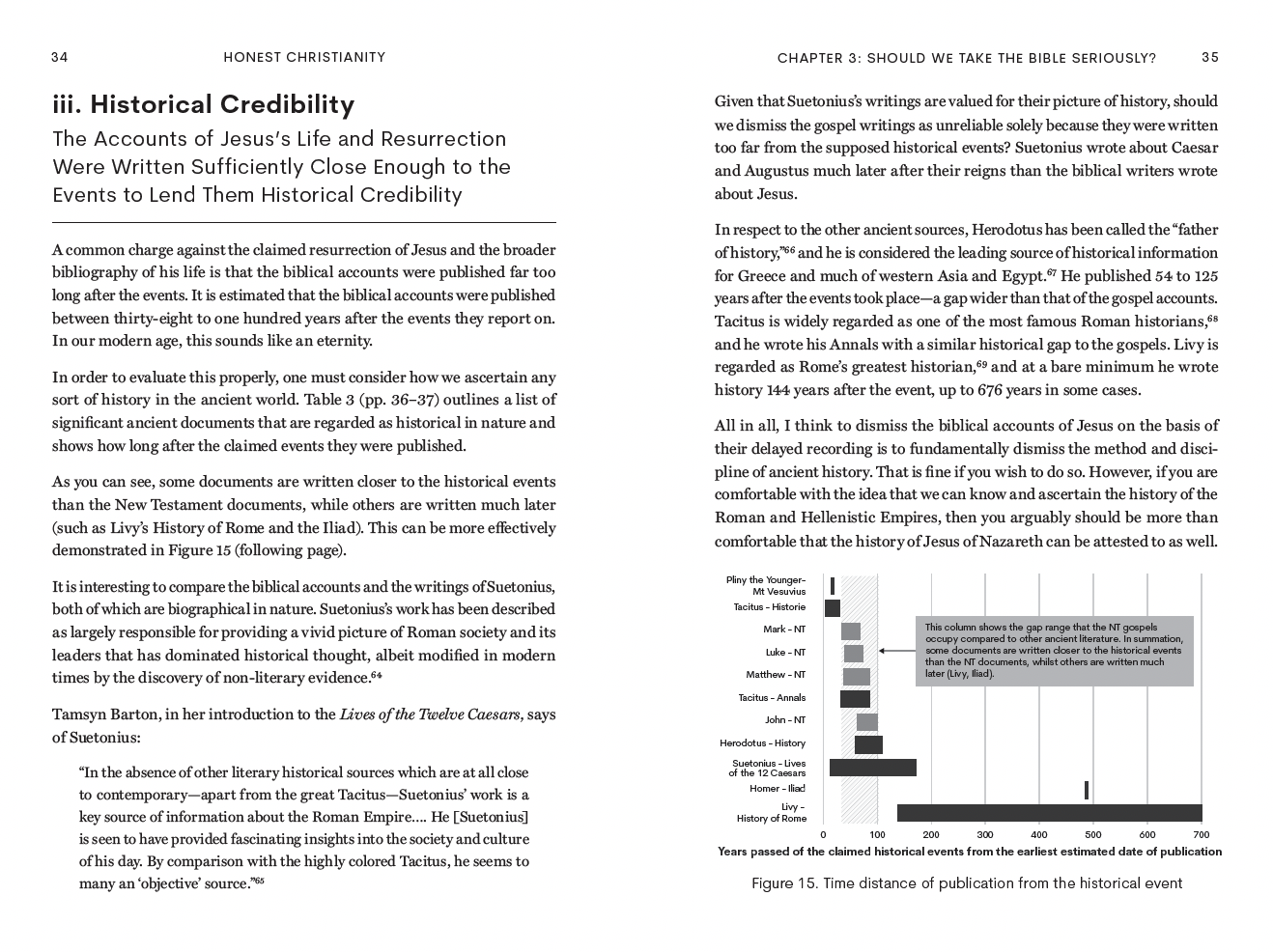
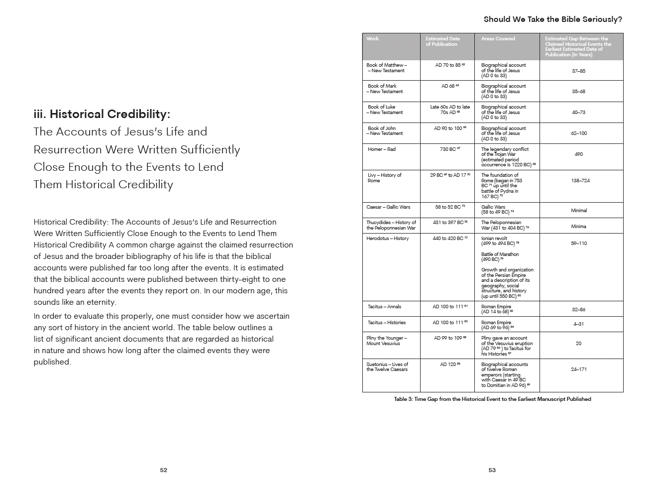
I would have loved to explore an embossed, foil cover but it wasn’t possible with my timeline and with printing on demand with Amazon KDP. On the other hand, it is great that my book can be purchased from any Amazon website worldwide and printed and shipped locally, rather than me having to arrange distribution from the UK to worldwide vendors, as I would have to with a traditionally-printed book.
David's Book Done Takeaways
What was the biggest surprise during your book project?
The internal battle of keeping my standards up vs. getting it done. It was SO much work. That's when I started saying “Maybe this is good enough” and I felt that tension with my standards. In the end I didn't compromise, I just tried to find more creative ways around the problems, which worked.
Which part of your book project was the most fun or rewarding?
I loved the editing! There's an elegance to the end result when all that's left is the core of the idea expressed in a way that's enjoyable to read.
When you write another book, what will you do the same way? What will you do differently?
When! It was such a huge amount of work to do alongside parenting, a full time job and life. If I write another one, I'll do it in a time of life when I know I can give a lot of myself to it. And I'll try to be more playful with it to make the ideas as clear as can be. It was when I started to have fun with The Patient Parent that my writing became much stronger.
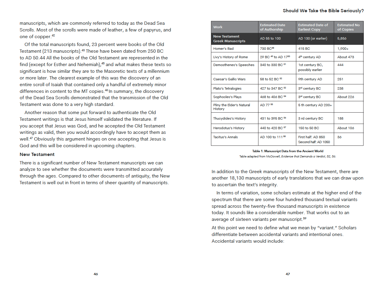
A Note about Bar Codes (ISBNs)

If you are publishing your own book, you will need to buy an ISBN for each edition of your book. (For example, David needed three ISBNs: soft cover, hard cover, ebook.) The actual bar code graphic is not so important (I can generate that myself if needed), but the registered numbers need to be purchased. David is in the UK and he bought his ISBNs from Nielson. My North American authors often buy their ISBNs from MyIdentifiers.com and buy a package of 10 numbers, since current pricing is USD$125 for one or USD$295 for 10. Recently a particularly ambitious new author told me that she purchased 100 numbers right off the bat—you may or may not be as visionary!
It takes patience: to write and publish a book, or to raise a child! David’s project developed patience in both the personal and professional arenas of his life.
Thank you so much, David, for allowing me to feature your book story in my newsletter!
Check out David’s work at www.beingdads.com,
or grab a copy of his book, The Patient Parent!
If you are ready to take the communication and marketing skills you have honed in the professional world and publish meaningful book, I’d love to help you get your message out there.
Send me any questions you have about book planning, design or formatting through my contact form. If you’re still in the planning stages, consider booking a one-hour live consultation. Or fill out this book project questionnaire or journal project questionnaire if you already know the specifics of your project.