
Last year I designed a book interior for Kirryn Zerna, a keynote speaker and branding expert. Her self-published book, The Stand Out Effect, teaches how to stand out on social media in order to create a successful business or brand. Kirryn has a distinct and consistent brand (as anyone writing a book on social media should!) and my goal was to make her book interior layout match her brand and also the topic of her book.
Author’s Brand Mood Board
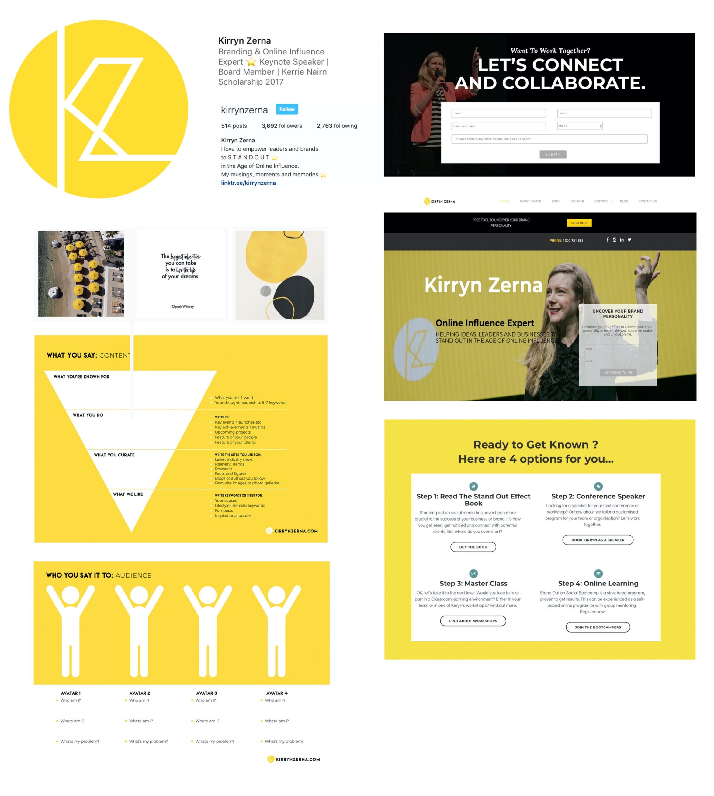
After my initial consultation with Kirryn, I learned more about her brand. Below you can see a kind of “mood board” that shows the look and feel of her brand (these are screenshots from her website and social media profiles, as well as a few of the files she shared with me for the book). What words would you use to describe her brand?
Author’s Brand Description
I would use words like: bold, bright, confident and striking to describe Kirryn’s brand. (Which words did the mood board bring to your mind?) For her visuals, she uses yellow, black and white as a consistent colour palette, and mostly geometric shapes (squares, circles) as well as stars. ⭐️
On-Brand Custom Interior Layout Solution
After Kirryn told me that her business cards are square instead of the standard oblong shape, I asked Kirryn to request that her printer quote on two different options for printing:
A traditional oblong format book, with a black ink interior
A square book format with black and yellow ink.
The square shape would go with her personal branding and also be reminiscent of social media platforms like Instagram which have popularized the use of squared graphics. As I expected, the price difference for the unusual shape and color was too prohibitive for a first book, so we went with an oblong shape with a black and white interior. (Make this book a best-seller and then her next book will be square with splashes of yellow! 🙃)
But there were still many ways to keep her book on-brand without using yellow or a square format. Below are some screenshots from the final book interior layout created for Kirryn. Can you see how the unique book interior elements tie in with her brand?

I designed a stand out interior for her stand out brand by:
using her bold brand typeface as the display (heading) typeface in the book
using a sanserif typeface for this fun, easy read on a casual subject like social media
using bold geometric shapes like circles for the pull quotes and chapter numbers, and bold black bars for subheadings
redrawing or reworking certain visuals (like the bullseye graphic at the centre, above) to make the graphics match the style of the rest of the book and her brand
adding some fun extras like small stars as dividers on her copyright page (why not?) or and a fun “thanks for reading” page on the last page with her website and book hashtag…tying in again to the ”online influencer” theme of her book and branding.
By doing some planning before the book design started, I achieved a book layout that is bold, bright, confident and striking, just like Kirryn’s brand. Her book’s content is memorable, and I hope the book’s layout is as well!
Kirryn told me that she felt I had treated her book as if it were my own, which was some of the sweetest praise I could hear. I hope each of my clients feels the love that I put into making their layout suit their personal or brand style. If you want your book interior design to match your brand, use my book project questionnaire or book a live consultation to tell me more about your book.