I work with a lot of self-publishers, and some of them select a photographer who is shooting photos for a printed book for the first time. As someone who has been integrating photos and text in book layouts for more than a decade, there are a few common problems I run into: images that (1) are not high enough quality, (2) images that don’t fit the proportions of the book or are cropped too tightly, and (3) images that shift significantly when converted from RGB to CMYK. You can avoid these problems by considering the following points.
Shoot your photos in the highest possible resolution.
This should go without saying, but photos that will be used for print need to be the highest possible resolution. They should be at least 300 dpi at final size, but since the photographer doesn’t know how much the designer may enlarge or crop the photo, it doesn’t hurt to send the designer photos that are up to 600 dpi at final size. If you are sourcing any additional photos from a stock photo site, purchase their highest resolution image if it will be used as a full-page photo.

Consider the proportions of the book when culling the photos or selecting photos from photographer proof sheets.
Usually a photographer will take both portrait and landscape orientation photos for a book, but sometimes when the photos come to me, only one of these orientations is provided. However, most cookbooks are portrait format and some are square. If the image provided is landscape orientation, it is difficult to have any “full page photos” because the proportions of the image are so different than the proportions of the book.
Consider the cookbook with blue pages shown above and below as an example. The page format is square. In order to make the landscape orientation images fit on square pages, they either had to be zoomed in/cropped closely (top example) or the images have to be quite small (lower example). Providing a portrait version of the same recipe would have given me more options for layouts, especially full page layouts.
If you are culling or selecting images and aren’t sure which ones to use, pick one portrait and one landscape (and not too closely cropped, below) or contact your book designer and ask what they think is best, given the dimensions and orientation of your book!

Don’t crop the photos too closely.
Leave enough “dead space” around the edges of the image that the book designer can do the final “cropping” when he or she decides exactly how to position your photos in the book. There is almost always a difference between the proportions of the photo as it comes out of the camera, and the proportions of the book. If the photographer or illustrator provides images that don’t suit the proportions of the book, it is the job of the layout designer to pick the best cropping possible. For example, take this overnight oats recipe spread from a cookbook I designed. The reader doesn’t see how much the photo has been cropped…


…but when I give you a behind-the-scenes peek into how the book looks in Adobe InDesign, the industry-standard book layout software, you see that the book is a 4:5 ratio but the photos a 2:3 ratio. I had to decide how best to crop this image, and chose to lose some of the jar and canister in the background rather than to crop the jar of oats.
Another reason to not crop your photos to closely is because a book designer always needs at least an extra 0.125” around all edges of the photo for bleed, if the photo goes to the edge of the page. This area will be trimmed off, but needs to be there so that there is no unintended white edge around the photo.
For a full wrap hardcover book with a photo on it, the cover designer might even need several inches of extra space around all edges of the photo, for the photo to wrap nicely around the cover board without leaving an unintended white edge.
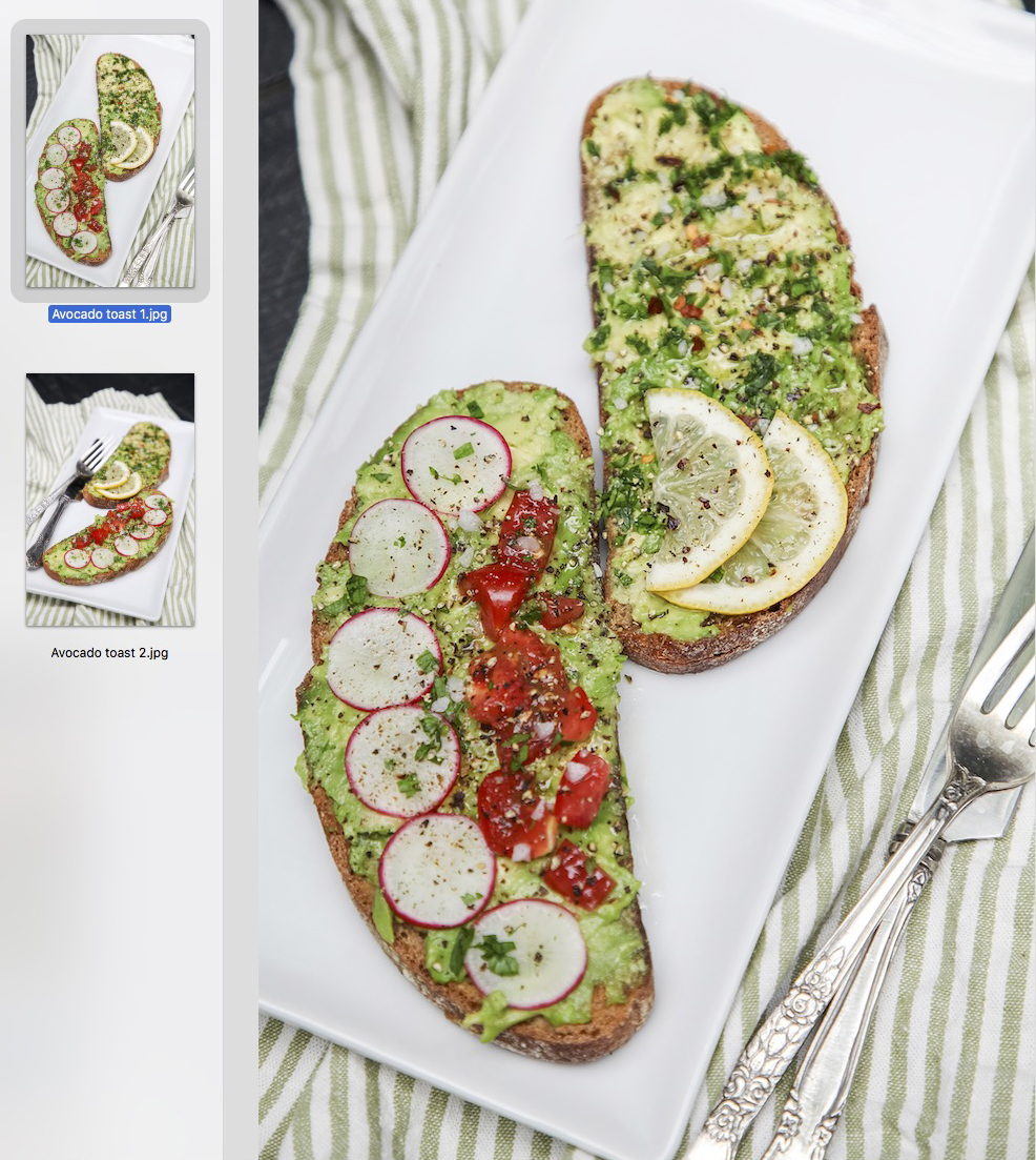
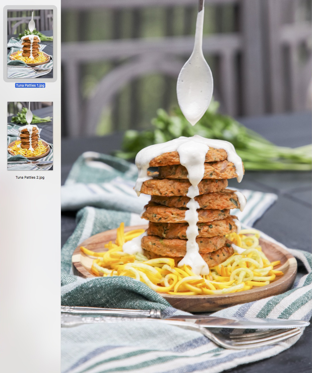
Related to the topic of cropping, sometimes providing the designer with several variations of the same photo for him or her to choose from can be a huge help for creating a successful layout. Just a slightly different position of a spoon or slightly different camera angle can make a big difference. For example, for the same cookbook project, the photographer sometimes gave me two similar photos to choose from.
Consider converting your photos to CMYK.
It used to be necessary that the photos used in printed books be converted to CMYK on the photographer or designer’s computer. However, because today photos and photo books are often seen both on screen (RGB) and in print (CMYK), it is becoming more common practice to simply let the printer convert all the images to CMYK before printing. However, if you are particular about the RGB to CMYK conversion, or are shooting photos in tones that show up significantly differently in RGB than in CMYK (like a neon green or light, bright aqua), you may want to go ahead and convert your image files to CMYK before sending them to the book layout designer.
There’s not much that I enjoy more than a good book interior layout with stunning photography! If you have questions about preparing photos for a book layout, shoot me a message or book a consultation with me!