
In my last post, I related what speaker, writer and presenter Elizabeth Milovidov, the owner of Digital Parenting Coach, learned through creating a book series published through Amazon KDP. If you missed that post, be sure to read an author’s perspecive on creating a book series with Amazon KDP. Today I want to share some do’s and don’ts which I learned, as a book designer, while creating so many matching books for Amazon’s print-on-demand publishing arm. Some of these insights apply most to those creating a series of books, and some apply to any book design that’s being produced through Amazon KDP.
DO use masters and styles in InDesign for anything and everything possible
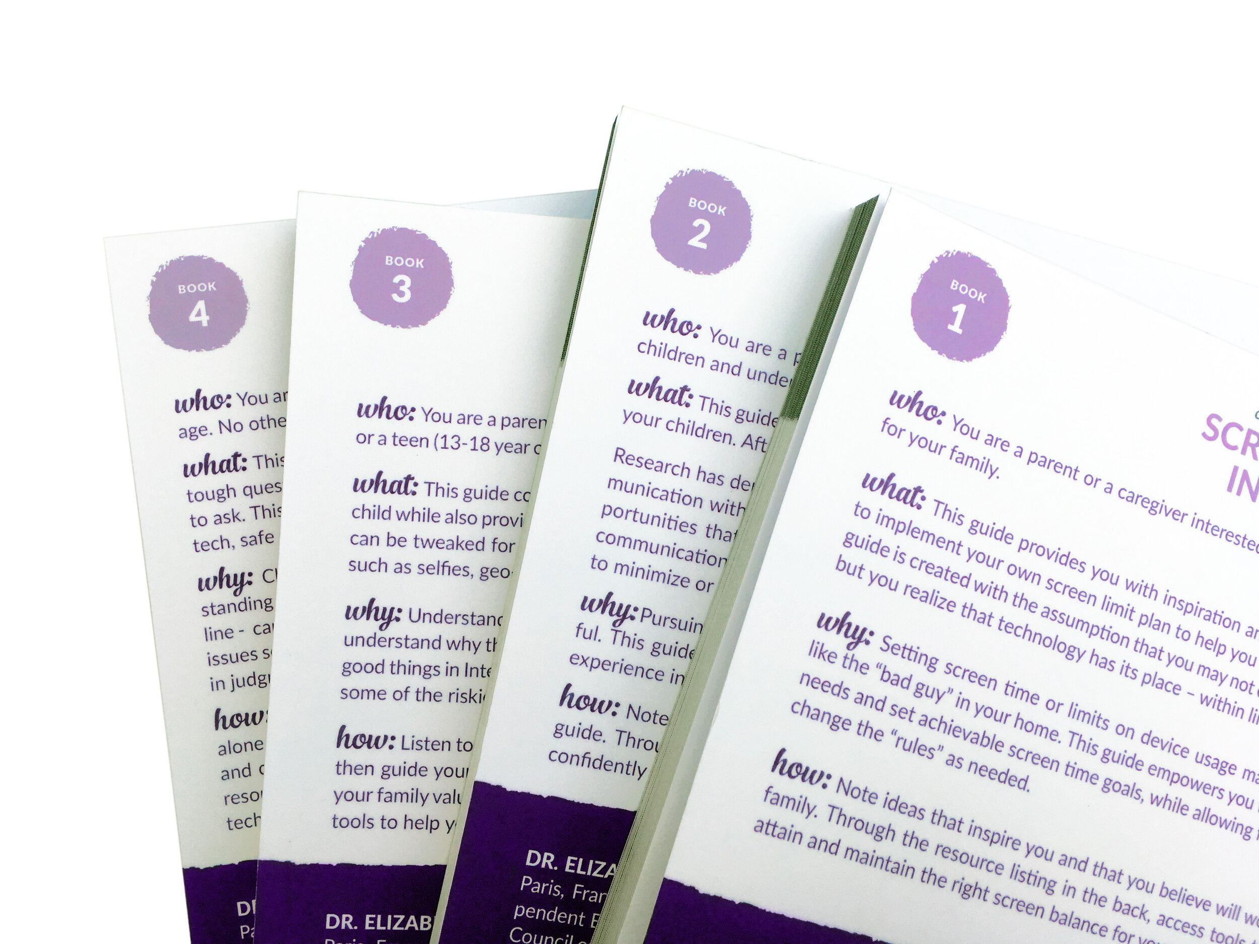
Creating this book series taught me more than ever the importance of using masters or styles for any and every aspect of the book design. While the books are all ultimately created separately, if the following InDesign tools are used, it will make a series of books much more consistent:
Master pages - to set page sizes, margins, footers, headers to be consistent throughout all the books
Paragraph styles and character styles - so that each book has the same text styling
Common linked graphics - for some of the common pages in the front matter, that is pages at the front of the book that appeared in every book in the series, I used the same linked PDF file for each of those pages.
DON’T use a lot of drop shadows or layers in InDesign
I learned the hard way that when books are exported from InDesign using the PDF export settings recommended by Amazon KDP, some layers and graphics flatten poorly. I had to manually flatten a few graphics in Photoshop, and import those Photoshop files back into InDesign, which was a hassle and so 2003. Be sure to look through your PDFs, after exporting using Amazon’s PDF export settings, and make sure nothing flattened weirdly.
DO watch out for the crease
Every book printing on Amazon KDP has a crease on the front and back covers about 1/4 inch away from the spine. It’s not hugely obvious, but it looks better if you can avoid having the crease hit an important element on your cover.
DO make the spine the same color as the book’s front and back covers

One of the cons of having books printed one-off by Amazon KDP is that there is not a lot of attention to detail given to making sure the books’ actual spines line up perfectly with the printed spines. For this reason, if the spine is a different color, sometimes a bit of the spine’s color wraps around the front or back cover, or a bit of the front or back color ends up on the spine. In our case, we were getting white strips on the spines or purple strips on the white front and back covers. The best way to avoid this problem would simply be to design the whole cover in one color, or at least design the whole area around the spine in one color.
DO order a copy of your book before releasing it
One of the huge pros of print-on-demand is that you can see one copy of your final product before printing any more copies! You can order what Amazon calls a “test print”, ie: a sample book, to see exactly how it looks. So do it! Order a test print of the first book in your series before formatting the rest, if possible, to make sure you’re happy with all the master styles (like margins, font sizes, etc.). Or if nothing else, at least order one copy of each book in your series before releasing them into the wild.
DON’T expect every print of your book to look exactly the same
Amazon prints their POD books around the world at various facilities. This is, of course, how they can ship so quickly to every corner of the earth. When I ordered Elizabeth’s “Conversation Starter” series from Amazon.de in Germany, they were printed in Wrocław, Poland. Another Amazon KDP book I ordered a few years ago was printed in Leipzig, Germany. But the same book, when being ordered from the USA or Canada will be printed at a different facility. There can be minor variations in color on the cover, the grey tones in the interior may print lighter or darker, etc. I recommend avoiding trying to print colors like teal (which with slight variations can look too green or too blue) or neon (this never prints as bright in CMYK as it looks on your screen). In case you can’t tell, Amazon KDP / print-on-demand is not for people who are extremely particular about color, nor is it ideal for books with a full-color interior.

While I had created books for Amazon KDP before, this project was the first time I created so many books that all matched and were released as a series. I hope these tedious but hard-won insights will be helpful to you if you’re preparing to design or release your own book or book series using Amazon’s self-publishing arm.
Are you planning to publish a book or book series through Amazon KDP? Book a live consultation with me, or shoot me a message and I’ll share more about working together on a book series published through Amazon KDP.