Some of my clients are making their first foray into the world of printing and publishing when they come to me, and as we discuss their project, I realize that there are terms I use regularly that they have never heard before. This week when we were discussing a sample layout for a book project, my client asked me what a "spread" refers to. It takes only about ten seconds to explain, but can make a big difference in discussing a project.
In this image, I've highlighted a page:
And in this one, I've highlighted a spread:

See, that was easy. A spread is simply a set of pages (usually two) viewed together. It's how you see the book or magazine when it's open and both pages are showing.
As someone working with a book designer or print designer, it's good for you to know the difference. Why? Well, especially in layouts where the text and/or images are spread across both pages, you must see your proof in spreads to get the full effect of the design.
If your designer sends you a PDF proof where the pages are shown individually, you can write back and ask if it's possible to also see it in spreads. After all, the final book will virtually always be seen as spreads, and when you can see it on screen in spreads, it gives you a much better idea of how the layout will strike the viewer visually. It may also help to you catch layout errors more easily.
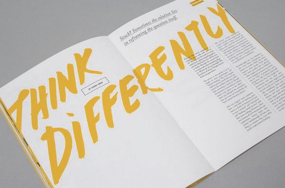
Source: 99U Quarterly Mag #4
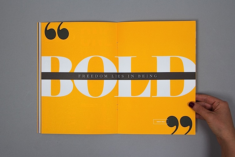
Source: 99U Quarterly Mag #4
In InDesign, whether a "print PDF" or "interactive PDF" is being exported, there's an option to export it as pages OR spreads. Here are a few screenshots:


If you understand the difference between a spread and a page, you can have clearer conversations with your designer about your expectations for the project and the proofs.
Please note: receiving a PDF of your book as spreads is important for visual effect, but receiving a PDF of your book as individual pages is essential for the actual printing process. You will still want to have an individual pages version of the proof:
If you are wanting to print off the proof your designer has sent to you, to proofread it (always recommended - you catch a lot more errors on a printed proof), or
For sending to your printer or publisher.
Now you know what the term "spread" refers to in book design and layout! And you even know where the option is in InDesign, to export the PDF as individual pages or as spreads. I remember a time when InDesign did not offer the option to export PDFs as spreads, but it's been a great addition to the software and definitely helps the client viewing a PDF proof to picture how everything will work together visually in the final, printed piece.
Sign up for my Book Done newsletter to get tips and stories about getting your book project done!