Creating a Book Series with Amazon KDP - An Author's Perspective

Since 2017, I have been working with Elizabeth Milovidov, the owner of Digital Parenting Coach, on the design and interior layout of books helping parents navigate parenting in the digital age. When Elizabeth came to me, she had her business branding in place, and she hired me to take the look and feel of her brand into book format, making matching covers and interiors for a wide range of guides and workbooks. As of right now, she has four series with four books in each. That’s sixteen books particular areas of digital parenting — yes, she’s been busy!

Elizabeth and I both learned a lot about what it’s like to create a book series for Amazon KDP (formerly CreateSpace) over this lengthy process of creating so many books to sell on that platform. I asked Elizabeth about some of the things she learned, to help other writers or speakers wanting to establish their subject-matter authority by publishing through Amazon KDP. The following are Elizabeth’s hard-earned insights about creating a book series to sell through Amazon’s print on demand publishing. You can also see Elizabeth’s Amazon author page here.

book series amazon kdp.jpg

The best thing about creating a book series with Amazon KDP was....

“being able to put my thoughts, experiences and ideas into words, and then seeing those ideas online and available for others!

“With Amazon KDP you have the option of creating print, or eBook, or both. But I would caution everyone to remember that creating books is not a money-maker! However, it is a reputation-maker. Once you create something solid, it is yours and it can be better than a LinkedIn profile, business card or website. It is tangible proof that you are the expert in your area, and that is invaluable.”

The hardest thing about creating a book series with Amazon KDP was....

“not being able to go back and make certain changes to a title or a series on Amazon. Once your book is out there, it's out there. You have a short amount of time during which you can make changes and edits on Amazon, but after that, a changed book is considered a second edition. And you, like me, may not want to advertise to the world that you made changes so quickly! You are not allowed to delete those entries, although you can withdraw them from the market. If you look at my Amazon webpage, you will see at least two or three out-of-print books which are merely earlier editions of books that I later edited heavily or changed the title.

If I were to start over again with creating a book series with Amazon KDP, I would…

“…do everything the same, as it was a brilliant experience! But the one thing that helped me immensely was hiring Julie to do the book design. I was able to rely on Julie for her eye, so that I could focus on the content. There were times when a page layout wasn't quite perfect, and Julie would make a suggestion to add text or another image—advice like this only increased the value of my work.

The only thing that I wish someone had shared with me previously is that creating a book or even a book series on Amazon KDP is easy—what’s difficult is marketing and selling the books. But like with everything, perseverance and the desire to learn, adapt and make adjustments are key! I will conquer the Amazon marketing challenge next!”

IMG_9815_e-2.jpg

I’m so glad Elizabeth was willing to share her perspective as an author, on publishing through Amazon KDP. In my next post, I’ll share from a designer’s perspective, some things I learned about creating a series specifically for Amazon KDP.


Are you planning to publish a book series through Amazon KDP? Book a live consultation with me, or shoot me a message and I’ll share more about working together on a book series published through Amazon KDP.

How to Know If Your Book Manuscript Is Ready for Interior Design and Formatting

Every self-publisher or author is excited to finally see his or her book formatted for print. So excited, in fact, that the temptation is strong to jump the gun and send the book formatter a manuscript that isn’t quite ready for formatting.
Sending your designer a manuscript that is unfinished or missing information is a lose-lose: it’s expensive for the author and frustrating for the designer. Here are a few ways for you to avoid “surprise” costs by making sure your book manuscript is truly ready for the formatting stage.

If your book manuscript is ready for interior design and formatting, you will be able to answer “yes” to the following three questions.

Has your book been professionally edited and proofread?

I list this first because it is a complete must. Professional editing and proofreading is essential, not only for the quality of your final product, but also to keep the cost of formatting your book from exceeding what your book designer quoted you. Every book should be proofread again after layout, but at that point, the proofreader should only be finding minor typos or layout issues, not reworking paragraph structure or removing full sentences.

Have you merged your manuscript files into one Word file?

If you haven’t done this yet, merge all your various Word files, etc. into one file with your whole book in it — from title page and copyright to references and appendices. Having this all together (and waiting to send it until you have all the needed info) is the best way to save yourself from paying extra charges if your book designer has to bill for admin tasks like ordering and merging Word documents.

Have you collected the printer specs that the designer will need?

Your book interior layout designer can’t start on the layout without knowing the page size, or if there are any special requirements from the printer. For example, print-on-demand book printers like Kindle Direct Publishing (formerly CreateSpace) or IngramSpark have their own particular requirements listed on their websites. It’s good to get a quotation from a printer and show your book designer the specs you have given the printer — this means fewer surprises for both of you when the final layout is sent to the printer. Some designers will help you communicate with the printer; be clear with your designer if this is part of what you need his or her help with!

prepare your book manuscript for formatting and design.jpg

If you can answer “yes” to the questions above, your book may be ready for formatting! But yeah … I get it.  You’re anxious to see what your book will look like, and can’t wait to get started. Maybe the manuscript is still being edited, or the proofreader needs an extra week. There are perhaps two things you can get your designer to start on before your full manuscript is ready for formatting. They are:

Get your designer to start on the book cover design. It’s great to have your book cover designed ahead of time for marketing purposes. The front cover can be designed virtually any time after you have a finalized title and a book summary.

Get your designer to create a sample interior layout. Sometimes you may need a sample book interior layout to pitch your book to a publisher or as a sneak peak for your readers. Depending on how your book designer works, he or she may be ready to create a sample layout with a manuscript that is not finalized. For example, last year I created a cookbook interior layout sample for a client who then came back to me this year with the full cookbook contents ready for formatting. For any book layout, your designer should send you a few samples pages before the whole book is formatted.

You’re bursting with excitement (and so am I!) It’s wonderful to see your book in its final format! Hang in there — you’re close to the finish line! Don’t turn your final files over to your book designer until they’re really ready!


If you reached the bottom of this post, you must be pretty serious about finalizing your book manuscript and beginning the book layout stage. Let’s talk about what you should do next.

Why I Print Book Manuscripts Before Formatting Them

I always encourage my clients to print their formatted books after they receive them from me. I tell them that they’ll catch more errors if they look at their books in print. But what I don’t mention to my clients is that I often print copies of their manuscripts at various stages in the design and layout process, too.

In fact, I often print a copy of their unformatted manuscripts for myself. This is a step many book interior layout designers might skip, but I’ll tell you why I think it’s important. It’s for the same reason that I ask my clients to print their formatted manuscripts: I catch more formatting errors if I look at the unformatted manuscript next to the formatted book. Printing the book manuscript improves the quality of my final product.

Most of the books that I format are non-fiction, and they have a lot of different formatting details to watch for: not just italics or bold but also images, tables, captions, superscript, footnotes or endnotes. I find that printing out the manuscript helps me to double-check my formatting and be sure I haven’t missed anything important.

Here’s a recent memoir manuscript that I printed out to compare to the formatted book on screen. (I printed it on the back of some papers I had which had been printed on only one side.)

IMG_9067.JPG

When I am setting up the first few sample page designs, I print those out as well, to test the typeface style, weight, size and to check the line spacing and margins. Sometimes I also print out the formatted book in full, to check it over again.

Of course, I’m a print designer, I like printing things out. But there’s more to it than that — I believe that when I review your book on paper at various stages in the interior layout and design process, it gives you a better book! This extra attention to quality is, I hope, one of the things that sets me apart from other book interior layout designers.

In case you’re wondering, whenever possible I print on both sides of the paper. I always recycle the printed manuscripts when the project is complete and another happy client is sending his or her book off for production!

As an aside, here’s a peek at how this memoir looked before formatting:

IMG_9068.JPG

And here’s how it looked after:

p%252B2019-08-19%252Bat%252B1.12.24%252BPM.jpg
book+interior+layout.jpg

My client told me that he caught problems that he had not noticed before when he read his manuscript once more in the final format. Together, we made a memoir that will be treasured by his family and friends!


A bit of attention to detail goes a long way in creating a book you can be proud of! If you’d like my help with your book project, or just want to ask me some questions, fill out this book project questionnaire or book a live consultation. The process page on my website lays out what it looks like to work with me. 

How to Shoot Photos for a Printed Book or Cookbook

I work with a lot of self-publishers, and some of them select a photographer who is shooting photos for a printed book for the first time. As someone who has been integrating photos and text in book layouts for more than a decade, there are a few common problems I run into: images that (1) are not high enough quality, (2) images that don’t fit the proportions of the book or are cropped too tightly, and (3) images that shift significantly when converted from RGB to CMYK. You can avoid these problems by considering the following points.

Shoot your photos in the highest possible resolution.

This should go without saying, but photos that will be used for print need to be the highest possible resolution. They should be at least 300 dpi at final size, but since the photographer doesn’t know how much the designer may enlarge or crop the photo, it doesn’t hurt to send the designer photos that are up to 600 dpi at final size. If you are sourcing any additional photos from a stock photo site, purchase their highest resolution image if it will be used as a full-page photo.

Consider the proportions of the book when culling the photos or selecting photos from photographer proof sheets.

Usually a photographer will take both portrait and landscape orientation photos for a book, but sometimes when the photos come to me, only one of these orientations is provided. However, most cookbooks are portrait format and some are square. If the image provided is landscape orientation, it is difficult to have any “full page photos” because the proportions of the image are so different than the proportions of the book.

Consider the cookbook with blue pages shown above and below as an example. The page format is square. In order to make the landscape orientation images fit on square pages, they either had to be zoomed in/cropped closely (top example) or the images have to be quite small (lower example). Providing a portrait version of the same recipe would have given me more options for layouts, especially full page layouts.

If you are culling or selecting images and aren’t sure which ones to use, pick one portrait and one landscape (and not too closely cropped, below) or contact your book designer and ask what they think is best, given the dimensions and orientation of your book!

Don’t crop the photos too closely.

Leave enough “dead space” around the edges of the image that the book designer can do the final “cropping” when he or she decides exactly how to position your photos in the book. There is almost always a difference between the proportions of the photo as it comes out of the camera, and the proportions of the book. If the photographer or illustrator provides images that don’t suit the proportions of the book, it is the job of the layout designer to pick the best cropping possible. For example, take this overnight oats recipe spread from a cookbook I designed. The reader doesn’t see how much the photo has been cropped…

photography and book layout.jpg
planning photos for a printed book.jpg

…but when I give you a behind-the-scenes peek into how the book looks in Adobe InDesign, the industry-standard book layout software, you see that the book is a 4:5 ratio but the photos a 2:3 ratio. I had to decide how best to crop this image, and chose to lose some of the jar and canister in the background rather than to crop the jar of oats.

Another reason to not crop your photos to closely is because a book designer always needs at least an extra 0.125” around all edges of the photo for bleed, if the photo goes to the edge of the page. This area will be trimmed off, but needs to be there so that there is no unintended white edge around the photo.

For a full wrap hardcover book with a photo on it, the cover designer might even need several inches of extra space around all edges of the photo, for the photo to wrap nicely around the cover board without leaving an unintended white edge.

Related to the topic of cropping, sometimes providing the designer with several variations of the same photo for him or her to choose from can be a huge help for creating a successful layout. Just a slightly different position of a spoon or slightly different camera angle can make a big difference. For example, for the same cookbook project, the photographer sometimes gave me two similar photos to choose from.

Consider converting your photos to CMYK.

It used to be necessary that the photos used in printed books be converted to CMYK on the photographer or designer’s computer. However, because today photos and photo books are often seen both on screen (RGB) and in print (CMYK), it is becoming more common practice to simply let the printer convert all the images to CMYK before printing. However, if you are particular about the RGB to CMYK conversion, or are shooting photos in tones that show up significantly differently in RGB than in CMYK (like a neon green or light, bright aqua), you may want to go ahead and convert your image files to CMYK before sending them to the book layout designer.


There’s not much that I enjoy more than a good book interior layout with stunning photography! If you have questions about preparing photos for a book layout, shoot me a message or book a consultation with me!

What Does Book Interior Layout or Book Interior Design Cost?

When you are researching the cost of a book interior layout online, it can be hard to pin down an exact price. Why is this? It is because your book is unique! Simply providing a word count and the genre is not usually enough to secure an price, because there are so many variables that affect the time your book designer will invest in making a professional layout. Book designers need to see the manuscript, or at least a significant sampling of it, before quoting an exact price.

book interior layout pricing.jpg

Here are the main factors that come into play in book interior layout pricing:

Text

  • What is the word count?

  • How neatly is the source file formatted? (If the source file from Word is already formatted using paragraph styles, etc. this can ease the final formatting process.)

  • How simple or complex is the manuscript? (For example: cookbook vs. novel. A novel generally has just a few different styles, but a cookbook is much more complex with small subsections of text regularly being formatted different ways.) Variables that affect complexity include:

    • character styles like bold or italic text

    • headings (chapter titles, subheadings, sub-subheadings)

    • quotations, verse, poetry

    • boxed text or pull quotes

    • forms or tables

    • endnotes or footnotes

    • indexes

Images or Diagrams

  • How many images or diagrams are there?

  • Do any of these images still need to be created, edited or adjusted, or will they be provided to the designer ready to insert?

Timeline

  • When will the final manuscript be ready for formatting?

  • How soon do you need the professionally prepared print-ready PDFs to be delivered?

Revisions

  • Does the number of revisions required exceed the number of revisions the book designer quoted on? (The best way to avoid this is to have the book proofread multiple times before layout begins.)

As you can see, there are a lot of variables that play into the cost of your book interior layout! If you have a book manuscript and are looking for a book interior layout quotation, fill out this questionnaire and send me your manuscript for an exact quotation or book a live consultation. The process page on my website lays out what it looks like to work with me. 

Should I Print With an Online Printer or a Local Printer?

In the past ten years, online printers have exploded and become the go-to for many print projects that used to be printed down the street. Sure, online printers are usually cheaper, but does that mean they’re always to be favoured over local printers? As I’ve researched various printing options for clients both in North America and Europe, it’s become clear to me which projects are well-suited to online printers, and which would be better printed locally.

Photo by Kaboompics .com from Pexels

A local printer may be best for:

Creative or complex print projects requiring personalized service: Printing with a local printer lends itself to creative print projects with unique shapes, papers, folds, or finishes. Not only can you get in-person advice from someone who can help you plan your project, but you can flip through paper samples or look at ink swatches in person. Typically, online printers are set up best for standard projects in standard sizes, which is one of the reasons they tend to be more affordable. 

Print projects with a tight turn-around time: As I mentioned in my post on saving money when ordering printing, when printing with an online printer, if you need the printed piece to arrive quickly, you will pay premium prices for rush production and overnight delivery. In this case, I almost always recommend printing with a local printer; you can pick up the printed pieces yourself if needed. It’s also faster to shoot your local printer (with whom you already have a relationship) an email with the necessary instructions and a pdf attached, than to create an account with an online printer and go through all the steps to set up the order to their specifications.

High-ticket print projects: For a project where the colours need to match exactly or you are quite particular about how the photos are printed, printing locally with a more traditional full-service printer is best. You may even be able to “press proof” if needed — to make an appointment with your local printer to be there when your project is being printed, to sign off on the prints as they leave the press.

It follows that an online printer may be best for:

Standard print projects with standard lead times: If you need a 3.5 by 2 inch business card (in North America) or an A6 postcard (in Europe), any number of online printers are begging for your attention. Most of them will probably do what you need them to do. If you have about 1-2 weeks lead time, most online printers can print and deliver at their standard reduced rates. When working with an online printer, there is usually no interaction with a customer service representative, and it can be a bit harder to get help with questions or complaints. 

Low-budget print projects: There are always clients for whom budget is of utmost concern. For these projects, planning them to suit an online printer’s standard product is your best bet. For example, recently a client wanted a 6 by 6 inch marketing booklet. An online printer offered that exact size, and the local printer could not compete with the pricing because the size was unusual and the booklets would have had to be put together by hand. 

As someone who cut her prepress teeth at a local printer, I am a fan of giving back to the local economy when possible, and not contributing to the closure of yet another local print shop. But like everyone else, I’ve printed with both types of printers. One last secret about local printers though — because you’re dealing with a real human with whom you have some kind of relationship, you can also ask if there’s any way he or she can meet your budget or price match another printer. With a local printer there’s a bit more “give” — they’re happy you want to work with them.


As a graphic designer who specializes in print design, I’m available to source or recommend printers for my clients. Whether you’re needing print design or print sourcing, let’s talk!

What Is the Best Way to Save Money When Ordering Printing?

While getting printing quotes and ordering printing for a client in the USA this month, I have been thinking about the best way to save money when ordering printing. Even if the money being spent on printing is not coming from my pocket, I hate to see clients paying double or triple as much for a print project simply because they don’t have this one thing. Can you guess what it is?

Photo by rawpixel.com from Pexels

Photo by rawpixel.com from Pexels

[Photo added to build suspense.]

Saving money when ordering printing is easy if you have time. The top reason that I see printing become expensive for clients is because they haven’t planned enough time for the most affordable printing options. In other words, print projects need to be planned well enough in advance by someone who knows what a reasonable printing timeline is.

Let’s say you’re ordering 5,000 postcards. Printing at the printer down the street might cost twice as much as printing at an online printer. But if you have to pay rush fees and express shipping for your print job at the online printer in order to get the project to you on time, you might as well support the local economy and send your project to the printer down the street, because you’ll end up paying almost the same thing. Planning print jobs with enough time to print them affordably can easily save hundreds of dollars even on a small project like postcards.

The savings become even greater if you are able to plan printing overseas into your timeline for larger projects or larger print runs. For example, that full colour cookbook that might cost $15,000 to print in North America might cost $6,000 to print in India or China…but you need to plan on at least an extra four to six weeks for printing and delivery. And even with printing overseas, shipping can become expensive if you suddenly have to have a quarter of your order sent by air instead of by sea because the timeline is too tight.

If you have time, you have choice. A bit of planning also gives you the time to:

  1. Gather quotes from more printers, finding the best price or quality for the price.

  2. Research other options that might also save money, like different papers or different formats.

  3. Negotiate with the printer that you hope to work with. (This is a benefit of working with a local printer, is that you may be able to negotiate with them and keep your printing local.)

  4. Wait for sea or ground delivery instead of air or overnight.

  5. Work with your designer in a low-stress way and avoid rush fees from the designer as well.

For a big corporation, saving $100 when ordering postcards or $2,000 when ordering books might not seem like much. But these kinds of savings are especially important for lean start-ups or organizations like non-profits for whom every penny counts!

So, what’s the best way to save money when ordering printing? Good planning — that is, knowing how much time you need to keep the print project from becoming a rush order!


Thank you for taking the time to read this post! I am happy to help clients source the best printing prices in their neighborhood, online or overseas. If you want to talk about how to save money on your next print project, please write to me through my contact page.

How I Found a Reliable Overseas Printer

Some time ago, a client asked me to assist in sourcing the printing of a large book project overseas, rather than in North America, where it had previously been printed. We had a great experience with the printer we used in North America, but as a start-up, the company’s biggest challenge was their budget for the project. The client wanted to see how printing overseas would compare to printing in the USA again.

Photo by Alex

Photo by Alex

Here's how I found a reliable overseas printer.

1. Submitted quote requests 

At the recommendation of a former colleague who has also printed overseas, I checked out a website called Print Industry, where you can describe what you need printed, and different printers can bid on your job. You can get a wide range of quotes without having to find and approach each printer yourself. My former colleague had used the site successfully in the past to find an offshore printer for a large project. 

Filling out all the details at Print Industry took some time, but after submitting them, we quickly got quotes from a few printers in the USA and from other countries (China and India). The prices provided by the overseas printers were about ½ or ⅓ of the price of the North American printers. We also requested quotes from a printer in Canada and from the printer in the USA whom we had used previously, for comparison. 

submitting a quote request to print industry.jpg

2. Sifted through the quotes

Between the quotes from Print Industry and the other quotes I requested, I received 8 to 10 quotes. I looked through them, primarily checking:

  • if the printer understood our project

  • how the printer’s price compared to the others’ prices.

I tried not to take into account the less-professional face of the Asian companies (their logos, websites, URLs and graphic design don't usually convey the Western idea of quality), but if their English was difficult to understand, I took that as a red flag.

If there was a printer that I felt didn't understand what we were asking for, but I wanted to give another chance for them to provide a quote, I wrote back with a request for adjustments to the quote.

3. Narrowed it down to the best prospect, a printer in China

In communication with my client, I eventually picked a printer who seemed to have understood our request and whose price was competitive, and started to communicate with them by e-mail about the project. 

4. Communicated regularly by e-mail with the printer in China

It was important to me that this company on the other side of the world be able to communicate clearly in English. Some overseas suppliers I’ve worked with can’t really understand and reply to specific questions and are not able to describe a problem or what they need. But we realized that we had found a professional guy with good English, who responded within a day or so to emails, and answered questions specifically. Green light!

Next, we wanted some proof that the company was real and that they were capable of doing the kind of work we needed. They offered to print a sample for us of the full-colour book file, and to send it to us with some other samples of their work and paper samples. The printing company requested $100 to send us two full-colour samples of our book, other book samples, and paper samples to two addresses (one in the USA, and one to me in Germany). The packages arrived quickly on our doorsteps and the quality of the printed samples was excellent. The cover paper samples they sent us matched the texture of our cover from the last printing.

We always had good communication with the printer. Over the months that we worked together, we had to change some deadlines and request new quotes, but our rep was always good to deal with. If at any point he had become difficult to deal with or hard to get an answer from, we would have taken that as a definite red light and looked for a new printer, but there were no such warning signs.

5. Committed to the printer in China

When the project was finally ready, we pulled the trigger. The client paid the first lump sum to the printer in China. I think the printer asked for an $800 downpayment to order the paper for the project, and then 50% of the balance before the printing began, and 50% before the books were shipped. 

The project experienced various delays on the client’s end, and when the files were finally print-ready, it was Chinese New Year and the factory was shutting down for two weeks for the country’s biggest celebration. This was a significant delay at the end of the project, but it was not the printer's problem, because we had expected to have the book done months before. This was the first time my client spoke on the phone with the rep in China (previous communication had always been by e-mail), and he spoke great English, was apologetic about the delay, and did his best to push the book through as quickly as he could once the factory was running again.

6. Received the printed books from China

We had 500 books sent by air to the USA (about a week for delivery) and the final 4,500 books sent by sea to a port in the USA (about five weeks for delivery). The client had to handle getting the books from the port to the company warehouse, but there may have also been a way to have the books delivered to the client’s doorstep. All in all, we were extremely satisfied with the final product and with the price, which was about ⅓ of what the project would have cost at the printer we used the year before. 

I hope this play-by-play is helpful to you if you're looking for a reliable overseas printer. If you use a bit of caution and common sense, you may find that an overseas printer that fits exactly what you're needing for a particular project.


Thank you for taking the time to read this post! If you'd like to know more about my experience printing in China, or would like me to be your liaison for a large overseas print project, please write to me through my contact page. If you’re already in communication with an overseas printer, read this post: How to Communicate Clearly With Your Overseas Printer. If you'd like to talk to me about a book project, please take a look at my Book Design services page.

How to Communicate Clearly With Your Overseas Printer

In my last post, I wrote about how to find an overseas printer for large print projects. As I worked long distance again with a printer in Asia this winter, I was reminded of a few things that ensure successful communication with a print representative who is far away, and who is probably not a native English speaker.

Photo by rawpixel.com from Pexels

Photo by rawpixel.com from Pexels

  1. Keep your written messages clear and jargon-free.

    In North American culture, we often start or end e-mails with a bit of small talk. But when you’re working with someone for whom English is not their first language, the more they have to read, the more chance there is of miscommunication or misunderstanding. Keep your e-mails or texts kind but clear and to the point. Don’t use idioms. Re-read messages before sending them to double check for clarity.

  2. Make sure all your questions are answered.

    Of course, you need to have a clear contract with your printer — you know that. But if anything is not clear to you about the project, be sure to ask questions until you’re sure you’re both on the same page. It’s legit to ask for paper samples, samples of previous print projects they’ve completed for other clients, or a printed sample to be sent to you. Your overseas print representative should be able to supply almost anything your local printer could supply, just that it will take longer and cost more to ship.

  3. Ask for multiple ways to contact your print representative.

    In the world of long-distance printing in Asia, phone numbers, e-mails and websites change more often than with established North American or European printers. If you’re working with a printer that you like, make sure you have at least two different ways to contact your print representative, such as e-mail and phone, or e-mail and WhatsApp.

  4. Ask ahead about local holidays or festivals if your timeline is tight.

    Another aspect of working with a long-distance printer is that they celebrate totally different holidays or festivals than you do. When you’re ready to submit your proof changes, they may be taking the train home to ring in the Year of the Pig. When you’re eating turkey dinner, they may be binding your latest catalog. Double check for any holiday dates that might affect your timeline.

  5. Don’t hesitate to phone if needed. (But please, check your printer’s time zone.)

    While most long-distance communication these days is done by e-mail or text message, sometimes the clearest way to sort out a misunderstanding or ask a question is by phone. Picking up the phone can smooth out differences; people are more likely to be gracious when they hear a kind voice on the phone.

As you can see, in order to receive the print project on time and done right, it’s essential to communicate clearly with your overseas printer. I hope these tips help you to have a confusion-free experience printing offshore.


Thank you for taking the time to read this post! If you'd like to know the contact information of the overseas printer I have used, or would like me to be your liaison for a large overseas print project, please write to me through my contact page.

Design and Print Production Considerations for a Book in the Grief and Loss Genre

This week I was discussing a book interior layout project with a client who is self-publishing in the Grief and Loss genre. As I spoke with her about a wide variety of topics related to the preparation of her book, a few thoughts came to mind that might also help others self-publishing in this category. 

Self-publishers face a myriad of options but don’t always know what suits their genre best. Making thoughtful decisions about your book’s physical appearance and layout will ensure that your final physical product reflects the heart of your book.

Photo by Kelly Sikkema

Photo by Kelly Sikkema


1. Choose off-white or cream-colored paper instead of white.

There’s something about the warm tones of cream-colored paper that just gives a warmer and more approachable feeling to your less-than-approachable topic. Black words on white paper feel a bit stark and academic — white paper is often the stuff of office work and text books. There is no hard and fast rule about this, but cream-colored paper is most often used in this genre and feels more welcoming. If you’re self-publishing at CreateSpace, cream and white are your only two paper options.

2. Choose matte cover paper instead of glossy.

A flashy, glossy cover screams “exciting” and “new” — not really what most authors are going for when approaching the topic of grief. Opt for a matte cover paper, even if your cover design has photos on it, to lend a more subdued, respectful tone to your serious topic. Whether you’re printing on demand with a printer like IngramSpark or CreateSpace, or working with a traditional publisher, ask about cover paper with a matte finish.

3. Consider a smaller format.

A smaller, easier-to-read format lends itself to being picked up when the reader has a few minutes to spare. It makes your book easier to tuck in with a gift or to mail to a friend going through a hard time. If your book is made up of short readings, poetry or stories, a small format is particularly natural; consider a size of around 5.5x8.5” for your book. But do let the nature of the content dictate the size — some years ago I laid out this Notes from Susie book interior and it was a standard 6x9” size. This 400-page collection of the deceased author’s writings would have been too thick in a smaller format. The same might go for books that are compilations of longer essays or a Grief and Loss genre book whose nature is more academic than coffee table.

4. Choose colors that suit your genre.

In Western cultures, usually cooler colors in the purple and blue spectrums are most associated with the subdued themes of suffering, healing and grieving. Purple has liturgical ties, and blue might remind the reader of water, the sky, or Heaven. (Green probably starts to feel too earthy or medical, unless your book’s theme leans that way.) Neutrals can also be a good choice. In many Asian cultures, white is the color of mourning; and in many Western cultures black or grey is associated with death or loss. Research your audience and work with your cover and interior layout designer(s) to pick colors that best convey the material you are self-publishing. Discuss colors ahead of time, or if your designer picks colors you were not expecting, feel free to ask his or her reasons for doing so.

juliekarenblogdivider-2.jpg

If you are looking for cover design or interior layout for your book in the Grief and Loss genre, I’d be happy to help you take these ideas into consideration and make your book more approachable and shareable when people are hurting. After all, you wrote it to reach those people, right? Now you’re on the home stretch — make smart design and print production choices to make sure your book catches your intended audience’s eye! Contact me here to learn more about working together.

Where Can I Find Free, High-Resolution Images for Print Design?

Photo by JESHOOTScom via Pixabay

Photo by JESHOOTScom via Pixabay

In the past five years, there's been a real boom in websites offering high resolution, print-quality photos that are free for commercial and personal use. Whether you're wanting photos for a professional print design project or even just looking for a beautiful new photo to enlarge for your office wall, check these websites before you shell out the cash for paid photo services.

1. Unsplash

The first place I look if I want non-cheesy, free, high-resolution photos is Unsplash. The images at Unsplash are well curated, and have a young, artsy vibe. They're high enough quality for printing and Unsplash doesn't require that you start an account with them to download images. All images on Unsplash are free for commercial or personal use. Another nice feature of Unsplash is that there's little advertising on the website; the same can't be said for most of the following photo sources. I like Unspalsh so much that I sometimes even contribute my own photos to the pool for others to use. 

2. Stocksnap

Stocksnap is another great gallery to search for quality, high-resolution photos at no cost. Similar to Unsplash but a bit less hipster. They offer alle of their images under the same CC0 license that lets you do what you want with their photos, with no attribution required. The quality of the images is sharp and good for print at most sizes. You can read their image licensing details here

3. Pexels

Still searching for that perfect image? Enter your keyword(s) into Pexels and press enter! Pexels specifies that their images can be used in print marketing material: "Use the photos for flyers, postcards, invitations, magazines, albums, books and more" but be sure to read their licensing write-up here before you hit print!  

4. Pixabay

Not to be confused with Pexels (the "p" and the "x" in both names still throws me off), Pixabay advertises that they have over 1.5 million royalty free stock photos and videos. Pixabay requires that you create an account and log in to access the images in higher resolutions, but it's worth it if they have the image you're wanting! 

juliekarenblogdivider.jpg

Of course, there are many more such websites, but I hope these four favourites of mine will be useful to you! It's always good to have a few different links go-to free stock photo websites in mind when you need images for a project, because particularly when it comes to free stock images, not every site will have the image you need.

If you can't find the image you're wanting for free, try a cost-effective source of paid images like Shutterstock.

Lastly, I can't emphasize enough how important it is to check and double check the licensing on "free" images before ordering a large print run using those photos. Free print-quality stock images can be a great solution in many situations, but watch for my follow-up post, where I explain why (in my opinion) you should never use a "free" image on your book cover, or front and centre in any other important, widely-distributed print marketing piece. 


Wondering about using an image for print, but not sure if the resolution is good enough? Give me a shout through my Contact page and I'll help you figure it out! Or sign up for my Book Done newsletter to get tips and stories to help you get your book project done!

Expect Delays When Self-Publishing

If there's anything I've learned since beginning to work independently with self-publishers, it's this: self-publishing a book takes longer than you expect. Especially if it's your first book.

Photo by Christin Hume

Photo by Christin Hume

A self-publisher often underestimates how many steps are involved in the publishing process. Maybe the photographer calls in sick. Or the editor needs an extra week. The proofreader can't work on the file right away because it came to her a different week than she expected. One small delay can have a domino effect, causing the whole project timeline to change.

When I am designing a full color book involving a lot of photography, usually the self-publisher works with me on a sample design or layout before the contents for the whole book are ready. The self-publisher talks to me about his or her ideas for the book, and gives me about ten pages of sample content. At this stage we establish the visual aspect of the book. Once the sample layout is ready, I wait — an indeterminate amount of time — until the full manuscript is ready for layout and design in the same style. On average, I would say that books come to me two weeks to two months later than the self-publisher originally intended, depending on the complexity and length of the content. 

I don't share this to be pessimistic, but to be realistic. If it's your first book, and especially if you're coordinating the project independently, I have three tips:

  1. Don't commit to a particular release date. You may have a release date in your mind, but you don't have to give that date to others. Your first book will almost always be completed later than you expected. (One of my clients shares about his experience with setting a firm launch date in this blog post.) Or, give a padded date...

  2. Pad your timeline. If you'd like to release your book in March, try to create a timeline that would have it releasing in January, to give yourself some wiggle room. If you give your contractors deadlines that are not your real, drop-dead dates, you won't be stressed out by every little delay that comes up.

  3. Don't rush the process. Skipping important steps at the beginning of your book project can be very expensive in the end. The full layout should never be done until the text has been thoroughly edited and proofread. Major changes after the book has been laid out or after the book has gone to press can unnecessarily blow your budget.

Self-publishing a book — especially if it is your first book — takes longer than you expect! But if you expect the unexpected, maybe it won't actually take longer than you expected!


Are you self-publishing a book? I'm happy to answer any questions you might have. Give me a shout through my Contact page!

What Does the Term “Spread” Refer to in Book Design and Layout?

Some of my clients are making their first foray into the world of printing and publishing when they come to me, and as we discuss their project, I realize that there are terms I use regularly that they have never heard before. This week when we were discussing a sample layout for a book project, my client asked me what a "spread" refers to. It takes only about ten seconds to explain, but can make a big difference in discussing a project.

In this image, I've highlighted a page:

book spread design and layout.jpg

And in this one, I've highlighted a spread:

design book spread.jpg

See, that was easy. A spread is simply a set of pages (usually two) viewed together. It's how you see the book or magazine when it's open and both pages are showing.

As someone working with a book designer or print designer, it's good for you to know the difference. Why? Well, especially in layouts where the text and/or images are spread across both pages, you must see your proof in spreads to get the full effect of the design. 

If your designer sends you a PDF proof where the pages are shown individually, you can write back and ask if it's possible to also see it in spreads. After all, the final book will virtually always be seen as spreads, and when you can see it on screen in spreads, it gives you a much better idea of how the layout will strike the viewer visually. It may also help to you catch layout errors more easily.

In InDesign, whether a "print PDF" or "interactive PDF" is being exported, there's an option to export it as pages OR spreads. Here are a few screenshots:

export print pdf as spreads.jpg
export a pdf as spreads from InDesign.jpg

If you understand the difference between a spread and a page, you can have clearer conversations with your designer about your expectations for the project and the proofs.

Please note: receiving a PDF of your book as spreads is important for visual effect, but receiving a PDF of your book as individual pages is essential for the actual printing process. You will still want to have an individual pages version of the proof: 

  1. If you are wanting to print off the proof your designer has sent to you, to proofread it (always recommended - you catch a lot more errors on a printed proof), or

  2. For sending to your printer or publisher.

Now you know what the term "spread" refers to in book design and layout! And you even know where the option is in InDesign, to export the PDF as individual pages or as spreads. I remember a time when InDesign did not offer the option to export PDFs as spreads, but it's been a great addition to the software and definitely helps the client viewing a PDF proof to picture how everything will work together visually in the final, printed piece.


Sign up for my Book Done newsletter to get tips and stories about getting your book project done!

A Visit to the Museum of Printing and Graphic Communication in Lyon, France

A few weeks ago I had the privilege of having two days to wander solo around Lyon, France. It almost goes without saying because it's France, but Lyon is a beautiful city! It's full of unique old buildings, Roman ruins, antique book shops and cafés serving fresh crêpes. 

view of lyon france.jpg
lyon france cafe.jpg
lyon france old city.jpg

Before going there, I was looking at a list of attractions and, of course, the Museum of Printing and Graphic Communication (Musée de l'imprimerie et de la communication graphique) stood out to me on the list of attractions. I happily spent lovely June afternoon there learning about books and printing.

Here's what the museum looks like from the outside:

museum of printing and graphic communications 1.jpg

It was founded in 1964 and is one of the leading European printing museums. It's housed in a beautiful Renaissance building, Lyon’s first town hall. Here's how the courtyard looks:

lyon musum of printing.jpg

The museum has a large permanent exhibit (schedule at least three hours for it, if you're planning a visit) as well as a temporary exhibit (when I was there, it was an Andy Warhol exhibit). Everything in the permanent exhibit is excellently translated into English, but the temporary exhibit was set up mostly for French speakers (English translations were available on paper sheets, but they were a bit hard to understand.)

andy warhol exhibit in lyon france.jpg

There's a gift shop at the entrance / exit and as would be expected, most all the flyers and booklets in their giveaway stand were colorful and gorgeously designed.

museum of printing and graphic communications 2.jpg

The permanent exhibit at the museum is divided up into the following sections:

  1. The beginning of printing (before 1450)

  2. The invention of letterpress printing by Gutenberg (1450-1500)

  3. Printing and the Renaissance (1500-1600)

  4. Printmaking

  5. Printing in the hand press period (1600-1800)

  6. The industrial revolution (1800-1900)

  7. Photography and printing in color (1850-1900)

  8. The graphic revolution (1880-1945)

  9. The information society (1950-…)

early book chinese.jpg

It was a fascinating visit and I'll just share some interesting facts and photos from the museum, in more or less chronological order. This is in no way a comprehensive look at the permanent exhibit — it's just some tidbits that stood out to me.

Watermarking has been used by papermakers in Europe since the 13th century. The main purpose of watermarking was to differentiate paper from competitors’ paper. The watermark would often be a symbol indicating the paper’s characteristics and origin.

history of paper watermarks.jpg
early moveable type.jpg

Until the middle of the 15th century, books in Europe could only be copied by hand or by using woodcuts. “In the latter case each page of text was treated as if it was an image and then printed by hand by rubbing the back of a sheet of paper placed on the inked surface of the woodcut.” The invention of letterpress printing “is regarded as one of the foundations of modern society”. Although Koreans were already using moveable type moulded in sand, Gutenberg in Germany created metal type that was precise and regular in appearance. Because the size of each piece of type was standardized, the final printing surface was perfectly flat and this led to the invention of the printing press in Germany.

inside the printing museum in lyon.jpg
letterpress printing.jpg
letterpress printing 3.jpg

Letterpress printing was born in Mainz, Germany in the 1440s and by approximately 1458 it was in Strasbourg, and 1459 in Bamberg. The first print shop in Lyon was operating from 1473 onward.

Printing spread quickly, and by the end of the 15th century, more than 250 towns in Europe had print shops. The two most important centers of production by that time were outside of Germany: Venice and Paris were putting out the most titles. 

letterpress printing 2.jpg

The work of an early press operator was very difficult. The hours were extremely long (14-hour work days in the summer) and the operator did not need to know how to read. The compositors — the ones putting the moveable type together into flats that could be printed — needed to be sufficiently educated and therefore were paid higher salaries than the press operators.

early gothic script.jpg

Have you ever thought about how many type-related terms have Italian names? This is because Italy had a great influence on the early typesetting and printing industries. The earliest printers in Germany were using Gothic letters (see photo above) based on type styles from medieval manuscripts. However the Italians were quick to create a new "Humanist" style, using lowercase letters invented in Italy in the 8th century (the “Carolingian minuscule”) and the capital letter style seen on Roman monuments. The Germans arriving in Italy began to use the Humanist typeface style as well, and gradually the German printers in Rome created a typeface called “Roman”. “Italics” also came from Italy, although in Italy italics are known as “corsivo” (cursive).

It took more than three quarters of a century for the book to go from a manuscript format to a printed style of its own. Certain elements began to be established, like the title page, and identifying information which indicated who produced the book. Pages began to be numbered; running headers were invented to give guidance to the reader. 

Rags were commonly used for the creation of paper for several centuries. More than 80 kinds of vegetable matter were mixed with rags in attempts to make an affordable paper. Inventors tried thistle, maize, nettle, straw, pinecone, potato and more! By 1870, paper made from wood came into widespread use. At the time, newspapers were flourishing and affordable paper was needed.

early newspaper masthead.jpg

In the 17th and 18th centuries, scientific and technical books were sought after by the educated public. Botany, medicine, anatomy, and history became topics that any educated individual could learn about from the printed materials that were appearing on each topic. Traditionally, skills and knowledge in art and architecture were transmitted only from master to pupil in a workshop, but soon those masters began to have to compete with printed manuals conveying the same information. Skills that were once transmitted orally or by everyday practice were beginning to be transferred theoretically through printed materials. For example, dressmakers' patterns could be printed and distributed with greater ease (see image below).

pattern printing.jpg

So much of what is taken for granted in our digital era was a complicated process in the early days of printing. Re-sizing one image during the 1800s could take several hours on a device like the one below:

reducing a picture in size.jpg

Three-color printing was invented in 1719. This was particularly helpful for making scientific illustrations more readable; previously any color had to be added by hand. But until the 19th century, coloured printed images remained rare and expensive. Only with the invention of chromolithography in the early 1800s could good quality images begin to be reproduced on an industrial scale, using CMYK. Chromolithography really took off in the 1860s and was used until the 1950s.

early colour printing.jpg

As color printing became more popular, the travel industry began to use color posters to advertise trips to exotic destinations like Algeria and Tunisia. (It's hard to even imagine a travel advertisement today that doesn't use color!)

early travel poster algeria tunisia.jpg

The industrial revolution led to the graphic revolution. As industrial capitalism grew, the need for marketing, advertising and “brand image” promotion grew. At this time, advertisers and printers began to need the help of graphic artists.

In the 19th century, advertisements had been regarded with mistrust, but by the end of the century, publicity became one of the driving forces behind consumption. Publicity agents became popular in the early 20th century, taking complete charge of ad campaigns. Instead of simply informing customers, their job became to persuade them. In France, the poster was a very popular form of advertising and it remains a more popular form of advertising in France than in other nearby countries to this day.

Posters and graphic communication were also used for a lot of propaganda during the turbulent eras of World Wars 1 and 2.

early poster art france.jpg
poster art france letterpress.jpg

The title “graphic designer” became standard only recently, but was invented in 1922 by an American type-designer named William Addison Dwiggins.

desktop publishing musem exhibit.jpg

During the second half of the 20th century, graphic communication changed radically as printing, production of administrative documents, and information technology merged. Computers changed the rules of the game. Printers incorporated computers into typesetting and page layout IT networks. Desktop publishing began in 1984 with the launch of the Apple Macintosh. The ability to print in-house revolutionized the printing industry. 

I thought this sentence near the end of the museum's exhibit summarized how radical the changes have been to the printing and graphic communications industry in just a few decades: “Today the simplest personal computer provides even the most modest user with graphic tools far more powerful and productive than the specialized machines and systems used by the printing industry before the digital revolution.” It's a fun era in which to be a communicator, book designer or graphic designer — we've come a long way! And if you're even a "modest user" of page layout software or printers, the Museum of Printing and Graphic Communication is worth your while if you visit Lyon!

Why Does the Paper in My Printed Proof Feel Different Than the Paper I Specified for My Project?

A few months ago, after a client received a printed proof of his catalog in the mail, he asked me: Why does the paper in my printed proof feel different than the paper I specified for my project? He had reason to be concerned: the thick paper on which the proof had been printed did not open very well, meaning a lot of each beautiful photo spread was lost to the centrefold of the book. He sent me a video to show me how stiffly the pages of his proof were turning. 

Plotter - the kind of device your proof is printed on (Image Source)

Plotter - the kind of device your proof is printed on (Image Source)

Thankfully, the printer and I were both able to reassure him that the paper the printer uses for proofing a project, especially a project that is printing on special paper or on an offset press, is usually not the same paper the final project will be printed on. At the commercial printer where I used to work, our proofs were printed on rolls of paper by a digital plotter, but the final paper came in cut sheets and was loaded into the sheet-fed offset press.

Offset Press - the kind of device your final product is printed on (Image Source)

Offset Press - the kind of device your final product is printed on (Image Source)

Usually, the first time you'll get to see "your" artwork on "your" paper is when the final product is delivered to your door. But that's why a full-service printer will usually send a sample of the paper to you separately (in the case of my client's catalog, the printer had done this months before), so that you can know the exact thickness or feel of the final paper. If it's really important to you to know how the product will feel — after all, it's hard to hold one sheet of paper and imagine how 200 such sheets will feel in a book — you can ask the printer to provide a dummy of your project. A dummy is a blank book made of your final paper(s), cut and bound to final size. It still won't have your graphics on it, but it will give you a real idea how your piece will feel in your hands.

Next time you get a too-shiny, too-thick proof in the mail, remember: your proof is rarely printed on the same paper as your final product. It's OK to double-check with your printer or designer to make sure the right paper is specified for the project.  Then, take a deep breath, approve the proof, and trust your printer on this one!


If you have a print-related question that's puzzling you, let me know through my Contact page and I'll do my best to find you an answer! 

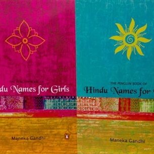
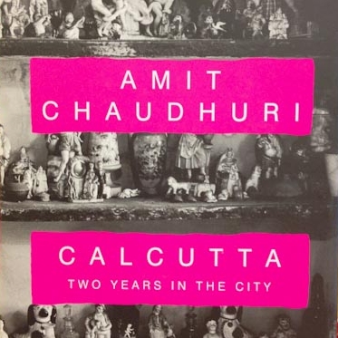
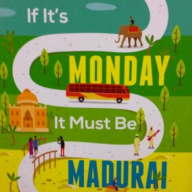
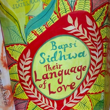
Bright Book Covers From India

I recently came across these snapshots of bright and beautiful book covers I saw in a bookstore in India in 2014. I still find India's enthusiasm for color so inspirational — browsing their bookstores was always a pleasure!


Thank you for taking the time to look at this post! If you like bright and beautiful book covers, we should talk! Contact me through my contact page.

Why Does the Color on My Ebook Cover Look Different Than the Color on My Printed Book Cover?

Recently a client sent me a screenshot of his print book cover and his ebook cover side by side, and asked me why he saw such a visible color shift between the two.

I explained to him that the ebook cover is in the RGB color space, but the printed book cover is in the CMYK color space. RGB is the color space used for on-screen images, while CMYK is the color space that printing devices can capture. As a basic explanation, the RGB images look brighter because they are being shown on a lit screen. It's hard to achieve the same brightness with ink on paper. As you can see in the chart below, CMYK captures a smaller range of color than RGB captures (and both capture fewer colors than our incredibly-designed eyes can really see!) 

Image by The Graphic Mac

Image by The Graphic Mac

My client's cover designer had always sent his bright teal cover to him in RGB, and suddenly before printing, he saw the teal for the first time in CMYK and was surprised at the significant color shift.

If you don't convert your images to CMYK before sending them to the printer, the printer must convert them to CMYK before printing. It's no big deal for them to make the conversion, but depending on the colors you are printing, you may notice that the printed piece comes back looking duller than you expected if you only saw proofs on your screen. 

The following two color spectrums help you to see which colors are hardest for CMYK to achieve. The duller quality of CMYK is instantly noticeable. 

Color spectrum shown in RGB

Color spectrum shown in RGB

Color spectrum shown in CMYK

Color spectrum shown in CMYK

Whether you're picking a color for a book cover or a logo, it's good to consider whether that color will be achievable both in RGB and CMYK. If not, you might want to consider adjusting the ebook color a bit to make it easier to match in print. Or, you'll just have to get used to the slight difference in color between your ebook cover and your printed book cover.


Thank you for taking the time to read this post! If you are needing a book cover design, please check out my Book Covers services page.

Should My Photo Be on the Front Cover of My Book?

This week a client of mine who is self-publishing a cookbook wrote to me with this question: "Should my photo be on the front cover of my book? Everybody says yes....[but I am not sure.]"

When I replied to her, in essence I told her two things:

  1. Having your face on your book's front cover is atypical in your genre. Looking at other cookbooks in the clean eating or vegan genre, I knew that it is not standard practice to have the creator's photo on the front.

  2. Sometimes having an atypical cover can make your cover win, but often it can make it lose. The decision to make an atypical cover needs to be a decision made for a deliberate marketing reason.

I went on to explain that the choice depends a lot on her businesses' branding. For example, if her business is very much about her face, her personality, her look, etc. then it might work well to put her face on the cover to further cement that idea that she is the one creating the recipes. However, if she doesn't show photos of herself a lot in her marketing, and focuses more on photos of her culinary creations, it would probably be better to do the same in her cookbook cover design...unless she's gearing up for a big change in her marketing methods.

Photo by Dan Gould

Photo by Dan Gould

After having written to her with my thoughts, I found two other answers to similar questions online, which I thought were worth sharing here. 

This insight is from Hobie Hobart:

Is it ever a good idea to put your picture on a book cover? 
This is contingent on many factors so the initial answer is, it depends. It IS a good idea, and nearly mandatory, to use your picture on the front cover if you are a Barack Obama, an Oprah, or a renowned superstar. Many authors think that putting their picture on the front cover will make them famous. This is not necessarily so. Unless you are well known in the media, bookstore buyers will not accept your book which pictures you on the front cover. However, if you are selling exclusively to a tight niche where you are well known, or your intention is to start branding yourself to a specific market, your photo on the front cover or the spine can be an advantage.

This is how Michele DeFilippo answered this question:

Should I put my own photo on my book cover? 
It depends. If YOU are the product, then your picture can absolutely be used on the front cover (think Dr. Phil or Suze Orman). If your book is non-fiction, you are a well-known expert in your field, and buyers would recognize your face, then your picture can be used on the back cover, along with a bio. Otherwise, your picture and bio belong in the back matter of the book.

Ultimately the answer is, "It depends!" But often the answer is, "No." Think carefully about your market and your branding before deciding to put your photo on your book cover.


Thank you for looking at this post! If you have a question about your book project that you'd like me to answer, leave a comment below, or write to me through my Contact page. 

How Can I Catch More Errors in My Book Manuscript or Print Design Documents?

This week I received a nice marketing email, and I followed a link in the email to a blog post. I didn't read the whole blog post, but this I did get out of it: the writer had written "check" where it should have said "cheek" — and that was my main takeaway. Probably not the takeaway that the author was intending. 

We've all been in those situations where a typo slips by us. When you are preparing files for print, catching typos and mistakes is even more essential than when preparing text for online media, where content can be corrected with just a few clicks. (I wrote back to the company who had sent me the marketing email, and within half an hour the typo was corrected.)

I won't claim to produce completely error-free print files, but here are a few tricks I've learned to get as close to perfect as possible.

Photo by Jonas Jacobsson

Edit text in software that has automatic spelling and grammar check (and make sure it is turned on). 

If you're typing or writing more than just a few words, make sure to start in a program or browser that provides basic spelling and grammar check. This sounds obvious, but it's easy to start typing in a software that's not flagging any errors. This is your first and easiest error safety net.

In higher-end design software, the option to automatically underline misspellings or grammar mistakes is not necessarily activated. In Adobe InDesign this has to be turned on under Main Menu > Preferences > Spelling. Adobe Illustrator and Adobe Photoshop are not text editing programs, but some people use them that way. They do not provide the option to automatically flag misspelled words; you actually have to manually run a spellcheck (Edit > Check Spelling).

The best option is to always start your typing in a program or software that provides spelling and grammar check, especially if you are not a native speaker of the language in which you work.

Get your computer to read your text to you.

Another helpful tool for catching mistakes in your text is getting your computer to read the text to you. If the author of the blog post I mentioned in my opening text had listened to her article, she definitely would have heard the difference between "check" and "cheek", but it was not a mistake a spell check could have picked up. I have used the free version of the software Natural Reader for this, but usually I just highlight the text on my Mac, right click, and select Speech > Start Speaking. I did it for this blog post, as well, and definitely caught some of those tricky typos.

Proofread a printed version of your document. 

I've heard that we notice 25% more errors when we proofread printed documents than when we proofread on screen, and I believe it. Printing out your document also helps you notice formatting issues — like a font that is too small, or text that is printing too close to an edge that will trim. When I lay out books for my clients, I often encourage them to print out the full proof and read it over in print, no matter how many times they've already read the manuscript over on screen. (And when you're done with that printed proof, please, recycle the paper.)

Ask at least one "uninvolved" person to proofread.

When deadlines are tight, it can be tempting to overlook this step. But any document can benefit from being looked over by another set of eyes. Sometimes you need to outsource the proofreading to a professional. Or just ask someone else who is a bit less involved in the project to read it over with fresh eyes. Last year, at the last minute a team member who had not been very involved in an important project was asked to help with the final proofread. He noticed that the text on the spine of our book was running in the wrong direction — an important detail that four or five of us who were more involved in the project had missed. 

Order a printed proof from your printer. 

While small or low-cost projects might not necessitate ordering a printed proof, for any print project with large amounts of text or that costs a lot of money, it's good to build enough time and money into the project to order a printed proof (in addition to the now-standard PDF proof). The printed proof can help you to recognize technical, visual or formatting issues that would never have come to your attention in a PDF, as well as any proofreading errors. For example, on a recent $10,000+ print project, I was so glad when the printed proof showed us that there would be a score line on the cover that would go directly through the company's logo. This gave us the chance to adjust the position of the logo — it was the only change we made after seeing the printed proof, but a change that made a big difference in the quality of the final product. 

No one's perfect! But the closer you can get your printed piece to perfection, the happier both you and your team or client will be! I hope these tips give you a few new ideas for catching errors in your writing and designing for print, before it goes to press!


Are you writing a book or preparing a document for print? Ask me a question through my Contact page.