Book Design Process

Should my book have a serif or sanserif body text font?

Recently I sent a client a sample book layout. His is a business technology book, and the book cover designer used the modern sanserif DIN on the front cover. I used the same font in the interior for headings and captions, but used the serif font Minion for the body text. After seeing the proof, my client asked me:

Since the subject matter of the book is contemporary, shouldn’t we have the whole thing in sanserif? 

It was a good question and sounded logical. Wouldn’t sanserif body text give the whole book a modern feel? And haven’t I designed whole books in sanserif fonts before?

Yes, in the last year I designed various books with sanserif body text, but they were:

  • a cookbook

  • a journal

  • a short book about social media marketing

  • a short book with cartoons with short essays about business themes.

I decided to format them in sanserif fonts:

  • because the subject matter was contemporary, BUT ALSO

  • because they were short, easy reads, or the text was in short blocks (like in the cookbook).

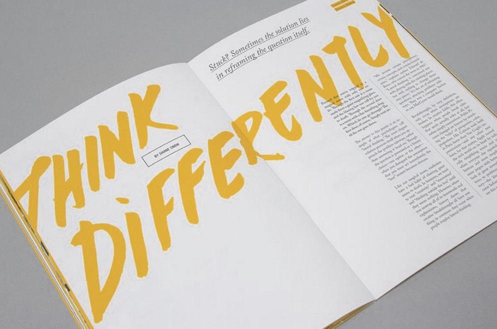
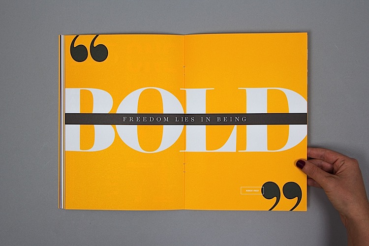
For example, look at these spreads from a journal I designed. The text is in short, simple lines or blocks.

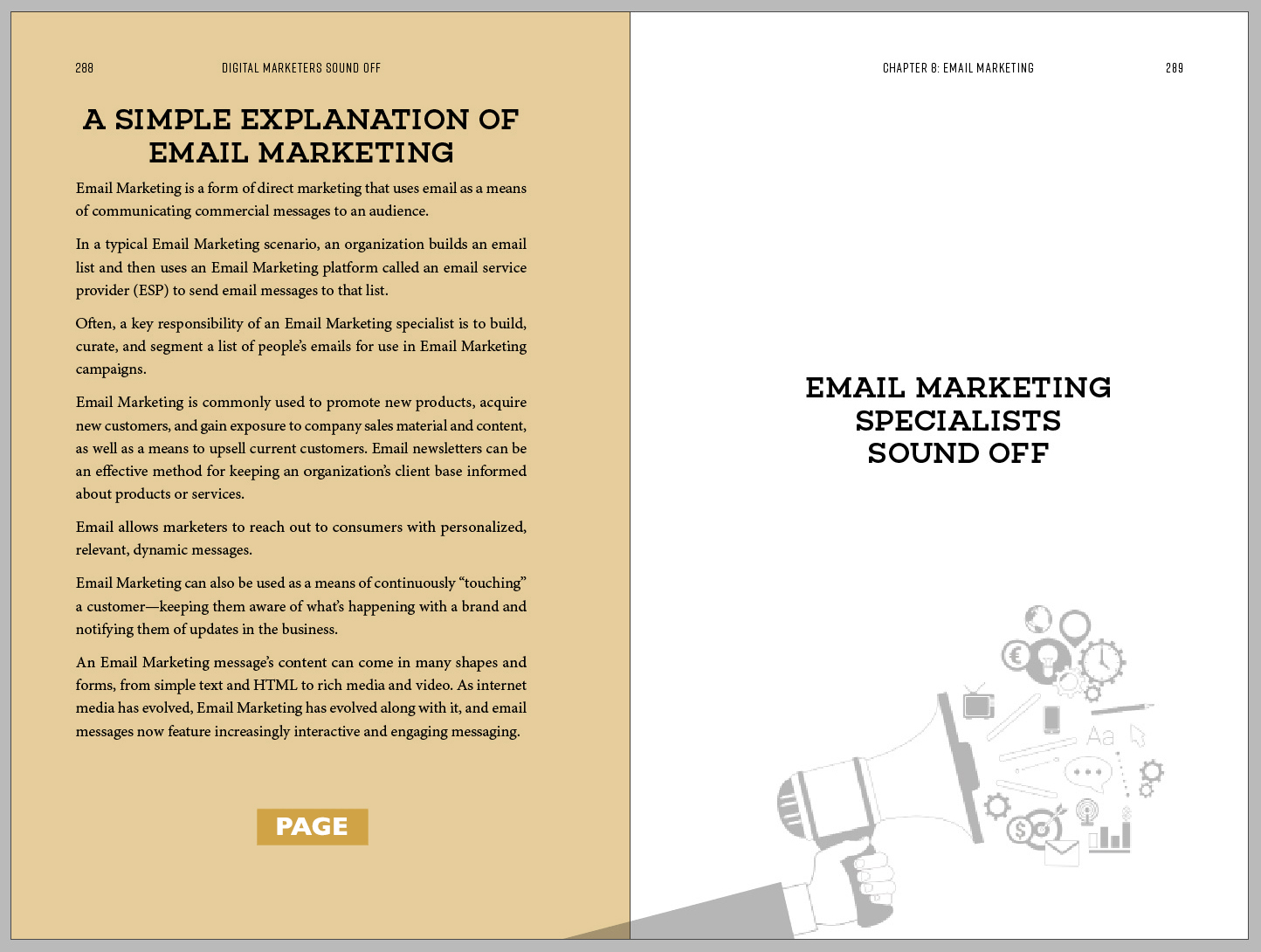
But in the case of the book my client’s business technology book, a 90,000+ word book on a technical topic. The text is in long chapters with lots of parts that need to be made as readable and understandable as possible. Serifs actually make text more readable, helping the human eye to identify the letter shapes quickly and easily. As you can see in the sample layouts below, serif text also sets the main body text apart from the other headers, pull quotes, indented quotes, etc. that are set in sanserif font.

To sum it up, should your book interior layout use a serif or a sanserif body text font? Only if the text blocks are relatively short and easy to read. For any long form fiction or non-fiction books your best bet is to go the traditional route, using serif body text to improve readability!


If you’re looking for a book interior layout or just needing some advice about how to get your book into print, feel free to get in touch through my contact page!

How To Choose a Book Designer

You need to choose a book interior designer. The internet is teeming with freelancers who could design your book interior, right? It can be hard to narrow down your choices and pick the designer who is the most suited to take that Word file (or folder of files) and make them into an attractive book.

But maybe the decision is not as hard as it seems at first. Read on for a few ideas how to quickly sift down to a few reliable prospects, and not lose your time on freelancers who won’t get the job done well.

Photo by Mia Baker on Unsplash

Photo by Mia Baker on Unsplash

Choose a designer who specializes in printed book design.

You may not be aware how many different types of designers are out there. Designers have their specialities, like brand (logo) design, web design, interactive design, or print design. Even within the specialty of print design, there are various niches. Some print designers might work with marketing materials (brochures, stationery, folders), others with labels or shopping bags or boxes. As you can imagine, designing something for a box is quite different than designing a long form book. That’s why you need to find a print book designer…although no one calls himself a “print book designer.”

A web designer or packaging designer can lay out a book just like a pasta chef can make your wedding cake: he has the general skills but it will take longer, because he hasn’t done it enough to know the shortcuts. He’ll probably make you a decent cake, but he won’t be able to recommend a wedding caterer or florist, and he might not be able to make that cake topper just the way you’d like it.

In a similar way, a book designer who regularly works with multi-page projects will be much more able to answer your questions, or at least help you find the answers. An experienced professional book designer is ready to handle more complex procedures (like footnoting, endnotes, etc.) that only happen in books. Having worked with dozens — if not hundreds — of people like you, he can anticipate what you need, offer advice (something self-publishers often need!) and connect you to other reliable people in the book industry who do other tasks that you might need (like photo editing, illustration, proofreading, editing, or indexing).

Another thing that should be mentioned is that not all ebook designers have experience with print book layout, and vice versa. Be sure to ask. The creation of a reflowable ebook (mobi or epub format) requires skills that lie more within the web design sphere, and while some print book designers may do both, some may not.

Choose a book designer who can show you samples of previous book designs.

Watch for a designer whose website shows the width and depth of experience he has in book design. Is he or she only showing one or two books in his portfolio, but claiming to be a book designer? Ask to see more samples, preferably pdfs that you can open and flip through. How similar does the book designer’s portfolio have to be to what you are needing? Well, if your book is about racoons, a designer doesn’t need to have a book about racoons in his portfolio to be a good fit. But he should have at least enough books in a variety of genres for you to see the breadth of the his abilities and to get an idea of if he can flex his style to suit various tastes or genres. If everything he shows you involves grunge fonts and death metal themes, and your book is about fairies, you might want to look elsewhere.

Choose a book designer who presents and interacts in a professional way.

Look for a book designer who responds promptly to your initial inquiry, is punctual at meetings, spell checks his emails, and provides your quotation in a way that shows he understands your project and what all it will entail. Watch for someone who is professional (but not overly formal) in communication.

Choose a book designer who is available when you need him.

It’s good to ask early on in your communications with a book designer about how soon he would be available to start on your book layout, and how long it would take. Even better, search for your book designer a few months ahead of time and book him ahead of time so that both you and he can plan time for your project. Some designers may be booked (pun not intended) for the next few weeks, but some may be planning months ahead for new projects.

Choose a designer who is linguistically and culturally similar to your audience.

If your budget is tight, it can be tempting to work with a designer overseas who is willing to work for an extremely low rate. But working with someone who can’t relate to your audience’s tastes or style is not best for attracting the kind of reader you want. Working with a designer that speaks your language fluently means less chance of miscommunication. If your designer is fluent in the language used in your book interior, it means he will (hopefully) tell you he comes across errors. For example, I often catch typos in books I am formatting, even if that is not the job I was hired to do!


If you’ve gotten this far, you’re probably looking for a book layout designer! Look here for more about my book interior layout services or ask me a question.

Can I Send My Book Designer My Manuscript in Parts?

In recent months, when facing the crunch to provide me with book manuscripts for large book projects, several clients asked me some variation of this question:

Is it possible for us to deliver to you the manuscript section by section?

I guess it seems to make sense, I must work from beginning to end of the book, right? So why can’t they send me pages 1-100, and later pages 101-200, etc.?

manuscript ready for formatting.jpg

I always have to tell my under-the-gun client the “bad” news that I request the whole manuscript to be delivered for formatting at once.

But really, it’s not “bad” news; it’s in the client’s best interests and in the book designer’s best interests as well.

It’s in the client’s best interests because if some parts of the manuscript are still being edited, it’s common that changes to the end of the book can also affect the beginning. An editor, at the end of a read-through, could decide to make a change that ends up affecting earlier pages in the book. A manuscript that an author thinks is ready for formatting can then be called back for some significant changes. It’s best for the author, editor, or proofreader to work on the book as a whole and give their final approval to the whole thing, not to a section at a time. To make a global change to the body text that affects various parts of the book can be easy when the author is toying with a Word file on on his or her own laptop, but it gets expensive when the book (or in this case, part of the book) has already been typeset (laid out).

And it’s in the book designer’s best interests because there are a lot of tasks in book formatting that are done globally to the whole book at once. A lot of this is what book formatters call “cleaning up” the text. Some of the global tasks I do are:

  • flowing the full text into my file, using specific import settings to not lose formatting from the Word document

  • checking and correcting spaces (For example, a common change is to remove double spaces after periods and make them single spaces.)

  • checking if hyphens and dashes have been used correctly and if not, correcting them (Do you know the difference between a hyphen (-), en dash (–) and em dash (—)? If you don’t, you’ll be glad that I do.)

  • removing extra hard returns and manual indents and instead assigning paragraph styles in InDesign that achieve the same results in a cleaner way

  • assigning character and paragraph styles, to control the formatting of the book on a global scale

It is much less efficient to do all of this clean up multiple times, and possibly less accurate as well, if the designer forgets one of the cleanup steps for part of the manuscript but does it for another part. Although every book designer works differently, I think it’s safe to say that book designers don’t generally work 100% from front to back of the book, perfecting the layout of one chapter before moving on to the next.

When major changes happen to the manuscript after the full layout is completely typeset, they become expensive for the client and possibly also hard to schedule for the book designer (if up to 2 hours of changes to the book layout are expected after full layout, and that becomes 10 or 15 hours, the client may find herself or himself with a long delay to receive the finalized layout!)

Years I ago I had a client who had me design and format several books in a series for him, only to come back with major changes to the original manuscripts, over and over. There were large gaps of silence (over six months at a time) when I assume he was once again rewriting, testing and editing his manuscript. Then I would hear from him again, asking for an update to his layout. This was costly for him, and frustrating for me. Eventually one time when he resurfaced asking for my help, I was on leave, and I must admit that I was happy to turn over the files to him and ask him to engage another book designer (I gave him a few contacts to try). He and I both would have been better off if he had waited to send me the book manuscripts when they were truly finalized.

The long and the short of it is that no, you can’t send your book designer your manuscript in parts, because it makes for a messy, expensive and time-consuming workflow. But I know, if you’re a visual person, you’re dying to see what your finalized manuscript will look like as a book! As I wrote in this article, two “visual” tasks you can get your book designer to work on before the full manuscript is ready for layout are the design of your book cover, and a sample interior layout.


In case you can’t tell, I’m a complete book design nerd. I’m happy to answer your questions about your book project. Do you want a free consultation?

Custom Book Interior Layout to Match Your Branding

Last year I designed a book interior for Kirryn Zerna, a keynote speaker and branding expert. Her self-published book, The Stand Out Effect, teaches how to stand out on social media in order to create a successful business or brand. Kirryn has a distinct and consistent brand (as anyone writing a book on social media should!) and my goal was to make her book interior layout match her brand and also the topic of her book. 

Author’s Brand Mood Board

After my initial free consultation with Kirryn, I learned more about her brand. Below you can see a kind of “mood board” that shows the look and feel of her brand (these are screenshots from her website and social media profiles, as well as a few of the files she shared with me for the book). What words would you use to describe her brand?

book+professional+speaker+communications+professional.jpg

Author’s Brand Description

I would use words like: bold, bright, confident and striking to describe Kirryn’s brand. (Which words did the mood board bring to your mind?) For her visuals, she uses yellow, black and white as a consistent colour palette, and mostly geometric shapes (squares, circles) as well as stars. ⭐️

On-Brand Custom Interior Layout Solution

After Kirryn told me that her business cards are square instead of the standard oblong shape, I asked Kirryn to request that her printer quote on two different options for printing:

  1. A traditional oblong format book, with a black ink interior

  2. A square book format with black and yellow ink.

The square shape would go with her personal branding and also be reminiscent of social media platforms like Instagram which have popularized the use of squared graphics. As I expected, the price difference for the unusual shape and color was too prohibitive for a first book, so we went with an oblong shape with a black and white interior. (Make this book a best-seller and then her next book will be square with splashes of yellow! 🙃)

But there were still many ways to keep her book on-brand without using yellow or a square format. Below are some screenshots from the final book interior layout created for Kirryn. Can you see how the unique book interior elements tie in with her brand?

book+layout+matching+your+brand.jpg

I designed a stand out interior for her stand out brand by:

  • using her bold brand typeface as the display (heading) typeface in the book

  • using a sanserif typeface for this fun, easy read on a casual subject like social media

  • using bold geometric shapes like circles for the pull quotes and chapter numbers, and bold black bars for subheadings

  • redrawing or reworking certain visuals (like the bullseye graphic at the centre, above) to make the graphics match the style of the rest of the book and her brand

  • adding some fun extras like small stars as dividers on her copyright page (why not?) or and a fun “thanks for reading” page on the last page with her website and book hashtag…tying in again to the ”online influencer” theme of her book and branding.

By doing some planning before the book design started, I achieved a book layout that is bold, bright, confident and striking, just like Kirryn’s brand. Her book’s content is memorable, and I hope the book’s layout is as well!


Kirryn told me that she felt I had treated her book as if it were my own, which was some of the sweetest praise I could hear. I hope each of my clients feels the love that I put into making their layout suit their personal or brand style. If you want your book interior design to match your brand, please set up your free consultation with me and we’ll talk about how to make it happen!

How to Make Your Book Look Longer Than It Really Is

I recently ordered a book by one of my favourite authors. It is a book that was published posthumously; it is the transcript of some talks she gave many years ago, that were unearthed and transcribed after her death.

The book was not cheap — I believe I paid 18€ for it — and when it arrived, I was surprised at how brief the text itself actually was. The publisher was successful in making the transcript of one author’s speeches into a book, although the word count was low.

Using photos of the book in question, here are some ideas for making your book look longer than it really is!

1. Start with ample margins.

Setting up the page with ample margins is always the first step to creating a roomy book interior layout. This book has about 0.75” inside and outside margins, 1.1875” top margin (not counting the header), 1.0” bottom margin (not counting the footer/page number). Plenty of room for note-taking, or dog-earing.

generous margins full book corner_grey yellow copy.jpg

2. Be generous with the body font size and leading.

Making the body font size bigger has to be done tastefully.…otherwise the book will look like it was typeset by a five-year-old! The book on the left below is one that I formatted and has a body text size of 10.75 over leading of 14.75 — I’m guessing that the font this publisher used (on the right below) was about 12 point over 16 or 17 point leading. (Leading is the space between the lines on which the text sits.) Even a slight increase in font size or leading makes a significant difference in how many words will fit on a page.

Make your book look longer by picking a bigger font size_grey copy.jpg

3. Always start new chapters on a righthand page.

In this book, no matter whether the previous chapter ended on a righthand page or a lefthand page, the new chapter always starts on a righthand page. This means that there are a few completely blank pages throughout the book. (Although starting chapters on a righthand page is fairly standard in non-fiction books like this one, it is not always done if the page count needs to be decreased.).

start new chapters on the right hand side grey copy.jpg

4. Sprinkle pull quotes and full page quotes liberally throughout the book.

Another way in which the typesetter of this book made it thicker and longer than it had to be was by adding pull quotes with liberal spacing above and below, and stylized full-page quotes, throughout the book. Take a look below at the examples. These elements give the book a relaxed feel; the designer wasn’t trying to cram as much as he or she could onto each page.

generous+space+pull+quotes+grey.jpg
add full page quotes_grey copy.jpg

5. Opt for a hardcover book with a dust jacket.

A hardcover book is of course thicker and heavier than a soft cover. The dust jacket adds another layer. If your book has a short but important message, and you want it to carry some heft, this is another idea that this publisher used to give this author’s last book more weight on a bookshelf.

6. Add notes, advertising or resource pages in the back of the book.

This was not something that this publisher did, but this is one more thing I’ve seen done to make a book slightly longer. If your book is being printed on an offset press, the pages are probably printing in groups of 16 pages on one sheet of paper. You can ask your printer for advice, but usually that means if your book page count is not a multiple of 16, a few sheets of paper will be blank in that printing flat. You might as well use that extra paper to add info about other books you’ve written, the Facebook group you lead, or worksheets that you usually give out at events where you share your material.


Do you have a book that you want to print? Let’s talk about how I can help you get it off your laptop and into your audience’s hands!

How to Know If Your Book Manuscript Is Ready for Interior Design and Formatting

Every self-publisher or author is excited to finally see his or her book formatted for print. So excited, in fact, that the temptation is strong to jump the gun and send the book formatter a manuscript that isn’t quite ready for formatting.

Sending your designer a manuscript that is unfinished or missing information is a lose-lose: it’s expensive for the author and frustrating for the designer. Here are a few ways for you to avoid “surprise” costs by making sure your book manuscript is truly ready for the formatting stage.

If your book manuscript is ready for interior design and formatting, you will be able to answer “yes” to the following three questions.

Has your book been professionally edited and proofread?

I list this first because it is a complete must. Professional editing and proofreading is essential, not only for the quality of your final product, but also to keep the cost of formatting your book from exceeding what your book designer quoted you. Every book should be proofread again after layout, but at that point, the proofreader should only be finding minor typos or layout issues, not reworking paragraph structure or removing full sentences.

Have you merged your manuscript files into one Word file?

If you haven’t done this yet, merge all your various Word files, etc. into one file with your whole book in it — from title page and copyright to references and appendices. Having this all together (and waiting to send it until you have all the needed info) is the best way to save yourself from paying extra charges if your book designer has to bill for admin tasks like ordering and merging Word documents.

Have you collected the printer specs that the designer will need?

Your book interior layout designer can’t start on the layout without knowing the page size, or if there are any special requirements from the printer. For example, print-on-demand book printers like Kindle Direct Publishing (formerly CreateSpace) or IngramSpark have their own particular requirements listed on their websites. It’s good to get a quotation from a printer and show your book designer the specs you have given the printer — this means fewer surprises for both of you when the final layout is sent to the printer. Some designers will help you communicate with the printer; be clear with your designer if this is part of what you need his or her help with!

prepare your book manuscript for formatting and design.jpg

If you can answer “yes” to the questions above, your book may be ready for formatting! But yeah … I get it.  You’re anxious to see what your book will look like, and can’t wait to get started. Maybe the manuscript is still being edited, or the proofreader needs an extra week. There are perhaps two things you can get your designer to start on before your full manuscript is ready for formatting. They are:

Get your designer to start on the book cover design. It’s great to have your book cover designed ahead of time for marketing purposes. The front cover can be designed virtually any time after you have a finalized title and a book summary.

Get your designer to create a sample interior layout. Sometimes you may need a sample book interior layout to pitch your book to a publisher or as a sneak peak for your readers. Depending on how your book designer works, he or she may be ready to create a sample layout with a manuscript that is not finalized. For example, last year I created a cookbook interior layout sample for a client who then came back to me this year with the full cookbook contents ready for formatting. For any book layout, your designer should send you a few samples pages before the whole book is formatted.

You’re bursting with excitement (and so am I!) It’s wonderful to see your book in its final format! Hang in there — you’re close to the finish line! Don’t turn your final files over to your book designer until they’re really ready!


If you reached the bottom of this post, you must be pretty serious about finalizing your book manuscript and beginning the book layout stage. Let’s talk about what you should do next.

Why I Print Book Manuscripts Before Formatting Them

I always encourage my clients to print their formatted books after they receive them from me. I tell them that they’ll catch more errors if they look at their books in print. But what I don’t mention to my clients is that I often print copies of their manuscripts at various stages in the design and layout process, too.

In fact, I often print a copy of their unformatted manuscripts for myself. This is a step many book interior layout designers might skip, but I’ll tell you why I think it’s important. It’s for the same reason that I ask my clients to print their formatted manuscripts: I catch more formatting errors if I look at the unformatted manuscript next to the formatted book. Printing the book manuscript improves the quality of my final product.

Most of the books that I format are non-fiction, and they have a lot of different formatting details to watch for: not just italics or bold but also images, tables, captions, superscript, footnotes or endnotes. I find that printing out the manuscript helps me to double-check my formatting and be sure I haven’t missed anything important.

Here’s a recent memoir manuscript that I printed out to compare to the formatted book on screen. (I printed it on the back of some papers I had which had been printed on only one side.)

IMG_9067.JPG

When I am setting up the first few sample page designs, I print those out as well, to test the typeface style, weight, size and to check the line spacing and margins. Sometimes I also print out the formatted book in full, to check it over again.

Of course, I’m a print designer, I like printing things out. But there’s more to it than that — I believe that when I review your book on paper at various stages in the interior layout and design process, it gives you a better book! This extra attention to quality is, I hope, one of the things that sets me apart from other book interior layout designers.

In case you’re wondering, whenever possible I print on both sides of the paper. I always recycle the printed manuscripts when the project is complete and another happy client is sending his or her book off for production!

As an aside, here’s a peek at how this memoir looked before formatting:

IMG_9068.JPG

And here’s how it looked after:

p%252B2019-08-19%252Bat%252B1.12.24%252BPM.jpg
book+interior+layout.jpg

My client told me that he caught problems that he had not noticed before when he read his manuscript once more in the final format. Together, we made a memoir that will be treasured by his family and friends!


A bit of attention to detail goes a long way in creating a book you can be proud of! If you’d like my help with your book project, or just want to ask me a question fill out my free consultation form!

What Does Book Interior Layout or Book Interior Design Cost?

When you are researching the cost of a book interior layout online, it can be hard to pin down an exact price. Why is this? It is because your book is unique! Simply providing a word count and the genre is not usually enough to secure an price, because there are so many variables that affect the time your book designer will invest in making a professional layout. Book designers need to see the manuscript, or at least a significant sampling of it, before quoting an exact price.

book interior layout pricing.jpg

Here are the main factors that come into play in book interior layout pricing:

Text

  • What is the word count?

  • How neatly is the source file formatted? (If the source file from Word is already formatted using paragraph styles, etc. this can ease the final formatting process.)

  • How simple or complex is the manuscript? (For example: cookbook vs. novel. A novel generally has just a few different styles, but a cookbook is much more complex with small subsections of text regularly being formatted different ways.) Variables that affect complexity include:

    • character styles like bold or italic text

    • headings (chapter titles, subheadings, sub-subheadings)

    • quotations, verse, poetry

    • boxed text or pull quotes

    • forms or tables

    • endnotes or footnotes

    • indexes

Images or Diagrams

  • How many images or diagrams are there?

  • Do any of these images still need to be created, edited or adjusted, or will they be provided to the designer ready to insert?

Timeline

  • When will the final manuscript be ready for formatting?

  • How soon do you need the professionally prepared print-ready PDFs to be delivered?

Revisions

  • Does the number of revisions required exceed the number of revisions the book designer quoted on? (The best way to avoid this is to have the book proofread multiple times before layout begins.)

As you can see, there are a lot of variables that play into the cost of your book interior layout! If you have a book manuscript and are looking for a book interior layout quotation, fill out this questionnaire and send me your manuscript for an exact quotation, or book a free consultation with me!

Why Don’t You Offer Free Book Interior Layout Samples?

To my surprise, this scenario has repeated itself three times in the past year:

  1. A potential client will inquire about a book interior layout project.

  2. I will spent a considerable amount of time learning about the project so that I can bid on it.

  3. The potential client will tell me that he or she was expecting a “free sample layout” first.

For example, a British client asked me a few months ago what I would charge to create four sample design spreads for his coffee table book. I spent several hours working for "free" (reading his inquiry, corresponding with him, Skyping with him, learning about him and his project). Then I sent him a price. This was his polite, but unexpected, response:

"...you are competing with one designer offering sample work free, and another charging $12 per page - would you like to reconsider your approach to the sample work?"

Let’s just say that I wasn’t charging anywhere near $12 per page. I didn’t budge on my price, and I didn’t get the project.

Asking someone to begin their work with no promise of payment sounds strange in almost any other industry. But somehow it has become “acceptable” in the online world of freelancing and graphic design. Design crowd-sourcing websites have given some clients the idea that designers can afford to work for free, and unfortunately, many graphic designers succumb to competing for business by beginning a project with absolutely no guarantee of being paid to later complete the project.

Imagine the same scenario, but in the restaurant industry. When you go out to eat, you don't ask five or six restaurants to make you an appetizer for free, sample all the appetizers, and then pick which of the restaurants will be honored with your purchase of an entrée. I mean, maybe you love sampling a wide variety of appetizers. That’s completely fine, if you want to pay for your appetizers at each of those restaurants, as a test of the quality of their cuisine!

No one expects to be fed for free at a restaurant, and I guess that’s why it always surprises me that anyone would expect to be “fed” graphic design for free either. So for the record, here’s why I don’t offer free book interior layout samples.

I don’t offer free book interior layout samples because…

  1. …the initial stage of your book layout is the most time-consuming and most important stage.

During the first stage of a book project, your designer is making both technical and design decisions that can make or break your project. Having a professional final product takes good thinking and planning from the beginning, both in image-heavy books and in simple text-based layouts. Settings related to typography (justification, kearning, leading) and layout (margins, graphics, colours, styles) are all made at this stage and set the course for the whole project. Errors or oversights at this point can cause expensive problems at the end of the project.

In the case of the client above, his coffee table book was going to have stories of significantly different lengths with photos accompanying them. No matter the length of the story, he wanted each story to take up only two pages, or one spread. This takes a lot of planning, to be sure that the design created will be flexible enough to suit such different types of content.

2. …I want your book to be unique.

Most designers who offer "free layout samples" have a one-size fits all template that they use and update for each new book. But as I mentioned above, there is no one-size-fits-all with truly professional book interior layouts. A true designer will treat your book like the unique project that it is, and consider how everything from the typeface selection to the placement of headers and footers suits your book’s genre or audience.

3. …designers doing free work ultimately can’t give as much time and attention to paid work.

Another reason I don't create book layouts for free is so that ultimately, when I do create books, I have the time and focus to deliver above and beyond what I have promised. I don’t have to rush through paid work to make time for the free work I’m trying to fit in to my schedule as well. When a client comes along who understands the value of my work, I'm not busy messing around with unpaid projects. I can complete the work I've promised — and more — within the deadlines. Because professionalism in pricing usually carries over to professionalism in business as a whole.

4. …no book designer should feel they need to work for free.

Sometimes refusing to do free sample book layouts feels a bit like running the only restaurant on the street that doesn't offer free appetizers. But as I take a stand against requests for free book interior layout samples, I educate clients and hopefully help fewer other designers to receive the same kinds of unprofessional requests. If other designers begin to do the same, maybe we’ll receive fewer of those surprising questions: “Would you like to reconsider your approach to the sample work?”


I don’t offer free book interior sample layouts, but I do offer free estimates. Learn more about my process here. Whether you’re an established publisher or self publishing for the first time, let’s talk about your next book interior layout project.

Expect Delays When Self-Publishing

If there's anything I've learned since beginning to work independently with self-publishers, it's this: self-publishing a book takes longer than you expect. Especially if it's your first book.

Photo by Christin Hume

Photo by Christin Hume

A self-publisher often underestimates how many steps are involved in the publishing process. Maybe the photographer calls in sick. Or the editor needs an extra week. The proofreader can't work on the file right away because it came to her a different week than she expected. One small delay can have a domino effect, causing the whole project timeline to change.

When I am designing a full color book involving a lot of photography, usually the self-publisher works with me on a sample design or layout before the contents for the whole book are ready. The self-publisher talks to me about his or her ideas for the book, and gives me about ten pages of sample content. At this stage we establish the visual aspect of the book. Once the sample layout is ready, I wait — an indeterminate amount of time — until the full manuscript is ready for layout and design in the same style. On average, I would say that books come to me two weeks to two months later than the self-publisher originally intended, depending on the complexity and length of the content. 

I don't share this to be pessimistic, but to be realistic. If it's your first book, and especially if you're coordinating the project independently, I have three tips:

  1. Don't commit to a particular release date. You may have a release date in your mind, but you don't have to give that date to others. Your first book will almost always be completed later than you expected. (One of my clients shares about his experience with setting a firm launch date in this blog post.) Or, give a padded date...

  2. Pad your timeline. If you'd like to release your book in March, try to create a timeline that would have it releasing in January, to give yourself some wiggle room. If you give your contractors deadlines that are not your real, drop-dead dates, you won't be stressed out by every little delay that comes up.

  3. Don't rush the process. Skipping important steps at the beginning of your book project can be very expensive in the end. The full layout should never be done until the text has been thoroughly edited and proofread. Major changes after the book has been laid out or after the book has gone to press can unnecessarily blow your budget.

Self-publishing a book — especially if it is your first book — takes longer than you expect! But if you expect the unexpected, maybe it won't actually take longer than you expected!


Are you self-publishing a book? I'm happy to answer any questions you might have. Give me a shout through my Contact page!

What Does the Term “Spread” Refer to in Book Design and Layout?

Some of my clients are making their first foray into the world of printing and publishing when they come to me, and as we discuss their project, I realize that there are terms I use regularly that they have never heard before. This week when we were discussing a sample layout for a book project, my client asked me what a "spread" refers to. It takes only about ten seconds to explain, but can make a big difference in discussing a project.

In this image, I've highlighted a page:

book spread design and layout.jpg

And in this one, I've highlighted a spread:

design book spread.jpg

See, that was easy. A spread is simply a set of pages (usually two) viewed together. It's how you see the book or magazine when it's open and both pages are showing.

As someone working with a book designer or print designer, it's good for you to know the difference. Why? Well, especially in layouts where the text and/or images are spread across both pages, you must see your proof in spreads to get the full effect of the design. 

If your designer sends you a PDF proof where the pages are shown individually, you can write back and ask if it's possible to also see it in spreads. After all, the final book will virtually always be seen as spreads, and when you can see it on screen in spreads, it gives you a much better idea of how the layout will strike the viewer visually. It may also help to you catch layout errors more easily.

In InDesign, whether a "print PDF" or "interactive PDF" is being exported, there's an option to export it as pages OR spreads. Here are a few screenshots:

export print pdf as spreads.jpg
export a pdf as spreads from InDesign.jpg

If you understand the difference between a spread and a page, you can have clearer conversations with your designer about your expectations for the project and the proofs.

Please note: receiving a PDF of your book as spreads is important for visual effect, but receiving a PDF of your book as individual pages is essential for the actual printing process. You will still want to have an individual pages version of the proof: 

  1. If you are wanting to print off the proof your designer has sent to you, to proofread it (always recommended - you catch a lot more errors on a printed proof), or

  2. For sending to your printer or publisher.

Now you know what the term "spread" refers to in book design and layout! And you even know where the option is in InDesign, to export the PDF as individual pages or as spreads. I remember a time when InDesign did not offer the option to export PDFs as spreads, but it's been a great addition to the software and definitely helps the client viewing a PDF proof to picture how everything will work together visually in the final, printed piece.


Sign up for my Book Done newsletter to get tips and stories about getting your book project done!

Why Does the Paper in My Printed Proof Feel Different Than the Paper I Specified for My Project?

A few months ago, after a client received a printed proof of his catalog in the mail, he asked me: Why does the paper in my printed proof feel different than the paper I specified for my project? He had reason to be concerned: the thick paper on which the proof had been printed did not open very well, meaning a lot of each beautiful photo spread was lost to the centrefold of the book. He sent me a video to show me how stiffly the pages of his proof were turning. 

Plotter - the kind of device your proof is printed on (Image Source)

Plotter - the kind of device your proof is printed on (Image Source)

Thankfully, the printer and I were both able to reassure him that the paper the printer uses for proofing a project, especially a project that is printing on special paper or on an offset press, is usually not the same paper the final project will be printed on. At the commercial printer where I used to work, our proofs were printed on rolls of paper by a digital plotter, but the final paper came in cut sheets and was loaded into the sheet-fed offset press.

Offset Press - the kind of device your final product is printed on (Image Source)

Offset Press - the kind of device your final product is printed on (Image Source)

Usually, the first time you'll get to see "your" artwork on "your" paper is when the final product is delivered to your door. But that's why a full-service printer will usually send a sample of the paper to you separately (in the case of my client's catalog, the printer had done this months before), so that you can know the exact thickness or feel of the final paper. If it's really important to you to know how the product will feel — after all, it's hard to hold one sheet of paper and imagine how 200 such sheets will feel in a book — you can ask the printer to provide a dummy of your project. A dummy is a blank book made of your final paper(s), cut and bound to final size. It still won't have your graphics on it, but it will give you a real idea how your piece will feel in your hands.

Next time you get a too-shiny, too-thick proof in the mail, remember: your proof is rarely printed on the same paper as your final product. It's OK to double-check with your printer or designer to make sure the right paper is specified for the project.  Then, take a deep breath, approve the proof, and trust your printer on this one!


If you have a print-related question that's puzzling you, let me know through my Contact page and I'll do my best to find you an answer! 

How Can I Catch More Errors in My Book Manuscript or Print Design Documents?

This week I received a nice marketing email, and I followed a link in the email to a blog post. I didn't read the whole blog post, but this I did get out of it: the writer had written "check" where it should have said "cheek" — and that was my main takeaway. Probably not the takeaway that the author was intending. 

We've all been in those situations where a typo slips by us. When you are preparing files for print, catching typos and mistakes is even more essential than when preparing text for online media, where content can be corrected with just a few clicks. (I wrote back to the company who had sent me the marketing email, and within half an hour the typo was corrected.)

I won't claim to produce completely error-free print files, but here are a few tricks I've learned to get as close to perfect as possible.

Photo by Jonas Jacobsson

Edit text in software that has automatic spelling and grammar check (and make sure it is turned on). 

If you're typing or writing more than just a few words, make sure to start in a program or browser that provides basic spelling and grammar check. This sounds obvious, but it's easy to start typing in a software that's not flagging any errors. This is your first and easiest error safety net.

In higher-end design software, the option to automatically underline misspellings or grammar mistakes is not necessarily activated. In Adobe InDesign this has to be turned on under Main Menu > Preferences > Spelling. Adobe Illustrator and Adobe Photoshop are not text editing programs, but some people use them that way. They do not provide the option to automatically flag misspelled words; you actually have to manually run a spellcheck (Edit > Check Spelling).

The best option is to always start your typing in a program or software that provides spelling and grammar check, especially if you are not a native speaker of the language in which you work.

Get your computer to read your text to you.

Another helpful tool for catching mistakes in your text is getting your computer to read the text to you. If the author of the blog post I mentioned in my opening text had listened to her article, she definitely would have heard the difference between "check" and "cheek", but it was not a mistake a spell check could have picked up. I have used the free version of the software Natural Reader for this, but usually I just highlight the text on my Mac, right click, and select Speech > Start Speaking. I did it for this blog post, as well, and definitely caught some of those tricky typos.

Proofread a printed version of your document. 

I've heard that we notice 25% more errors when we proofread printed documents than when we proofread on screen, and I believe it. Printing out your document also helps you notice formatting issues — like a font that is too small, or text that is printing too close to an edge that will trim. When I lay out books for my clients, I often encourage them to print out the full proof and read it over in print, no matter how many times they've already read the manuscript over on screen. (And when you're done with that printed proof, please, recycle the paper.)

Ask at least one "uninvolved" person to proofread.

When deadlines are tight, it can be tempting to overlook this step. But any document can benefit from being looked over by another set of eyes. Sometimes you need to outsource the proofreading to a professional. Or just ask someone else who is a bit less involved in the project to read it over with fresh eyes. Last year, at the last minute a team member who had not been very involved in an important project was asked to help with the final proofread. He noticed that the text on the spine of our book was running in the wrong direction — an important detail that four or five of us who were more involved in the project had missed. 

Order a printed proof from your printer. 

While small or low-cost projects might not necessitate ordering a printed proof, for any print project with large amounts of text or that costs a lot of money, it's good to build enough time and money into the project to order a printed proof (in addition to the now-standard PDF proof). The printed proof can help you to recognize technical, visual or formatting issues that would never have come to your attention in a PDF, as well as any proofreading errors. For example, on a recent $10,000+ print project, I was so glad when the printed proof showed us that there would be a score line on the cover that would go directly through the company's logo. This gave us the chance to adjust the position of the logo — it was the only change we made after seeing the printed proof, but a change that made a big difference in the quality of the final product. 

No one's perfect! But the closer you can get your printed piece to perfection, the happier both you and your team or client will be! I hope these tips give you a few new ideas for catching errors in your writing and designing for print, before it goes to press!


Are you writing a book or preparing a document for print? Ask me a question through my Contact page.