Case Study - Journal Design for Podcaster and Content Creator

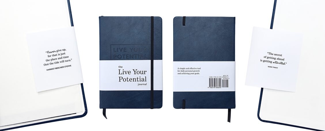
This first case study on my website features a journal design for my client Felix Mack, a podcaster and productivity enthusiast who came to me when he was ready to have his first self-published book designed. Read all about the Live Your Potential Journal in this article, and see what Felix had to say about the process here, in his testimonial video.

professional journal designer for podcasters

Felix is a podcaster who wanted to develop and sell a product based on his podcast. The Live Your Potential Journal was designed as a simple and effective tool for daily self-improvement and goal achievement. The journal is for those seeking to document their personal growth journeys, through goal-setting, gratitude and taking specific actions relevant to their goals. Of course, it also has lots of inspirational quotations!

The title of Felix’s journal came quickly, since he has a podcast with the same name! He just “stole” his own title for the book! 😊 

journal design

Felix’s Book Done timeline:

From concept to done in just 9 months! (Obviously, Felix doesn’t mess around! Must be all that goal-setting!)

🐣 Idea hatched: January 2020
✍️ Writing started: February 2020
🎨 Files ready for editing, design and layout: April 2020
✔️ Book done (released): September 2020

journal images design interior.png

Felix’s Book Done take-aways:

Here I interview Felix about what he learned during the process of getting his journal done!

What was the biggest surprise during your book project? Will you do something differently next time? 

My biggest surprise was the errors I didn't catch when reading my own material! Having your eyes go over my journal content and suggest content changes (edits) definitely improved my final product. Next time I will get more eyes on my content during the initial phases, before I give the content to you.

Which part of your book project was the most fun or rewarding? 

The editing process with you was the most fun and rewarding—seeing how things could be improved in my journal along the way and coming away with an even more valuable product for my followers. 

Did any part of your book project take longer than you expected? 

I didn’t know how long it would take from the time the journal was printed until it reached my doorstep, so I was surprised at the production and delivery timeline. I printed overseas, and it took about two months from the time I placed the printing order until the journals arrived.

Which part of your book project was the most challenging?

The most challenging was the process of physically getting the book on Amazon—likely because it was my first venture selling a physical product through Amazon. 

Screenshot 2021-02-12 at 14.13.49.png

Felix’s Book Done tips:

  • If you’re having trouble coming up with a title, draw inspiration from your own work or other content you have created.

  • Get feedback from your audience before sending your files to Julie, and then get more feedback during the design process (after Julie shows you the sample page design layouts).

  • Work with a good editor and/or proofreader!

  • If you’re printing overseas, expect it to take some time. Start talking to a printer ahead of time and get those timeframes in mind.

  • Do not wait until your book is done to start marketing! Start today.

  • If you're going to be listing on Amazon, get familiar with the process and what it will take to make your book available before your book is actually ready to list.


journal design with belly band.jpg

Felix’s Book Done technical details:

Your printer needs these kinds of details to give you a quote for printing a similar book.

Quantity ordered: 500 
Page count: 236
Dimensions (page size): A5
Binding: Sewn binding

Interior details
Ink colors: Black ink only
Paper: 100gsm uncoated white
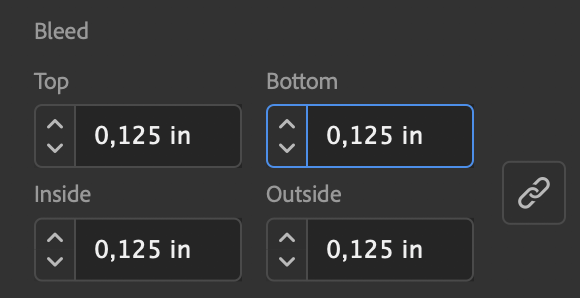
Bleed*: Yes 

Cover details
Cover material: Thermo PU leather in Navy Blue
Ink colors: None
Finishing: Debossing

*Bleed refers to whether your book has images or graphics that go off the edge of the paper. This is important for the printer to know, because it determines how big the sheets of paper your book is printed on need to be.

Felix was great to work with, and so kind as to give me the video testimonial above. I helped him with clarifying the concepts in his journal through editingdesigning and laying out the cover, interior, and belly band, as well as making adjustments to the print-ready files when the printer requested them in an unusual format.  (I don’t always offer editing as a service, but on a case-by-case basis, I will consider it. Otherwise, I am happy to recommend an editor or proofreader who can help you!)


What’s next for your book?

I hope Felix’s story has been helpful, no matter where you are on your book journey. What kind of book project are you working on? Book a live consultation with me or sign up to get more of these case studies in your inbox via my newsletter.

What Does the Term “Bleed” Refer to in Book Design and Layout?

A term that often comes up when I am checking a book file someone else has created, or preparing to design a book interior or book cover, is “bleed”. Does your book bleed, or does it not? A printer may ask you if your book bleeds or not when quoting you a printing price, because this influences how much paper the printer needs to print your book. If your book should bleed but does not, your printer may reject the file, or the final product may not look the way you are expecting.

Bleed is an extra 0.125 inch or 0.3 cm area around all edges of the pages or cover of your book. Bleed is needed on any printed document that has any text or graphic elements that should go off the edge of the page or right up to the edge of the page. Basically, documents that have bleed print on oversized paper, and are later cut down to the right final size. The artwork “bleeds” off the edge of the page, hence the term.

For example, if a book is 6x9 inches, a book file that should be 6x9 inches at final size but has bleed is actually 6.25x9.25 inches, and then cut down to be 6x9.

What follows are two examples of book spreads that do not have bleed. That is, there are no graphics or images that go off the edge of the page. The solid yellow line indicates the outside edges of the book and nothing goes beyond that point. If your whole book looks something like this, your book does not have or need bleed.

Does not need bleed.jpg
Does not need bleed 2.jpg

As soon as you have any image or graphic that goes off the edge of the page, your book file needs bleed. As you see on the spread below, the grey fade and the fading photo both go off three sides of the spread. That means that this file “bleeds”, or at least, it should.

Needs bleed.jpg

This book was built with 0.125 inch or 0.3 cm bleed around all edges of the page. The printer will cut on the yellow (“trim”) line, but print on a paper that is larger. The graphics “bleed” (extend past the edge where the book printer will trim the pages) which allows the images to print right up to the edge of the page without leaving an awkward white border.

Needs bleed - added.jpg

Here is another example of a book spread that needs bleed on all sides.

Needs bleed 2.jpg

As you can see below, there is extra image around the edges of the page. In some areas it is more than 0.125 inches, but that is fine—the software will only export as much bleed as it is told to export. The area that is shown with a faded yellow border over it is the area that is the true 0.125 inch bleed zone. The rest is extra and it’s OK.

Needs bleed - added 2 just this much.jpg

How do I make sure my book file has bleed?

In the commonly used word processors like Microsoft Word or Apple Pages there is no real support for bleed. The best you can do is create a file that is 0.125 inches larger than the actual page size in every direction (and keep in mind that that part of the paper/design will cut off). So an 8.5x11 inch page would be set up as 8.75x11.25 inches in Word or Pages, and the printer needs to be given very clear instructions as to the final size and where to cut the printed piece. The same thing must be done in Adobe Photoshop, because although it is professional software, it is not really created for page layout.

Screenshot 2021-01-30 at 23.46.04.png

Adobe InDesign and other professional page layout or design software makes it possible to set up bleed when the document is being set up. When exporting PDFs for the printer, you may have to make sure the bleed setting is selected for the PDFs to have bleed in them. The screenshot shown here is taken from Adobe InDesign, where it is easy to put the appropriate bleed settings into your file. The ability to build bleed into your file from within the software also exists in Adobe Illustrator or Microsoft Publisher. Canva and Adobe Acrobat should also allow you to add bleed to your files.

If you are working with a professional book designer, you don’t need to worry about bleed, because your designer will set it up for you. You just need to understand what it is, in case your printer asks you if your book has it! To have a designer or printing company fix a book file for you by adding bleed to it after it has already been created can be fairly time-consuming or expensive if it was not created in professional software or if you don’t have the original, editable book files. It’s best to use professional software and/or work with a professional from the beginning of your file set-up, to avoid expensive “repairs” to your file before printing.

Amazon KDP, IngramSpark or my printer is asking me if my book interior has bleed. How do I answer?

If your book has any text, graphics, photos or images that are supposed to go off the edge of the page, then your book has bleed! This includes small details like a line that runs off the edge of the page or a shaded box that should go up to the edge of the page. And even if only one of your interior pages has bleed, you just say “yes” to the question.


Now you know what the term "bleed" refers to in book design and layout! It’s an important but little-known term outside of the design and printing specialities. Without it, your book may not look like you were expecting it to look! If you have any further questions about book design or set up, contact me!

How to Use the Final Page of Your Book for Marketing

The final page of your book offers a great opportunity for a bit of marketing or self-promotion. This page can come after the about the author page, and faces the inside back cover. It can be a great place to ask for reviews, share links or hashtags, encourage readers to place another order (of a journal or similar product) or buy another book from the same author or publisher.

Below I have some simple text-based template samples to help you make the most of this prime piece of real estate. Copy and paste a sample from below and tweak it to suit your needs, replacing the text in brackets with your own details! I will update this page as I come across new ideas for how to use the final page of your book to further establish your brand or name.

Photo by Stas Knop via Pexels

Photo by Stas Knop via Pexels

Sample 1

Thank you for reading
[your book title here]!

Please share your impressions on social media using the hashtag,
[your hashtag here].

Please visit [your web address here]
which features [list the cool stuff on your website here].


Sample 2

Thank you for reading [your book title here]!

Please share your feedback on social media using our hashtags and handles:
[your hashtags and handles here].

For a downloadable [cool freebie here] and additional resources,
or to book [your name here] to speak at your event
please visit: [your web address here]

If you enjoyed this book, please consider writing a review with your honest impressions on Amazon, Goodreads, or the platform of your choosing. Your feedback is incredibly valuable for helping independent authors like us to reach a wider audience.

[Your logo here]


Sample 3 (Journal)

[Your logo here]
Order your next journal at [your website here]


Sample 4 (Other Books or Resources)

Check out [author’s name here / publishing house name here] ’s other books / resources!

[Book title]
[Cover image]
[Book summary and ISBN]


[Book title]
[Cover image]
[Book summary and ISBN]

[Your website or other contact information here]


Sample 5 (About your Company or Non-Profit)

[Company or Non-Profit logo here]

[Mission Statement here]

[Summary of your offerings, resources or products here]

For more resources and events, go to:

[Your website here]

What Does a Printer Need to Know Give Me a Book Printing Price?

I give my book clients PDF files that are ready to send to the printer of their choice. But if you’re a first-time author, approaching a printer to ask for a price for printing your book can be a bit intimidating. What do they need to know in order to give you a price? Printers sometimes talk in their own special language: what is bleed, or CMYK, or perfect biding?

I reached out to Amanda at Priority Printing Ltd. in Edmonton, Canada (the book printer where I worked many moons ago) to ask her to help me to make a list of everything a printer needs to know to provide you with a basic book quote. The information in this post was provided by Priority Printing Ltd., and they’d love if you’d reach out to them for a book printing price.

Here’s what you should tell your printer, to get an accurate book printing estimate:

  • Quantity - How many copies of the book do you need? Usually the printer would like to know the minimum and maximum quantities you would be interested in, and quote about 3 different quantity options. Once the printer has set up your book and is ready to print, it doesn’t cost a lot more to print a few more copies, so the price improves as the quantity increases.

  • Page count - How many pages does your book have? If you don’t know yet, give an estimate, and ask the printer to update the pricing once you have an exact page count.

  • Dimensions - What size are the pages of your book? Some common North American sizes are 5.5x8.5”, 6”x9”, or 8.5”x11”. However, one of the perks of printing your book with a traditional printer (as opposed to a print-on-demand printer) is that you can virtually choose any size you want.

  • Binding - How will your book be bound? The typical options are:

    • Perfect Binding (for softcover books, most common binding style for most self-publishers)

    • Hard Cover Binding

    • Saddle Stitch (“folded” spine with stitches or staples to keep the book together, only works for thin booklets)

    • Plastic or wire spiral binding

  • Interior details:

    • Will the inside of your book print in black ink only, or in full color? (The printer might also call full color “four color” or “CMYK”, referring to cyan, magenta, yellow and black.)

    • What kind of paper do you want for your book? Uncoated paper (“offset” or “opaque”) is a great option for books with black ink only interiors; coated paper (gloss, semi-gloss, or dull) is great for a book that has a full color interior.

    • Does your book have “bleed”? This means, does your book have text, graphics or images that go right up to the edge of the page? If it does, your book needs to have “bleed”, and the printer needs to know that.

  • Cover details:

    • Will your cover print in full color or black ink?

    • Does your book have foil, emboss, or any other finishing effects on the cover?

    • What laminate finish would you like for your cover? This is a coating that helps to protect the cover paper, making it more durable. There are three basic options: gloss, matte or soft touch.

If you are not sure how to answer some of these questions, just talk to your printer. This is another privilege of working with a local or traditional printer, you should be able to talk directly to a customer service representative, asking your questions and getting any explanations or samples that you need!


Feeling like you’ve bitten off more than you can chew with your book project? Sign up for my “Book Done” Newsletter to hear stories and tips from other writers who’ve been in your shoes and gotten their books done! Or, looking for a book designer? Let’s talk.

How and When Can Endorsements Be Added To My Self-Published Book?

Having endorsements on the cover or first interior pages of your book can be a powerful marketing tool. But one question clients sometimes ask me when they are preparing their self-published manuscripts for design is how and when to add endorsements to their book. They have almost everything else ready to give to me to start the design, but the endorsements haven’t come in yet.

Do I need the endorsements before I begin designing? Or is there another way? I don’t have to have the endorsements before I get started, but I do need to know if you will be getting some, so that we can reserve space for them. You will need to specify where: front cover, back cover, or first interior pages. You can deliver them to me shortly before I create the final print-ready files for press.

There are two main options for how and when to start collecting endorsements from your reviewers, which I will share below. No matter which method you choose, if you are planning to approach reviewers and collect endorsements, start early to make a list of your potential reviewers’ names and contact information (e-mail or mailing address). This will allow you to quickly send out your draft for their review when it is ready!

Adding Endorsements to Self-Published Book.jpg

Give your reviewers the final edited draft of your book (pdf format) to review while your book is being designed.

In this scenario, your reviewers can be reading the book at the same time as I am designing it. My layout and design process often takes about 4 weeks, which means your reviewers could work on endorsing the book while the book is being formatted. This is the fastest way to get endorsements, because reviewers can be reading your manuscript while the book is being designed and no time is lost.

Around the time I am finishing your full book interior layout, your endorsements will be ready, and you can send them to me for insertion.

But depending how design- or illustration-heavy your book is, you might not really want to show it to your reviewers until the design is complete. In that case, consider the next option.

Give your reviewers an “advance reader copy” or “proof copy” of the designed book before it is fully released. (Plan about one extra month into your timeline for this reviewing stage!)

In this case, your reviewers will receive either a PDF or printed “advance reader copy” (ARC - also called “advanced review copy” or “proof copy”) of your book after it is fully designed. Print-on-demand companies like IngramSpark or Amazon KDP make it easy to send reviewers printed sample copies of your book through their website if you will be self-publishing with them; the sample printed books are marked “not for resale” or “advance reader copy” so that it is clear that they are not the final book.

Or you can easily distribute PDFs of your book by email. Note: usually in print-ready book files, the book cover and book interior are separate and pages are shown one at a time. But for reviewing on-screen, it can be nice to have the cover and interior files merged into one and the pages shown in spreads (two at a time) to simulate reading a physical book. You can let me know if you want a “reviewer” copy of your pdf, which I will make in this more screen-friendly format just for your reviewers.

If you are not on a tight timeline, this method has some big advantages, especially if you send your reviewers a printed sample, because they get almost the final book experience (holding the book, seeing the final design) and it’s easier for them to not forget that they’re owing you a review, when the book is sitting on their desk or countertop (and not lost in a pile of e-mails).

Once all the endorsements are in, you provide them to me, and I add them to the book and give you print-ready files that are ready for your book launch!


If you’re thinking about when to add the endorsements to your book, you must be almost ready to have your book designed! Read my other articles and then use my book project questionnaire to tell me more about your book and let me help you get your book done!

What Size Should My Self-Published Book Be?

The size of your book is important for many reasons. Too big? Too small? Your readers will likely notice that something feels “off” or your book will look funny on the bookshelf next to other books.

The size of your book is important for financial reasons, too. It can be expensive to change the book size late in your project, or to lose sales because your book just isn’t what stores or individual buyers are looking for.

But how do you pick the size of your book, especially when you’re self-publishing and see a long list of sizes like this one from Amazon KDP?

Possible trim sizes from Amazon KDP.png

Authors sometimes ask me for my opinion about what size their books should be. While I am happy to tell them (and you) what I know about book sizing, ultimately I suggest that they do their own research and make the final decision about book size themselves, because book sizes are more of a marketing decision than a design decision. Poor planning when it comes to the size of your book can mean expensive design changes to your files, a loss in sales, or a book that just doesn’t end up with the look and feel you were hoping for.

I want to offer a bit of input on how to make this important decision. I can’t tell you the “right” size for your book. But what follows is what I can tell you.

Photo by Lina Kivaka on Pexels.com

Photo by Lina Kivaka on Pexels.com

The orientation and size of your book are decisions that should be made early on in the book project, especially if your book has a lot of graphics.

The orientation of your book’s pages (portrait / landscape / square / other shape) of your book is a decision that needs to be made early in the process of your book project, before any visual decisions about your book are made. It can (and maybe should) be made in conversation with your illustrator, photographer, or book designer, but before they begin their work. It’s never fun to have clients who are disappointed that their photographer shot the images for their book at a different aspect ratio than the book itself (ie: the book is 8x10” but the photos are 8x14”). Or they want full spread illustrations but their illustrator created images that are more suitable for one page, not two. The more visuals in your book, the more important it is that size and orientation be decided early on and communicated to all contributors. For example, any images that you want to have cover the whole page or spread (for example, 8x10” or 16x10”) need to actually be slightly bigger than that to allow for some trim area around the edges of the paper when the book is produced (standard is 0.125” in every direction).

Research the size of other books in your genre.

Do you know which books would be displayed next to yours in a bookstore or online store, and what size they are? Have you picked up and felt a physical book of the size you are hoping to print? For novels or trade books, the sizes are fairly standard. But for art books, coffee table books or children’s books there is a lot more variety. While you may be expecting to print and distribute mostly in your own country, it’s good to also consider whether your book size would work well for a broader, international audience when (not if!) it becomes a best-seller! 😊

The popular print-on-demand printers are best for standard book sizes. Unusual sizes, paper, or binding usually require offset printing.

Print-on-demand book printing services offer a more limiting selection of trim sizes, binding styles and paper options. Click to view all the sizes at IngramSpark or Amazon KDP.

If you want your book in an unusual size or something that will be bound in an unusual way (such as the short side of a rectangular book, or a square book) you may find yourself with limited options with print-on-demand printers or basic digital printers.

I had a client recently who really wanted to have a landscape orientation trade book, because the traditionally-published books in her genre mostly had a landscape orientation. However, when she realized that her preferred size and orientation was not available from Amazon KDP, she decided to go with a size they offer, because publishing through Amazon KDP was much more convenient for her.

On the other hand, if your book’s unique size, paper or binding style is important to your project, may need to consider traditional offset printing, whether locally or in Asia. Offset printing is not limited to traditional book sizes, binding or materials. Of course, the set up costs are more expensive, but the sky is the limit as far as sizes, shapes and materials.

Do your homework carefully before producing a book in a non-standard size.

A non-standard size can make your book stand out: in a good way, or in a bad way. You probably don't want a book that doesn’t fit on bookshelves (unless it is a unique coffee table book) or is too big or heavy for standard shipping. But on the other hand, sometimes an unusual size can give you a unique edge in your category. Maybe it needs to be a special size to serve a special purpose (such as fitting in a coat pocket or tucking into a certain size bag or package). If you decide that from a marketing perspective, an unusual size is right for your book, more power to you! Just do your homework first and be sure you can articulate why!


If you’ve read this whole article and still have questions about your book project, it’s probably time we talked! Pick my brain through a live consultation, or skim through my articles page and find more helpful information for getting your book done! ✅

What Your Designer Needs to Know to Design Your Book Cover

What does your book designer need from you to design your book cover and then to prepare it for printing? The path to publishing can be confusing, and I hope this article will lay out for you everything you need to consider—or the information you need to gather—to hand over to your professional book designer. Preparing everything your book cover designer needs ahead of time will save you and your designer time, and perhaps save you money, too!

This front cover was designed by Usman Saleemi for Eline Allaart. I made final adjustments to the front cover and then designed the back cover and spine to match the front cover.

1. For the front cover

In order to design a relevant and impactful cover, I ask my clients to fill out a questionnaire that gives me all of the information I need. Some of the main information I ask for in the questionnaire is:

  • The finalized book title (and preferably the subtitle, too).

  • A description of your book’s target audience.

  • Names of other books that might be targeted to the same audience.

  • Examples of a few book covers that you like and/or don’t like.

  • Cover dimensions (width x height) - designing a cover before this information is available is problematic.

I also like to have a one-page book summary that I can read to learn the main themes of your book.

If you have a particular image or graphic that you want to include on the front cover, provide this in the highest quality/resolution possible.

2. For the back cover

The back cover of your book will only be designed after the front cover design is finalized. Which of the following elements do you want to include, and do you have them ready? Don’t forget to see what other authors in your genre include on their back covers and decide how similar you want your back cover content to be.

  • Title, subtitle (sometimes included on a back cover, sometimes not)

  • Book summary text and possible subheading(s)

  • Any other photos, graphics or symbols (or the designer will suggest what visuals would be best for the back cover)

  • Author bio and / or author photo

  • Endorsements

  • Advertising copy (such as “More than 10,000 copies sold!” or “Now in its third edition!”)

  • Credit (sometimes a cover design, cover image or translation credit is included on the back cover)

  • Publisher or company logo(s)

  • Website or contact information

3. For the barcode / ISBN area

  • Barcode file: The file I need to place your barcode on the back of your book is preferably an eps (vector) file of the barcode. However, pdf or jpeg format may work as well. If you are working with a publisher, the ISBN and barcode file will likely be provided for you. If you are self-publishing, you will need to buy and access the ISBN and barcode files yourself. (If you are creating your book through a print-on-demand printer like Amazon KDP, they may include a free ISBN and barcode and may even offer to place the barcode onto the cover after it arrives at the printer. If this is the case, I don’t need the barcode file but I do need to know where the barcode will be positioned and its size. The printer should be able to provide a template showing this.)

  • Price: If you want the price included on the back cover and and it is not already embedded in the ISBN graphic, please provide the price (or prices, if it will be sold in different countries/currencies).

4. For the spine

To build the spine of your book, I need to know two things:

  • What content should be included? For the spine, the standard is to include the title and author name. If you want to include a publishing house logo or anything “extra” you should send the logo along in eps format or in the highest quality/resolution possible.

  • How wide is the spine? Spine width depends on the number of sheets of paper in your book and what kind of paper is used (every brand or type of paper has a different thickness). Your printer can only give you the spine size once you know exactly how many pages are in your book. If you are using a print-on-demand printer like Amazon KDP or IngramSpark, you can calculate the spine size yourself on their websites. If you are using a traditional printer, you will likely need to contact your sales representative and ask him or her. Either way, your book’s spine cannot be created until you send this information to the designer.


Ready to get started on your book cover project? Learn more about my book design service and start thinking through what you need to provide to make the design process run smoothly!

What Do You Call a Person Who Creates the Inside of a Book?

A first-time author who had a live consultation with me told me that she was well into her book-writing process before it ever occurred to her that she would eventually need someone to help her with preparing the interior of her book. She simply thought: I write my book in Word, and then it goes to print. As she was googling about book cover design, she found my website and realized that “book interior layout” is also a thing.

I understand her confusion, though, because everyone notices book covers, but many good book interiors are almost not noticed. Actually, that is exactly what makes them good: they provide such a smooth read that the reader is not distracted or confused by the layout and is able to concentrate fully on the message.

Another client expressed to me how hard it was for him to find someone to put together the inside of a book. First of all, he didn’t know what to call that person, so he didn’t know what to search online. It was a lot easier for him to find a book cover designer online than to find someone whom he trusted to set up the text and custom illustrations for the interior of his book. We discussed how some of the terms people use to describe book interior layout can be confusing, like “interior design” (search that and you’ll come up with interior design for homes) or “book design” (search that and you’ll probably mostly come up with cover designers).

Perhaps book interior designers have no particular term that they all use for their work because there are many routes to becoming a book designer. There is no one credential or association for people who design books. Some learned the trade as apprentices in a printing company or through an apprenticeship program in media. Some are self taught through online learning and reading books. Others went to university for some kind of graphic design program and somewhere along their career route realized that they loved book design and publishing.

I tried to think of all the terms I have heard to describe the person who designs or lays out book interiors. Some of these are out-of-date or very specific. But here is a semi-comprehensive list!

Book Designer

This is the term that I usually use when I tell someone in person what I do. It’s pretty easy to understand at least. If you search this term, you should find people who indeed, design books. But because some designers specialize solely in book interior design or book cover design, a “book designer” does not always create the inside of a book!

Book Interior(s) Designer / Book Layout Designer

This term refers specifically to someone who works on the interior look of books! Sometimes a book designer will have a section of his or her website for “interiors” and a section for “covers”. “Book layout designer” is perhaps not the first phrase that would come to a lay person’s mind to google, but is a good descriptor that narrows down to exactly what you are looking for.

Typesetter

The term “typesetter” is a technical term that comes from the pre-digital era, but is still used. Bookmakers used to literally “set” physical pieces of lead “type” in order to create words, sentences, paragraphs—and books! This term is still used today, and usually if you find someone who calls themself a “typesetter”, they are someone who knows their trade well and has a good understanding of the powerful details Adobe InDesign offers to make large typesetting projects manageable.

Editorial Designer

While an “editorial designer” may work more specifically with the design of magazines or periodicals, they may also work with other multi-page design projects, like book interior design.

Graphic Designer

Graphic Designer is a catch-all term for people who work with graphics. Many graphic designers may design books during their career, but if a graphic designer is more of a generalist, they may not know the finer details of typesetting and book layout. I recently read a book that I could see had been formatted by a “graphic designer” but not a true “book designer”. The way the spacing and indentation was handled made it clear that the designer had not created a lot of books in his or her lifetime.

Paginator

I only heard this term recently, but it’s a more technical term for someone who helps with layout (probably more production/technical than creative). This person might paginate chapter books but might also work in a newspaper or publication kind of environment, probably not setting up the original page design but maintaining the style throughout a long-form publication like a phone book (do those exist anymore?) or manual.

(Book) Formatter

The term “book formatting” is still a commonly used term. “Formatting” sounds less creative than “designing”, and formatting might often be a task assigned to a more junior designer at a publishing house or graphic design studio, to take the more senior designer’s sample design concept and make it work through the formatting of the whole book.

Desktop Publisher

This was a term that was being used when I first got my feet wet in design and publishing in 2005! I was an intern at a non-profit publisher and they offered me the opportunity to learn book design and graphic design on-the-job. But the term they were using at the time was “desktop publishing”—a term used to describe the small size and relative affordability of designing on a desktop computer instead of through the expensive commercial phototypesetting equipment that was used before book design was done as it is today, on desktop computers (source).

What do you call the person who creates the Inside of a book? Well, a lot of things! But terms like “book” + “interior” / “designer” / “layout” / “typesetting” should get you headed in the right direction to find the ideal book interior designer for your manuscript. Check out my book interior layout service page and see if I might be a good fit!

How to Check Your Sample Book Interior Layout Proof

The exciting moment has arrived! Your book designer has sent you a sample layout of your book interior (10 to 20 pages of your book, designed for print) and asked you to give approval or feedback before the full book is laid out.

But what are you supposed to watch for? What’s important to give your feedback on at this stage in the project? Here are five specific elements that influence book design and layout for you to consider when looking at your book interior layout proof.

Photo by LinkedIn Sales Navigator from Pexels

1. Fonts

Book designers choose fonts (also called typefaces) with a lot of thought. (In fact, if someone ever asks me “What’s your favourite font?” I can’t just answer that, because there is no “perfect” font—it just depends on the project!) Your book fonts have been chosen:

  • to be readable and communicate clearly,

  • to match the tone or feel of your book’s message,

  • with your target audience in mind, and probably

  • to match the cover or other branding related to the book or author.

That said, if there is a font that you really don’t like, by all means—tell your book designer. Your feedback on a font that gives you the heebie-jeebies is needed at this stage and not once the full layout is complete!

2. Graphic elements or styles

Depending on the content of your book, there may be borders, dividers, bullets, dingbats, dropcaps, etc. that the designer has chosen and designed to match the overall look, feel and message of your book. You may have provided cartoons, illustrations, or other artwork and the designer has chosen how to set it up on the page or integrate it with the surrounding text. If for some reason you don’t like how any of the graphic elements look, mention it in your sample book layout feedback. Your designer should be able to adjust the sample so that it looks good both to you and to him or her—or at least explain why certain graphic styles were chosen or why they work well for your audience or genre.

3. Font sizes

My clients print the sample pages of the pdf that I send them at actual size (100% size) and make sure the font size and spacing looks natural. This setting might look something like this (screenshot below) in Adobe Acrobat or whatever program you are printing your PDF from. (Be sure not to “shrink” or “scale” the pages.)

Screenshot 2020-09-22 at 16.51.19.png

The only exception to printing at 100% size might be if your book is an odd size. I designed a book that was 10x14” and could not be printed at full size on a standard printer. In that case I recommend printing a couple of pages at 100% size (even though this will mean that some of the content of the page gets cropped off/does not print) but then also to print the full sample proof using the “fit” or “shrink” or “scale” setting so that you can see the whole page on one paper, even if it’s a mini version!

4. Spacing

Your book designer has thought about:

  • margins (the space between the edges of the body text and the edges of the page),

  • leading (the space between the lines of text),

  • how much space should be between the text and any other graphics on the page,

  • how much space comes before a new chapter title or heading or between paragraphs,

and created a page that is easy on the eyes and meets industry standards for book layout. Even a small change to a margin or leading can affect typesetting greatly, so if something about the spacing looks odd to you, ask about it now.

5. Headers and Footers

Headers and footers are the smaller text at the top or bottom of the page that contain things like book title, chapter title, author name, or page number, etc. Because there are various ways headers and footers can be populated and formatted, feel free to give your input if you think the content of the headers or footers should be different.


During this important first stage of a book layout, your designer is making both technical and visual decisions that can make or break your book project. Having a professional final product takes good thinking and planning from the beginning, both in image-heavy books and in simple text-based layouts. Settings related to typography and layout are all made at this stage and set the course for the whole project. Your designer has put a lot of experience and know-how into setting up a book sample that not only looks good on screen but will work well for your audience and for the size and style of your book.

Knowing what kind of feedback your designer is looking for at the sample page proof stage helps you know how to check the proof in a way that is both accurate and helpful for your designer.


If you’re reading this article and have a book project that you’re hoping to soon have ready for design and layout, see if you’re ready to work with a book designer!

How to Check Your Full Book Interior Layout Proof

I often work with clients who are partnering with a book designer for the first time. When I send a full book interior layout proof, they often don’t know what kinds of details to watch for. I created this post to give my clients (and anyone else who is interested) a plan to work through while checking a full book proof.

1. Flip through the pdf(s) on screen to make sure there are no major problems.

Take a quick look at the pdf your designer has provided, and make sure there are no major problems that are immediately visible. If you saw and approved a sample layout, there should be no major surprises at the full book layout stage. But in case there is anything that is really off (like a header that is wrong on every page), your designer might be willing to quickly fix this for you before you print off a full proof for a more careful check.

2. Print off a full proof.

I always, always recommend printing off your book interior layout proof at 100% size and checking over the paper version of your book. Even better, ask a local copy shop to print it off for you, cut it down to final size, and add some cheap binding, so that you can get a feel for what the final book will really look like. It is said that 25% more errors are caught when looking at a printed copy (rather than a digital copy) of your book.

3. Check the accuracy of the content.

The text you provided should be reflected exactly in your book layout, unless your designer corrected some glaring errors. If I correct a textural error (like an obvious typo) I flag the text that was changed in bright pink, so that it is instantly clear to my client that a change has been made to the copy they provided.) However, because of the possibility of errors in your manuscript or errors introduced while typesetting, you need to carefully check the content itself one more time now that it is in its final format.

  • I suggest paying a professional proofreader for a final check after the full layout is done. Even if your book has been professionally edited, a proofreader’s job is different; he or she watches for the tiny punctuation or spelling errors that you or an editor might have missed.

  • Read the whole book one more time yourself to watch for any errors, omissions or typos.

  • Double check that the information on the copyright page is complete and accurate.

4. Check the formatting of the content.

Watch for accurate formatting

  • Table of contents - Does the table of contents accurately reflect the contents of the book, both in titles and page numbers?

  • Headings - If you have different levels of headings (subheads, sub-subheads) is the hierarchy correct?

  • Local Formatting - Has local formatting from your original manuscript (like bold, italics, or small caps) been carried over correctly into the body text?

  • Lists or Bullets - Have any numbered or bulleted lists been formatted neatly?

  • Footers or Headers - Do the footers or headers have the correct contents in them?

  • Superscript or subscript - If there is superscript (like 14th or O2) or special characters (like musical symbols or mathematical formulas) do they appear correctly in the final layout?

  • Tables, images and graphs - Is the content of any graphics and their captions accurate?

Watch for consistent formatting

Professional book designers use “master pages” and text “styles” to make the style of your book look consistent. Many of these have to be applied manually. It is your designer’s job to watch for consistency, but you can watch to make sure nothing has been missed. As you check your proof, watch for consistency in the:

  • Margins - Are the margins (the space between the edge of the page and where the text begins) consistent on similar pages?

  • Dropcaps - If there are paragraphs that start with one big letter (called a “drop cap”) are these used consistently?

  • Indents - If your book uses an indented paragraph style, is it indented consistently? The first paragraph after a header or non-body text should not be indented. (The indent really only exists to separate the next paragraph from an identically formatted line of text above it.)

  • Footers or Headers - The contents of the headers or footers may vary depending on the complexity or genre of your book, but they should be consistent. For example, if the top left (verso) header says the book title, and the top right (recto) header says the chapter title, every page should be consistently formatted this way. On some pages there should be no footer or header (usually the pages up to and including the table of contents and the opening page of each chapter have no footer or header, or just the page number).

Tables, images and graphs - If there are tables or graphics in the book, are they formatted in a similar style (fonts, overall look) and with similar amounts of space around them?

5. Respond to your book designer’s questions or notes.

Sometimes I ask a few questions in my email to the author when I deliver the full book interior layout proofs. I often leave a few pink text notes in the book layout itself, to draw the author’s attention to problems or questions that I had while creating the layout. These questions should be answered when giving feedback on the full proof.


A note about image quality: If your book has photos, tables or images, they may not look crisp in your full book interior layout PDF proof because your designer probably sent the pdf in lower quality via email or another file sharing service. Usually the high quality PDF files for printing are not released until your final invoice is paid. However, it is your book designer’s job to warn you if there are images in your book that are lower quality than what is usually recommended for printing (300 DPI). If you cannot provide the images in higher quality, they can still be printed, but they might look fuzzy and/or you may get a warning message from your printer when you submit your PDF(s) for printing.


Hey, eagle eyes! Did you learn something new today? You have probably thought about the accuracy of your own manuscript a lot, but didn’t realize how many details go in to making sure the formatting of your book is accurate and consistent!

Once you’ve gone through this list and throughly checked your printed-out book proof, you’re ready to send any final changes or corrections to your book designer. Changes can be sent using the PDF mark-up tools in Adobe Acrobat, or as a simple typed list (ie: “On page 5, change heading “Be Bald” to “Be Bold”.) Usually I include 2 to 4 hours of free changes to the book interior layout in my layout pricing, depending on the length and complexity of the book. Sending all your changes as clearly and neatly as possible, and all at once, will save on extra fees for inputting changes.

I hope this list has helped you know what to watch for in checking your full book interior layout proof, especially if it’s your first book!

Can I Design My Own Book Interior in Word?

Sometimes I get an email from an author who has done her very best to format her book in Word and is just wondering if I can check her Word file and make a few small design tweaks.

For example, a month or two ago new author Elizabeth sent me her book file, which she had already formatted to a 6x9 inch page size (the final size of her book) and said,

I’m hoping I don’t need much layout help. Obviously I need help with the Table of Contents and Appendix, at least. Anyway, let me know how much needs to be done…
It doesn’t have to be perfect, but I would appreciate if it looked professional.

“Can I design my own book interior in Word?” The answer depends on how professional you want your book to look. If it’s a collection of family anecdotes for distribution to fifteen family members, Word will probably do (and will probably make sense budget-wise). But if you are wanting your book to reflect your professional abilities and perhaps build your platform as an author, speaker, or communicator, a book formatted in Word will usually not look professional enough.

For this particular project, Elizabeth allowed me to take the whole book from Word into my professional book interior layout software, Adobe InDesign, and format it with the more powerful tools that InDesign provides. I created this post to show you some of the clear visual differences between an author-designed book layout from Word and a professionally-designed book layout created in InDesign.

(By the way, I never, ever format books in Word. Therefore I also don’t go into Word to tweak files my clients have designed in there. You might find a freelancer online who is a Word expert who will offer to do this for you, but a professional book designer will work with Adobe InDesign.)


Book interior layout has a lot of small details to it that seem unimportant (after all, we all have access to Word!) but that in the end make a book somehow look clunkier and less relaxing to read. Overall, I took Elizabeth’s book font size down, changed the font, and added more leading (space between the lines).

(Click on any image in this post to see a larger version.)

One of the main things that makes it hard to make a book look professionally formatted in Word is the lack of control over things like where the text starts on the page. You can hit “return” or “enter” a few times to try to make a new chapter open lower on the page, but it’s hard to be sure that all your new chapters are opening in the same position. In professionally typeset books, new chapters often open lower on the page. One of the big differences between the Word layout and the InDesign layout of this book was the position of the chapter titles on each opening page.

When formatting Elizabeth’s books I also added footers with the page number and the book title or chapter name. This is easy to do in InDesign.

Indents, which are used to indicate that a new paragraph is starting, are not needed on the first paragraph of a chapter because it is obvious that a new paragraph is beginning. A book designer recognizes small details like this and cleans up the look of your book when importing it from Word.

InDesign has more powerful controls for making the Table of Contents look just the way it should. As you can see, Elizabeth was having trouble with formatting some of the longer chapter titles and knowing how to include the page numbers. The results from InDesign look cleaner.

Word also does weird (and sometimes ugly) things like automatically make your hyperlinks blue and underlined. This is unnecessary and is a sure sign the book was formatted in Word.

A book designer’s expertise can especially work to your advantage for complex formatting like in Elizabeth’s appendix. Word can get a bit hard to control when you have multiple levels of bullet points, tabs, indents, etc.

Even while cleaning up the formatting of the Appendix, I realized that the way the content was organized was not completely clear, and after my suggestions, Elizabeth went back and reworked her Appendix so that it was more understandable. This is another benefit of working with a book designer, is having another set of eyes go over your formatting / content and checking if it is organized as clearly as possible.

I think it is clear from the images in this post, that there is a dramatic visual difference between an author-designed book layout from Word and a professionally-designed book layout in InDesign. When looking for a book designer, be assured that a professional book designer does not work in Word; look for someone who will work in the industry standard book layout software, Adobe InDesign, if you want a professional final product!


If you’ve gotten this far in this article, you’re probably self-publishing! Check out my articles page to learn more about self-publishing and what it’s like to work with a book designer.

Side-By-Side Comparison of Print and Ebook

I was hired to create the book book interior layout for Space is Open for Business by Robert C. Jacobson and Luca Funari was contracted to create the ebook. The layout of this book was complex both for print and ebook formats because of the sheer length of this technical business book, but mostly because there were so many graphics, pull quotes, charts, columns, and other visuals and special formatting.

I thought this would be a good book to use as an illustration of how a print book and ebook look side by side. While the final ebook does not look exactly like the final print book, it maintains the general look and feel of the printed book, while having all the flexibility and accessibility of a reflowable ebook. Click on any image in this article inspect it more closely.

Many ereaders will show the cover in black and white, as seen below, although that is not always the case.

This gorgeous cover was designed by Richard Ljoenes.

This gorgeous cover was designed by Richard Ljoenes.

The fonts in an ebook will look different than the fonts in the printed book. A lot of the “extras” that can be used in print book formatting are simplified for ebook format to ensure that it reads clean on any and every device. For example, drop caps (the big letter at the beginning of an opening paragraph) are not often used in ebooks, heading fonts may look different, and body fonts can be changed at the whim of the reader. A good ebook adaptation will try to carry a few of the visual elements (maybe the chapter numbers, or something like that) from the print book into the ebook to keep some visual similarity between them both, but overall, the way the fonts and spacing look in an ereader like a Kindle or Nook depends on the reader’s preferences, not the designer’s.

compare print book and ebook.jpg

Below you can see how the same text can be read in three different fonts, just depending on the settings the reader chooses on his or her device.

compare ebook fonts_1000px.jpg

The Table of Contents in an ebook looks quite different than in a printed book, and of course the “page numbers” are quite different because page numbers don’t really matter / exist in a reflowable ebook. The Table of Contents set up on an e-reader is based on the way the software works and is functional but not necessarily beautiful. It might not bear any resemblance to the printed books table of contents other than that the headings themselves are the same.

how will my ebook table of contents look.jpg

As you see below, the wider column and text wrap in the printed book give a different look than the ebook. With reflowable ebook layouts, there is not as much control for wrapping text around graphics, etc. The ebook will look slightly different on each device. So text and captions have to be formatted a bit differently (no text wrap, just on their own line).

compare graphics in print book to graphics in ebook.jpg

One of the hardest things to view in an ereader is something like this two-page chart. In the printed book it is a lot easier to look at and read simply because I was able to use two pages at once and turn the graphic on its side to maximize the use of the space. In the ereader layout, this graphic is harder to read, although on most devices it’s possible to zoom in.

chart in print book vs chart in ebook.jpg

In an ebook, “pages” are seen one at a time and not in a spread like in a printed book. For example, the opening pages of each section will always be on their own page in the ebook and not seen next to the previous page.

print book ebook.jpg

For those who are really attached to the look of their printed book, it can be hard to accept that in some ways the format of the ebook has to be a bit simpler and more straightforward. But people who are accustomed to reading ebooks know that they look different than the printed editions of the books and usually, the visuals don’t matter so much to ebook readers. They have probably chosen the ebook edition for other reasons: accessibility, price point, etc.


If you have a print book that needs to be converted to ebook, or just want to talk about your book project, schedule a live consultation with me or send me a message through my contact form! I am happy to answer any further questions you may have.

Ebook Adaptation Information for Self-Publishers

When my clients need print books adapted to ebook format, I rely on the expertise of Luca Funari, an ebook coder who has been helping me make print books into lovely ebooks since 2017. I asked if he could answer some questions about the process of getting from manuscript to ebook or print book to ebook. It is super important to me that my clients are happy with both their print and ebook products, and Luca goes the extra mile to make sure his books look good and work right on Kindle or other ereader software. In this article Luca shares some answers to basic questions about ebook adaptations. (Check this post if you’re looking for a side-by-side visual comparison of a print book and an ebook.)

Photo by Fraenkly on Unsplash

Photo by Fraenkly on Unsplash

I am getting my book designed for print. Should I make it available in ebook format as well?

This is a marketing decision, and there is no one answer that applies to all cases. See what authors, speakers or content creators in your genre and market do. But yes, most books are released in both formats. Digital ebooks can be sold at a lower price, and purchased from anywhere, which should increase book sales.

Can my print book designer create an ebook for me?

Usually print designers are unable to create ebooks, because ebooks require different procedures and different software than print books. Ebooks are basically like small websites that require an HTML/CSS knowledge rather than artistic skills. This is why Julie works with me, Luca, for ebook adaptations.

Can I create my ebook myself? 

It is possible to create your own ebook file, but the quality of the final result depends on: (1) the complexity of the ebook; (2) the quality of the software you use for the conversion; and (3) your own technical abilities. If you have never done coding or ebook conversion before, the time it will take to figure it out yourself is probably worth much more to you than the cost of paying someone who creates ebooks all the time to adapt your book to ebook format.

At what stage in the book writing process should I (a) contract an ebook designer and (b) send the ebook designer my book?

It’s a good idea to find and contract your ebook designer before you need him or her, to avoid long wait times for your ebook. But you should send the book only when you have the final version, corrected and proofread.

If your book has a print version, it is necessary that the print formatting be completed before starting ebook formatting. This saves you from having to pay double (both the print book designer and ebook designer) to fix any errors found in the book at the end of the project. There should be no more errors in the book by the time it comes to me. When you work with Julie, she quotes on ebook adaptation along with print layout, if desired.

What file formats do I need for my ebook? What are the standard ebook formats and for which platforms?

The standard, free/open ebook format is EPUB. All platforms accept and sell it, other than Amazon, which sells its own proprietary formats. The most common Amazon format is the MOBI format (but I used the plural "formats", because Amazon owns a lot of them—FK8, KPF, etc.) Technically all e-publishing platforms accept other kinds of documents too; most of them accept DOC files, HTML or plain text format TXT.

Self-publishers should submit MOBI or KPF when publishing on Amazon; all other platforms prefer the EPUB format. When I create ebook files for Julie, I always include both EPUB and MOBI ebook files.

What is the difference between “fixed” and “reflowable” format for my ebook? If I am offered both options, which should I choose?

A “fixed” layout ebook is basically a “what you see is what you get” way of converting an ebook. It is used for books where images are the main conveyer of the message and not words (children’s picture books, photo books or comic books).  The fixed ebook layout has been created to adapt these kinds of books to digital devices, although it has its limitations. These books will virtually look exactly the same on any and every device: no surprises, but also no ability to make the text, margins or spacing bigger or smaller if you are reading on a bigger or smaller device. Imagine a full pdf page of your book shrunk down to fit on your cell phone screen: at some point fixed layout ebooks are impractical and illegible.

"Reflowable" ebooks are more like a website, which your phone, e-reader, or computer reads and adapts to your preferred settings, screen size, etc. For example, in the image below you see the same reflowable book being read at different settings: the reader on the left chose to make the font and line spacing bigger, the reader on the right preferred to keep it small.

compare ebook font settings_1000px.jpg

As far as which is better—fixed or reflowble—the raison d'être for ebook technology and digital reading is adaptability, readability and accessibility for those ideas. Ebooks must offer accessibility and readability to as many people as possible, including people with physical disabilities. They should be adaptable to as many devices as possible, to reach as many people as possible. For this reason, I believe that a digital ebook should be readable on many devices and must offer some crucial features: character resizing, image magnification, table magnification, font interchangeability, audio, dictionary, different background colours, and more. Most of these features are only possible in a reflowable text ebook like an EPUB or MOBI file. When the reader changes the character size all the text flows and it becomes readable and accessible to more persons. For this reason an ebook should be reflowable if at all possible. Even books with complex layouts should be adapted to the reflowable format for more accessibility, if at all possible. (If it weren't for these aspects, the PDF format which your print designer can easily export from InDesign would work perfectly for ebooks.)

In this graphic, you can see how a reflowable ebook read on an ereader gives the reader the option to pick the font that he or she prefers—this is obviously a perk of reading an ebook verses a printed book.

In this graphic, you can see how a reflowable ebook read on an ereader gives the reader the option to pick the font that he or she prefers—this is obviously a perk of reading an ebook verses a printed book.

I love the look of the fonts in my printed book. Can my ebook look exactly the same?

For the ebooks I create, I recommend that we allow the reader to specify the fonts on his or her reading device or app, and not worry about matching them exactly to the printed book. This saves time and money. But yes, the font licences can be purchased and embedded in the ebook if the author really wants the look of the book to carry through on all devices.

How much should I budget for ebook adaptation?

Prices vary depending on the complexity of content and the type of layout: fixed or reflowable. For a “fixed” layout ebook, the price is usually per page. The price may go down if there are many pages. "Reflowable" ebooks are more difficult because there are many elements that affect the production time. For example: the length of the text; and the number of complex time-consuming elements in the layout.

Pricing also varies with the quality of the work and experience of the ebook coder. For example, you might find someone online who says they will do a “quick and dirty” conversion of your novel using a software like Calibre. If you want a quick conversion, do not expect any attention to detail or service if you are not happy with the conversion. An ebook adaptation (not conversion) with attention to detail, layout re-adaptation to digital format, image optimization to reduce the file size, attention to platforms requirements (what does Kobo require that Amazon does not, etc?), with various final formats (MOBI, EPUB, etc.) or ebook tweaking to satisfy different platform requirements creates a high-quality final product but costs more.

What kinds of elements are harder to convert to ebook format?

All the elements in your book layout that are not "plain" text increase the production time. A few of the more time-consuming elements in an ebook adaptation are: lists, footnotes, endnotes, boxes, hyperlinks, tables, images, fonts, or multi-column layouts.

These elements add extra time to the ebook coding process because they cannot be handled by some kind of automatic conversion software, and even if the ebook coder starts the conversion process using software, he or she usually has to edit the code to fix different issues that come up when viewing the ebook in different devices or apps.

How long does ebook adaptation take?

Here again, there is great difference in time investment between an automatic conversion of a text-only novel without any attention to detail, which can require one hour, and a good adaptation for a technical book, with great attention to detail, which can require some weeks of dedication. I once had a complex ebook adaptation take me 86 hours!

For this reason, when Julie and I collaborate on an ebook adaptation, we say that it takes somewhere between one and three weeks. A faster conversion might be available for a rush fee, but usually the ebook adaptation is done while the print book is going to press, which means the ebook and print book can be ready to release around the same time.

Can you upload my final ebook files to Amazon or other platforms for me?

In 99% of cases I say “no”.  I prefer not to have your password or have access to your self-publishing account, for liability reasons. This is mainly because the behind-the-scenes area in your Amazon, IngramSpark, Book Baby, etc. account shows your payment information, and allows me to make any change I want to your print or ebook. I always suggest that my clients learn to upload their ebook files themselves.


Many thanks to Luca for sharing the inside story for self-publishers wanting their books converted to ebook. If you’re looking for book interior layout for print and/or ebook, fill out this questionnaire and send me your manuscript for an exact quotation or ask me your questions in a live consultation.

How your Book Interior Design Can Match the Cover of Your Book

When you think about the appearance or design of your book, the main topic of your consideration is usually the cover. But did you know that the interior design of your book can match or clash with the design of your cover?

When ROCK International asked me to help with the book interior layout for their first chapter book for teens, the cover design was almost finalized already. They shared the cover files with me, so that I could match as many visual elements as possible to the chosen design aesthetic. The final result was a book interior that supported the look and feel of the cover in every day.

Here is the cover design by Kayla Krahn:

ROCK International WIJMWHS book.jpg

Nate’s book has a really black-and-white, powerful message and was written for a youthful audience. I think the designer captured both of these vibes in the cover, with the bold red, black and white look and the handwritten or scribbled feel to the text and design elements. In this post I’d like to show how many of the different interior elements in a book can tie in with the look of the book.

First of all, of course, I used some of the same fonts as on the cover. The brush-script font would be overwhelming if used too often, but so I used it as an accent here and there: for the chapter numbers, drop caps, ampersands, etc.

Christian book dropcap.png
book design final page.png

I also created a simplified, black and white version of the main cover elements to use as an interior title page.

book+interior+design+title+page.jpg

I designed bold, heavy spreads to open each new part of the book. (There’s a big gap down the center so that no words would be lost in the spine of the book.) The dark black pages also clearly divide the book into parts that can be seen even from the outside of the book when the book is closed (because the edges of the pages are dark).

book interior design part opener.png

In the question sections at the end of each chapter, and throughout the book, I used the hand-drawn scribble for effect.

Notes page sample book.png

As you can see, there are lots of ways in which the interior of your book can match the look of your cover.

If you have not hired a cover designer yet, make sure to tell your cover designer that you want access to the “layered” or “editable” cover design files when the project is completed. This helps any other designers you will work with (for interior layout, or also for book marketing purposes, etc.) to be able to use elements of your cover design in other designs related to your book! Or work with the same designer for both your cover and interior for a seamless design experience (I offer both book cover and book interior design services).

Your interior is where the manuscript you have poured your love into is put on display. A well-designed interior layout will enhance the reader’s experience which begins at the cover, building on the look and feel created by the book designer and not distracting from it.


Looking for book interior design? Learn more about my book interior layout service or go ahead and fill out my Book Interior Layout Questionnaire to quickly get a quote.

How Can I Prepare an Out-Of-Print Book For Reprinting Digitally?

The author of successful interior design book series wrote to me with a quandary: she’d like to re-release several of her most successful books through Amazon KDP (Print-on-Demand / POD) but her books were printed around 1997, before the digital age. She has no digital files for the photos or book layouts. The printer destroyed the film they used to create the print layouts before offering that she could purchase it. But some of the books are still selling well, and she’d like to reprint them. She wrote asking for an affordable, realistic solution for getting her books recreated and back onto the market.

What follows is what I recommended for her book, in case it helps any others who are trying to bridge the gap between an analog or pre-digital book and today’s digital printing / print-on-demand market.

(Also, note to all printers: don’t throw away an author’s film before asking him or her first!)

Photo by wu yi on Unsplash

Photo by wu yi on Unsplash


The analog book layouts need to be rebuilt digitally and once this format is achieved, they should be good to go for a long time. The same digital format should work whether you print them on Amazon or run a full offset printing of the books somewhere else. It’s really important to make sure the price you get for re-laying out your books includes you receiving a copy of the working/editable InDesign files (not just the print-ready PDFs) at the end of the project, so you can have those files for any future edits or reprints. 

File Preparation

In order to set up the books for printing, I would need:

  • All the text (including cover, spine, copyright page - everything) in a flowing / editable text file format (Word). The formatting can be very simple (it would be helpful to have bold and italics already implemented, but headers, etc. don’t need to be formatted in any special way, since it is clear from the previous book what formatting is needed. 

    • If you don’t have an original digital copy of the text, OCR scanning should be able to capture most of it (scanning with character recognition turned on, ie: scanning the book pages) but it would have to be checked very carefully before being submitted for layout for any errors.  

  • All the images scanned from the originals in high resolution format. (For print, images need to be at least 300dpi at final size). If the images need color correction, retouching or to be cut to white, this should be done already before the book layout begins. I have a high quality photo editor that I can recommend if you need this. 

  • Any logo images or other graphics other than photos and text, in high quality format.

  • A pdf or some kind of scan of every page of every book, that shows a clear page edge on at least two sides so that we can match everything, including margins.

  • The fonts in digital format. I can probably find the names of the fonts if needed, but purchasing them would not be included in the layout costs.

Layout Process

  • I would ask to have one copy of each book (from the last, pre-digital printing) sent to me before the layout begins so that I can more easily check layout visually.

  • I would show you a sample of the first ten pages of the book and then proceed with full layout.

  • Cover and pages would be laid out to match the previous book exactly, unless you need any errors corrected or updates made.

  • Solid ink colors (like the colors of the titles, or solid color backgrounds) would be matched as closely as possible to the printed book, but then could be checked through ordering a sample of the POD book through Amazon KDP. (Color matching with POD is not an exact process. Each book is printed at a different place or at a different time and the color can vary.)

Layout rate

I would charge for this project on a per page rate, with the minimum order size being one full book. In order to give an official estimate, I would need to see the full scan of every page of the book. My price includes cover set-up, two hours of changes to the book after full layout, and final print-ready and editable files .


If you have a similar situation, with an out-of-print or almost out-of-print book that you want to get back into circulation, send me a message. Whether or not you work with me on the final layout, I’m happy to answer any questions you have about getting your book back into circulation.

Indexing Information for Self-Publishers

If you are self-publishing, especially for the first time, you may have questions about indexing. Does your book even need an index? Can you make the index yourself? What does it cost to get an index created by a professional indexer?

Joanne Sprott of Potomac Indexing LLC recently created an index for a book I was designing. She kindly agreed to answer some of the questions you may have about indexing. I hope you find Joanne’s overview of indexing information for self-publishers helpful!

what does it cost to get my self published book indexed.jpg

How do I decide if my self-published book needs an index?

First of all, normally only nonfiction books need indexes. Very few fiction books are indexed. (Maybe something like Shakespeare’s collected plays or some other famous literary works would have an index.)

Length is the other primary deciding factor. Usually only a book with 100 or more pages is indexed. But pages are relative to trim size—the 100 is based on a 6x9-inch trim size common to trade books.

If you meet the nonfiction and more-than-100 pages criteria, then deciding on whether your book should have an index comes down to whether you think it will add enough value to make the cost worthwhile. People do buy books— especially biographies of famous people—based on a browse of the index. In books that teach something, indexes can be valuable to students for writing their own essays or exams. They are also very valuable in scholarly books to guide other scholars through to the element in the book that they are interested in comparing to their own and others’ research and writing.

Can I make my own index (DIY)?

Technically, yes, you can make your own book index. From my experience, though, there’s a certain weird way of thinking that goes with indexing, and most people don’t “get it.” They often waste a lot of time getting lost in making entries for trivial details or passing mentions (such as including every name mentioned in the book!) Authors often have trouble seeing their material from the reader’s point of view and may just outline the book in a slightly more detailed way than the table of contents and stop there. It’s a decent start, but index users are often looking for more specific topics that are scattered in the text; one of the benefits of an index is that it brings together scattered topic mentions that might be lost in an outline approach.

For a more comprehensive guide to thinking like an indexer and doing the index yourself, check out Potomac Indexing’s free indexing guide for authors, which is accessible from the footer area of our website.

How do I find and choose an indexer? Do indexers have specialties?

The best place to find an indexer, at least in the USA, is the American Society for Indexing. They have a “Find an Indexer” option in the left menu that will take you to a page where you can search for an indexer.

Yes, a number of indexers do specialize, although most are intelligent generalists. Medical books, legal books, scholarly books, and technical manuals all have indexers who specialize in those subject areas and vocabulary. ASI doesn’t specifically certify its indexers, but when you look for one in your subject area, you’ll see their experience and training.

Of course, our four partners at Potomac Indexing (we all belong to ASI and have experience in many subjects, going back to the 1990s) would be happy to help you as well. 

What does it cost to get a book indexed?

The short answer is that an index can range from USD$400 to $5,000. Average is more like USD$1,000 to $1,400.

Pricing depends on density of index terms, the book’s trim size, and length of the book. At Potomac Indexing, we normally charge a flat fee based on a per page, per entry, or per word rate, in that order of preference. Every index is a custom job, so we usually ask to take a look at some sample of the book to gauge the index term density. We will analyze word count on a typical all-text page (is it a standard about 400 words per page, or a coffee table book with 1000 words per page?), and then look at how many pages have just pictures, for example, which will reduce that index-term density for the entire book.

As an example, let’s come up with a per page rate for a 6x9 trade book on business advice, almost entirely text, that has 350 indexable book pages.

Wait, you ask, what’s an indexable page? Well, we indexers don’t count any pages we don’t have to read to decide on index terms. So, most of the front matter, from title page through acknowledgments (sometimes we index preface material) is excluded, along with back matter like bibliographies/reference lists (we may index substantive endnote material, but that’s a judgment call; definitely not the purely referential notes).

I would likely quote $3.50 to $4.00 per page for this type of subject matter, which generally is not all that dense with index terms (maybe 2 to 3 terms on average per page). So in this case, your cost would be $1225 to $1400. Not pocket change, but the indexer has to read the book and create a separate organized document called the index, so it takes longer than, say, a proofreading job. 

Yes, we read the book, not necessarily word for word, but nearly, in order to understand its themes and subtopics as well as pick up important people and place names. This is not something a software application can automatically do for us, because it can’t decide on whether a term is important enough to the surrounding discussion to be included in the index. That’s what separates a human-constructed index from a set of search engine results.

At which stage in the book writing process should I
(1) first contact an indexer, and (2) send the indexer my book?

Books designated for print with a static index shouldn’t be indexed until the page numbers are final. Subject lists without page numbers might sound like a time saver, but you have to go through the whole book again anyway to set the final page numbers. It’s more efficient to do all of this once.

That said, if you have an ebook in the works, or you really need to index early from the manuscript (it still needs to be basically finished), you can opt for an embedded index. This is where the indexer not only reads the book and decides on index terms, but also inserts special tags for each index term into the document in whatever program is used to create the book (Word, InDesign, HTML, there are lots of options). Embedded indexes use live links to the tagged location in the book. So, the index automatically reflects any changes that are later made to the book file (or changes to ebook view settings), such as if a key word moves from one page to another.

How long does it take to get a book indexed?

I like to allow about two weeks on average to build and return a finished index. Depending on book length, I could do it faster than this, but that assumes I have an opening in my schedule at just the right time. Normally, indexers are juggling multiple projects that don’t all arrive as scheduled, so the two-week turnaround helps us stay sane. However, if you have an 800-page book, I may need a bit longer to finish the index.


Potomac Indexing LLC (established in 2006) consists of four experienced indexing partners along with access to another forty independent indexers in various specialties, allowing Potomac Indexing LLC to say “yes” to almost every job that comes its way. Potomac Indexing LLC guarantees the quality of the work regardless of which partner or associate indexer does the initial indexing, handling everything from a self-published memoir to a series of accounting guides or drug regulations that come back for indexing year after year. Check out their portfolio to see if they are a good match for indexing your book.


Do you have more questions about self-publishing, indexing, or book interior layout? Feel free to send me a note and I’ll do my best to help you, or to connect you with someone who can help you!

How to Compile a Book from Facebook or Social Media Posts

Do you want to write a book? Do you regularly post on social media? Your book’s content may already be half ready, ideas just waiting to be pulled together from Facebook, LinkedIn, or Instagram in a cohesive format for print. In the following post I explain how a client of mine used Facebook posts to build a memoir. Whether you’re writing a memoir, a travel journal, a business book, a marketing book — don’t forget how much content you may already have available to you on your social media accounts.


A few years ago the publisher of Notes from Susie asked me to provide interior design and layout for a memoir about a lovely woman named Susie. Susie was a prolific note-writer, and when cancer made its presence in her life known, she and her husband took to Facebook to keep her friends and family updated about their battle. Besides sharing what was going on, they shared a lot of lyrics to beloved songs in their posts.

Celebrating Grace, the publisher, pulled this story about grief, health, family relationships, music, and the Christian life together This book is an example of how a touching memoir can be assembled mostly from Facebook or social media posts.

Here’s how you can compile your own book from social media posts.

1. Gather all the information you want to include in your book from your social media account(s).

Copy and paste the text of each individual post that you want to put into your book into a Word document, in chronological oder. This can be a tedious job, and if you are sifting through a huge number of posts, you may want to hire a freelancer to do this busy work for you.

Note the date (and time, if important) of the posts, and if various voices are used, be sure it is clear which person is writing in each post.

(You can see below that Susie’s posts were organized chronologically in her book, and had date ranges as headers, and days of the week as subheaders.)

Download and save any images (or make screenshots of any other visuals) from your social media accounts that you want to include. Label these in such a way that it’s easy to find which text they relate to.

Screenshot 2020-06-16 at 15.11.22.png

2. Decide on a structure for your book.

Consider how best to organise the information from the posts in a way that would be understandable to the reader: chronological, thematic, by voice…. Your story will dictate which order or structure makes the most sense.

Susie’s story was told chronologically, with introductory and concluding material surrounding her and her husband Mark’s notes and posts, which make up the bulk of the book. The breakdown is like this:

  1. Front matter (foreword, acknowledgements, general introduction and introduction to Susie);

  2. Susie’s story (Susie and Mark’s posts, organized chronologically, and divided into three parts)

  3. Back matter (epilogue, reflections from Susie’s children, credits, and reviews).

Don’t hurry this process; having a solid and logical structure to your memoir is one of the most important aspects of making your book clear and easy to follow.

Screenshot 2020-06-16 at 15.12.13.png

3. Edit your story and decide on a title.

Edit and rearrange your material to suit the structure you’ve chosen. It doesn’t make your memoir inauthentic if you have to remove a few posts or add some explanatory material between posts to make them flow. As long as you keep the different kinds of text organized in your file (post, introduction, explanatory paragraph, footnote) your book designer can help you make instantly obvious which parts are which, through smart formatting. As you edit your story, note ideas for the title of your book!

In Susie’s books, the songs had special formatting, as well as pull quotes, copyright lines, etc.

Screenshot 2020-06-16 at 15.11.43.png

4. Add visuals or meaningful touches.

Collect photos to support your story.

  • Scan or collect photos in the highest quality possible, so that they will appear crisp in print.

  • If you are taking photos of memorabilia for the book, set the objects on a plain white background and be sure you have even lighting (no strong shadows) before shooting the pictures.

  • If you are using representative photos from the internet, make sure you have permission to use the images you select, and that the images are high quality. Here are some ideas about where you can find free, high quality images for your book.

  • You may want to insert your images into your Word file, so that you have a visual of where each one appears, but Word will compress the quality of your image. For this reason, be sure to also keep a folder with all original high-quality images in it, for your book designer. Before your story and images are handed over to your book designer, you should note in the Word document where each photo should be inserted. (For example, simply write “Insert Photo404.jpg from folder ‘Early Years’ here.”)

Scan handwritten notes or paper memorabilia to sprinkle throughout the book. Because Susie was such a note writer, her book has quite a few notes from her, and a few notes to her. As always, be sure to scan at the highest resolution possible on your scanning device.

Adding handwritten notes to a memoir.jpg

Add meaningful quotes or other fun touches. Remember to acknowledge the sources of any quoted material, and remember that that if you are quoting extensively from other writers’ work (poetry, prose, lyrics), you need to check if you have permission to reprint that content. (Don’t be like the self-publisher I ran into many years ago, who informed various musicians after printing that she had included their lyrics in her book! She thought they’d be delighted. Instead, one musician threatened to sue her, and his lawyer required the author to cover the musician’s lyrics in each copy of her book with a sticker!😢)

Screenshot 2020-06-16 at 15.12.00.png

5. Get someone else to edit and/or proofread your content.

Once you’ve organized and edited your memoir text and content, it’s time to ask others for their input. Even if you’re just planning to share your book with a handful of family members, be sure to at least have one objective set of eyes go over your entire manuscript. You’ll be surprised how many little typos slip by you when you’re familiar with the story!

If you’re planning to release your book to a wider audience, be sure to have it professionally edited and proofread (these are two separate tasks). If you request it, your editor can also check the accuracy of things like quotations, titles or dates.

6. Make decisions about final format, printing, book designer, etc.

At this point you’ll need to consider where and how you want to print your book, how many copies you need, what your page size will be, etc. You can ask your book designer for advice on these topics if you’d like.

Once your text and images are as finalized as you can get them (and proofread one last time!), it’s time to hand them over to your book designer and her work her magic on the cover and interior design! (Note: usually the designer can start on the cover before the interior is completely finished, if you’d like to get a head start, but the title does need to be finalized before cover design can begin).

Check out my client questionnaire if you’re wondering what kinds of things your designer needs to know to help you with a book cover and book interior layout.

Notes from Susie is a lovely example of how digitally-recorded writing and images—which would be otherwise buried in a social media feed—can live on as a professionally-designed paper book! I hope this post has been helpful and inspired you to invest some time and creativity to make an unforgettable memoir for your family, friends, or wider community!


If you’ve gotten this far, you’re probably pretty keen to compile a book from Facebook or other social media posts! And I’m pretty keen to help you! If you’d like to tell me your story, I’m all ears: let’s talk. Or sign up for my Book Done newsletter to get tips and stories to help you get your book project done!

Should my book have a serif or sanserif body text font?

Recently I sent a client a sample book layout. His is a business technology book, and the book cover designer used the modern sanserif DIN on the front cover. I used the same font in the interior for headings and captions, but used the serif font Minion for the body text. After seeing the proof, my client asked me:

Since the subject matter of the book is contemporary, shouldn’t we have the whole thing in sanserif? 

It was a good question and sounded logical. Wouldn’t sanserif body text give the whole book a modern feel? And haven’t I designed whole books in sanserif fonts before?

Yes, in the last year I designed various books with sanserif body text, but they were:

  • a cookbook

  • a journal

  • a short book about social media marketing

  • a short book with cartoons with short essays about business themes.

I decided to format them in sanserif fonts:

  • because the subject matter was contemporary, BUT ALSO

  • because they were short, easy reads, or the text was in short blocks (like in the cookbook).

For example, look at these spreads from a journal I designed. The text is in short, simple lines or blocks.

But in the case of the book my client’s business technology book, a 90,000+ word book on a technical topic. The text is in long chapters with lots of parts that need to be made as readable and understandable as possible. Serifs actually make text more readable, helping the human eye to identify the letter shapes quickly and easily. As you can see in the sample layouts below, serif text also sets the main body text apart from the other headers, pull quotes, indented quotes, etc. that are set in sanserif font.

To sum it up, should your book interior layout use a serif or a sanserif body text font? Only if the text blocks are relatively short and easy to read. For any long form fiction or non-fiction books your best bet is to go the traditional route, using serif body text to improve readability!


If you’re looking for a book interior layout or just needing some advice about how to get your book into print, feel free to get in touch through my contact page!

How To Choose a Book Designer

You need to choose a book interior designer. The internet is teeming with freelancers who could design your book interior, right? It can be hard to narrow down your choices and pick the designer who is the most suited to take that Word file (or folder of files) and make them into an attractive book.

But maybe the decision is not as hard as it seems at first. Read on for a few ideas how to quickly sift down to a few reliable prospects, and not lose your time on freelancers who won’t get the job done well.

Photo by Mia Baker on Unsplash

Photo by Mia Baker on Unsplash

Choose a designer who specializes in printed book design.

You may not be aware how many different types of designers are out there. Designers have their specialities, like brand (logo) design, web design, interactive design, or print design. Even within the specialty of print design, there are various niches. Some print designers might work with marketing materials (brochures, stationery, folders), others with labels or shopping bags or boxes. As you can imagine, designing something for a box is quite different than designing a long form book. That’s why you need to find a print book designer…although no one calls himself a “print book designer.”

A web designer or packaging designer can lay out a book just like a pasta chef can make your wedding cake: he has the general skills but it will take longer, because he hasn’t done it enough to know the shortcuts. He’ll probably make you a decent cake, but he won’t be able to recommend a wedding caterer or florist, and he might not be able to make that cake topper just the way you’d like it.

In a similar way, a book designer who regularly works with multi-page projects will be much more able to answer your questions, or at least help you find the answers. An experienced professional book designer is ready to handle more complex procedures (like footnoting, endnotes, etc.) that only happen in books. Having worked with dozens — if not hundreds — of people like you, he can anticipate what you need, offer advice (something self-publishers often need!) and connect you to other reliable people in the book industry who do other tasks that you might need (like photo editing, illustration, proofreading, editing, or indexing).

Another thing that should be mentioned is that not all ebook designers have experience with print book layout, and vice versa. Be sure to ask. The creation of a reflowable ebook (mobi or epub format) requires skills that lie more within the web design sphere, and while some print book designers may do both, some may not.

Choose a book designer who can show you samples of previous book designs.

Watch for a designer whose website shows the width and depth of experience he has in book design. Is he or she only showing one or two books in his portfolio, but claiming to be a book designer? Ask to see more samples, preferably pdfs that you can open and flip through. How similar does the book designer’s portfolio have to be to what you are needing? Well, if your book is about racoons, a designer doesn’t need to have a book about racoons in his portfolio to be a good fit. But he should have at least enough books in a variety of genres for you to see the breadth of the his abilities and to get an idea of if he can flex his style to suit various tastes or genres. If everything he shows you involves grunge fonts and death metal themes, and your book is about fairies, you might want to look elsewhere.

Choose a book designer who presents and interacts in a professional way.

Look for a book designer who responds promptly to your initial inquiry, is punctual at meetings, spell checks his emails, and provides your quotation in a way that shows he understands your project and what all it will entail. Watch for someone who is professional (but not overly formal) in communication.

Choose a book designer who is available when you need him.

It’s good to ask early on in your communications with a book designer about how soon he would be available to start on your book layout, and how long it would take. Even better, search for your book designer a few months ahead of time and book him ahead of time so that both you and he can plan time for your project. Some designers may be booked (pun not intended) for the next few weeks, but some may be planning months ahead for new projects.

Choose a designer who is linguistically and culturally similar to your audience.

If your budget is tight, it can be tempting to work with a designer overseas who is willing to work for an extremely low rate. But working with someone who can’t relate to your audience’s tastes or style is not best for attracting the kind of reader you want. Working with a designer that speaks your language fluently means less chance of miscommunication. If your designer is fluent in the language used in your book interior, it means he will (hopefully) tell you he comes across errors. For example, I often catch typos in books I am formatting, even if that is not the job I was hired to do!


If you’ve gotten this far, you’re probably looking for a book layout designer! Look here for more about my book interior layout services or ask me a question.

Creating a Self-Published Cookbook - An Author's Perspective

I recently worked with Krystelle F. Gratziani, the owner of Conscious Cooking, on the design and interior layout of her first cookbook Conscious Cooking: Healthy Recipes for Families. Her clean and crisp self-published cookbook is full of gorgeously photographed original recipes, inspiring some new meals in my kitchen as we worked our way through this lovely project.

Krystelle is a food blogger with an established following, but this was her first foray into print. We had lots of conversations back and forth on the long journey of getting her cookbook into print, which is why I thought she’d probably be willing to share what she learned along the way, to help anyone else who is wanting to self-publish a cookbook!

want to self publish a cookbook.jpg

The best thing about self-publishing a cookbook was…

“…the moment I held the first printed book in my hands! I was so touched, emotional and proud. It was very special to see the final result after spending more than three years working on my cookbook. It was a very emotional moment — I cried!”

The most challenging or surprising thing about self-publishing a cookbook was…

“It sounds funny to say this, but creating recipes and writing the book was the easiest part! The most challenging or surprising part was all the other kinds of work that needed to be done; work that I had no experience in or knowledge of. I had to do a lot of learning along the way and honestly, it was much more work than I had imagined. There was the writing and editing of the content, shooting and re-shooting of food photos, editing of the photos, the design and layout, printing, publishing, marketing and shipping….! I thought that once the cookbook was printed, my work was almost done, but there’s still lots to do, after the book has been released!”

If I were to give advice to someone else who wants to self-publish a cookbook…

“Hire as much help as you can afford to. For this project, I hired a photographer, a photo editor, a book designer (Julie!) , a proofreader and an indexer. The rest I did on my own, but next time I would hire people to help me distribute the book, do PR work, and so on. It's really a lot to coordinate solo.

“Also, be sure to work with experienced people in each field of expertise. It will help your cookbook project be done faster and more efficiently. I used a popular platform to find freelancers of different kinds along the way, and I was very pleased with the results.

“Julie and I worked very hard on the project , and she truly did an incredible job with the book. She was not only very talented and knowledgable, but also very patient and friendly. I couldn't have found a better book designer!”

[Now I’m blushing. ☺️]

author+with+her+self+published+cookbook.jpg

Stages of Self-Publishing a Cookbook

Every author’s journey to creating a self-published cookbook looks a bit different, but these are roughly the steps that are needed. One step does not necessarily finish before the next one starts; for example, your designer can start on a sample interior layout before all the recipes and photos are finalized; that is how I worked with Krystelle. But generally, this is the order in which the steps occur!

  1. Planning the cookbook. (Consider what categories or kinds of recipes you want to have, create a rough outline, etc.)

  2. Creating and testing the recipes. (This is probably the part you already know how to do best!)

  3. Writing the recipes and any other content. (Don’t forget that cookbooks often have a few other resources, stories or information. For example, Krystelle had some material at the front of the cookbook about her food philosophy, food for babies or toddlers, etc.)

  4. Editing the text. (Do this yourself first, but then hire an editor with experience in food editing, if possible.)

  5. Shooting (and probably re-shooting) photos of the recipes. (It can be a costly procedure to have to do a second or third photoshoot because you forgot a few photos, added a few new recipes, or need a photo in a different shape or from a different angle. This is one place where careful planning can save you a lot of money!)

  6. Photoshop or touch-up work on the photos. (If you need a photo editor, send me a message. I recommended the photo editor Krystelle used, and Krystelle was super happy with her work!)

  7. Design and interior layout of the book. (This is where I come in!)

  8. Proofreading. (It’s probably wise to have several proofreaders check it! Just one wrong digit could spoil a whole recipe.)

  9. Indexing. (You probably need to hire a professional indexer for this, and it should only be done once the pages are all in their final positions.)

  10. Printing. (Ask around for a few quotes, and you might want to compare the cost of printing in Asia to printing locally.)

  11. Marketing / PR. (Any author who is self-publishing will tell you how important this step is! Marketing should start before the book is ready, of course, but will continue long after.)

  12. Shipping / Distribution. (Do you want to handle shipping yourself? Do you want to hire a distributor? Which countries will you ship to, and how?)

  13. More Marketing / PR. (As Krystelle mention, this part never really ends!)


Are you planning to self-publish a cookbook, and wondering what the process could look like to work with a professional book designer? You might want to book a live consultation with me. I’m happy to help!

Please note that a custom cookbook design package (full color, hardcover, 150 pages) usually starts at USD$5,000. This does not include the cost of printing. Sign up for my Book Done newsletter to get more stories from people who’ve gotten their book projects done!