Motivational speaker Debra Searle approached me in 2019 to help her design and lay out a journal. Debra is a positive force and adventurer known for her “choose your attitude” message. She has been journaling for years to help herself achieve her goals. She had created journaling pdfs to share with others, and wanted my help to:
design and lay out The “Choose Your Attitude” Journal as a product she could sell or include in a goody bag at events where she speaks
liaison with a printer in China for production of her “Choose Your Attitude” Journal, helping to make sure the printer understood what she wanted and produced it according to plan.
I was happy to help Debra’s beautiful journal vision come to life. In this post I will talk about the four main parts of the project, sharing a few insights to help others who may also be wanting to design and produce journals.
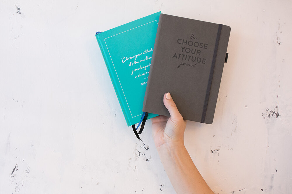
Photo copyright Shoal Projects Limited
Design of the Journal
Debra has two main audiences:
corporate crowds (for example, when she speaks at an HBBC event), and
females around Debra’s age range (who may follow her on social media or watch her “Choose Your Attitude” show).
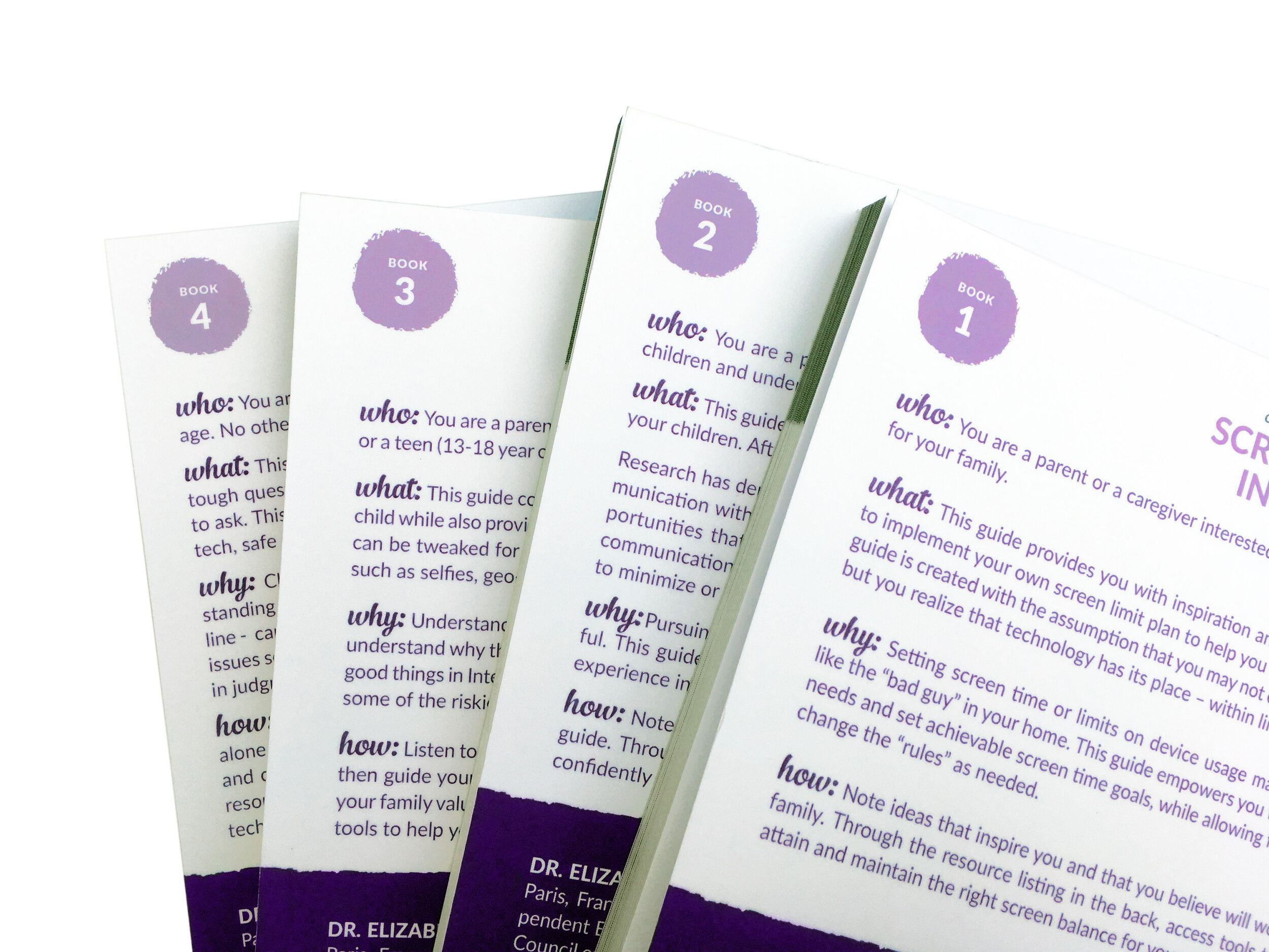
She wanted to produce two journals that were the same inside but had different covers. The general look and feel of the journal needed to suit both audiences, and suit her current branding…which involves a lot of teal!
After I understood her audience and her goals for the journals, the first step was to create cover designs and sample layouts for the interior. She provided Word files with the text and simple layouts showing what she wanted. I designed a few simple covers for each journal, as well as a sample of about 10 pages of the interior. I chose a clean, open san serif for most of the book, and added some interest with a handwritten font called “High Tide” (also a nod to Debra’s background, rowing solo across the Atlantic). Debra’s team gave me ideas like what you see on the left (below) in their draft, and I created an interior that matched their vision but also matched the overall look of the journals.


For the journal that needed to have a broader appeal, Debra chose a grey color and I designed a straightforward cover without too much “flounce”. For the more feminine journal we used teal and the handwritten font on the front. In the end, this is how the journal covers looked:

Photo copyright Shoal Projects Limited
The design aspect of this project also involved designing icons to match the key themes on the journaling pages, and designing a belly band that would wrap around the journals. This was the main design on the belly bands, which were made to suit both journals.

Journal Design Tip: Designing an interior and belly band that matched both covers saved a lot of money at production time.
Full Journal Layout
Once we had established a look for the journals, I created the full interior in the same matching style. It included, in order:
Title page
Copyright page
About the Author
Introduction
Quick Start Guide - a two-page visual guide to how to use the journal pages
How To Guide - a more detailed explanation of how to use the jouranal pages
Goal Setting section
Journaling pages - The heart of the book, the same journaling page repeated many times
A logo and “ad” in the back sharing where the reader could get another copy of the journal
Journal Layout Tip: Be sure to test and re-test your journal contents before your get the journal laid out professionally. Even though Debra an her team were very organized and had done a lot of planning and testing, we still ended up having at least ten rounds of proofs before the journal interior was perfect and ready to print. This kind of back-and-forth on a project like this is not unusual. We were all pleased with the final product that we sent for printing.

Photo copyright Shoal Projects Limited

Journal Production and Printing (in China)
Debra also hired me to liaison with the overseas printer whom I have worked with before. I exchanged over 40 emails with the printer, discussing the details of producing the journal. These emails related to:
Pricing - Some back and forth as the project specs changed a few times
Samples - Before placing the full order, we asked for two “dummy” journals to be made with a rough version of the cover design and blank sheets inside (the actual final paper). One cover had a grey PU (leather-like) cover (no ink), and one had a hardcover with teal ink. These dummies gave us a feel for the size, weight and look of the final product. We also asked for physical samples of the different PU materials, so that Debra could feel the different materials and see the color swatches in person. With the printer I use, requesting samples like these can cost around $100 to $200 to produce and airmail to my client in about a week, but is worth every cent to be sure that the final product is what we are expecting them to be!
Production Details - As I wrote in my article How to Communicate Clearly with your Overseas Printer, it’s really important to be clear and direct in communication with the printer. Because we wanted two journals that were so similar but also different, I knew it could be a confusing project. I created some visuals to help make sure all the production details were clear. For example, they both journals had ribbons bookmarks, pockets in the back, etc. But the grey one had rounded corners and rounded spine, and the teal one had a hard cover with square edges and a squared spine. In the end, both journals had all the detailed finishing work done correctly, with the exception that they had been individually packaged in plastic bags - something we had not wanted!

Journal production details like a back pocket and pen loop required extra attention to detail both in our order and in the production at the factory.
Photo copyright Shoal Projects Limited
Journal Production and Printing Tip 1: Always pay the extra $100-$200 to get proofs or samples sent to you when printing in China. Ask to have samples of the actual final paper or material (ie: PU, ribbon, back pocket, post) as well as a printed proof of the final product, if possible.
Journal Production and Printing Tip 2: If you’re printing a product (journal, book, etc.) overseas, you are likely doing so to get a much more affordable product. Expect that about 10% of the final products will not be sellable; be pleasantly surprised if more of them are! 😉
Journal Shipping (from China)
When shipping a book abroad, there is a lot to be considered. Overseas printers can ship to the client’s door (more expensive) or nearest port (less expensive, but you have to get it through customs, etc. yourself). They can ship by air (much more expensive) or by sea.
Debra used a shipping broker who picked up the journals from the production facility in China and ensured that the journals arrived at her warehouse in England. The warehouse also took care of some shipping / receiving / distribution duties with the final products.
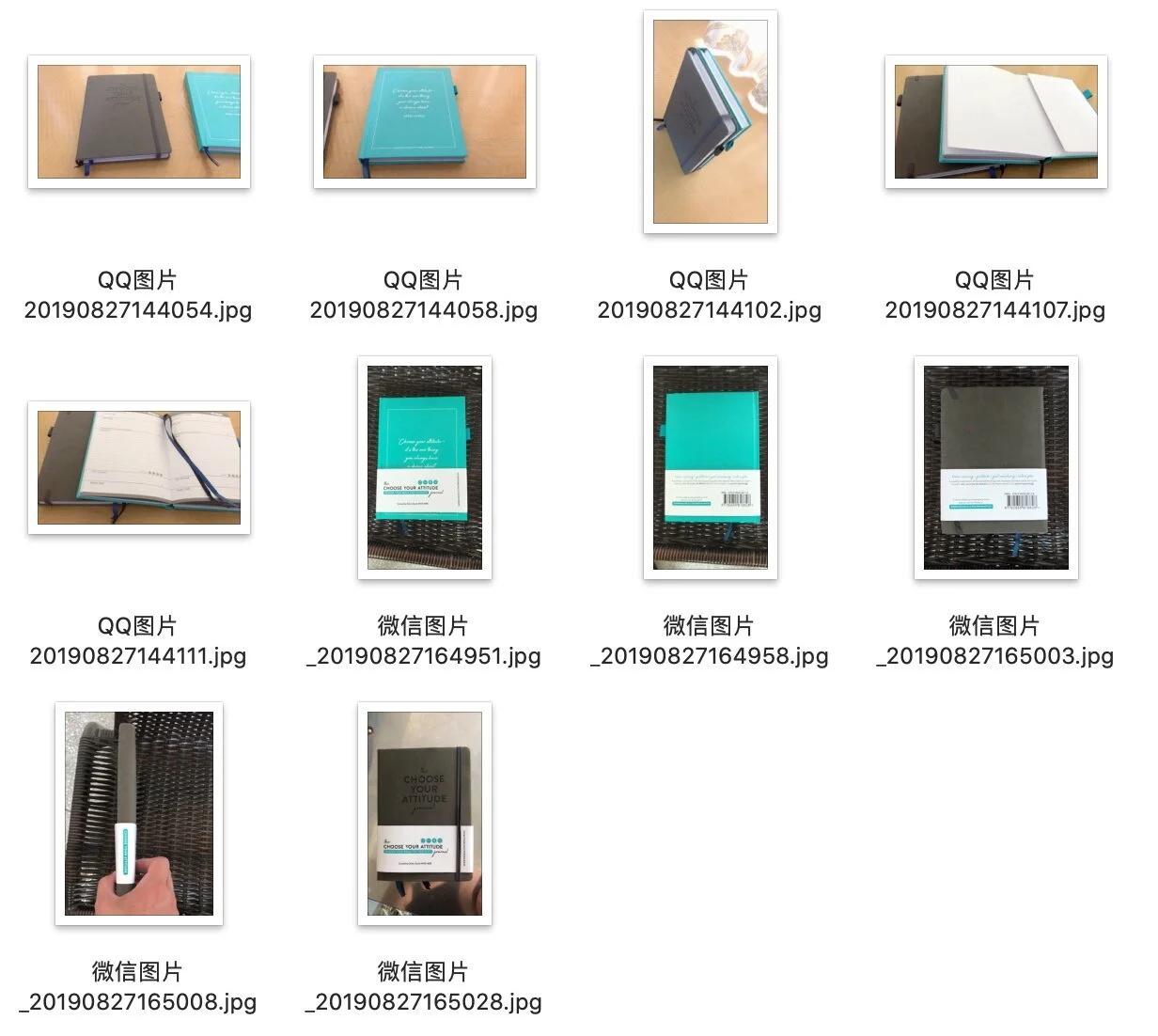
Journal Shipping Tip 1: Before transferring the last 50% payment to the printer in China, we asked to see photos of the final products. This is always a good idea when working with a production house so far away. We received various photos of the journals that showed that they had indeed been produced — below are the photos we received before Debra sent the final payment.
Journal Shipping Tip 2: We learned with this project that soft cover rounded-corner journals shipped much better than hardcover square-corner journals. The squared corners got more beat up in transport.
Journal Shipping Tip 3: It’s pretty complicated dealing with shipping from abroad. It’s usually better to print locally for small quantities or simple products, to save dealing with international shipments.

Photo copyright Shoal Projects Limited
I hope this article about designing and producing a journal has been helpful, whether you’re planning to print locally or abroad! Shout out to Debra for the beautiful pictures of her final product!
If you’re considering producing a journal, read this case study by my client Felix, who used his podcasting platform to develop and sell a motivational journal. Or sign up for my Book Done newsletter to get more stories from people who’ve gotten their book projects done!
NEW OFFER: Book a one-hour brainstorming session with me to get a head start on your journal planning and production! I’ll save you a lot of trouble by sharing what I’ve learned through trial and error with my journal design clients, sharing which printer we have used most successfully, and whatever else you want to know!