How to Check Your Sample Book Interior Layout Proof

The exciting moment has arrived! Your book designer has sent you a sample layout of your book interior (10 to 20 pages of your book, designed for print) and asked you to give approval or feedback before the full book is laid out.

But what are you supposed to watch for? What’s important to give your feedback on at this stage in the project? Here are five specific elements that influence book design and layout for you to consider when looking at your book interior layout proof.

Photo by LinkedIn Sales Navigator from Pexels

1. Fonts

Book designers choose fonts (also called typefaces) with a lot of thought. (In fact, if someone ever asks me “What’s your favourite font?” I can’t just answer that, because there is no “perfect” font—it just depends on the project!) Your book fonts have been chosen:

  • to be readable and communicate clearly,

  • to match the tone or feel of your book’s message,

  • with your target audience in mind, and probably

  • to match the cover or other branding related to the book or author.

That said, if there is a font that you really don’t like, by all means—tell your book designer. Your feedback on a font that gives you the heebie-jeebies is needed at this stage and not once the full layout is complete!

2. Graphic elements or styles

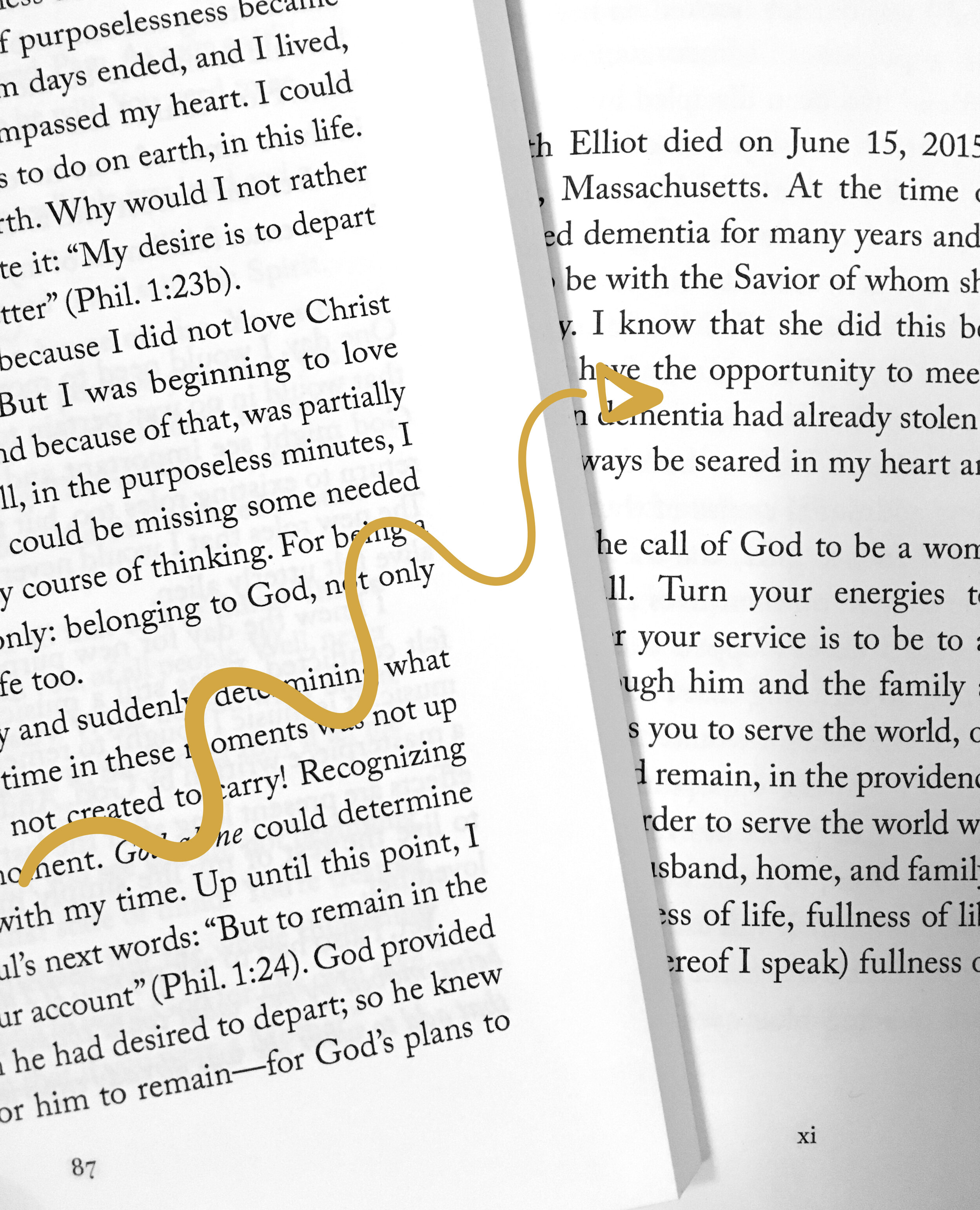
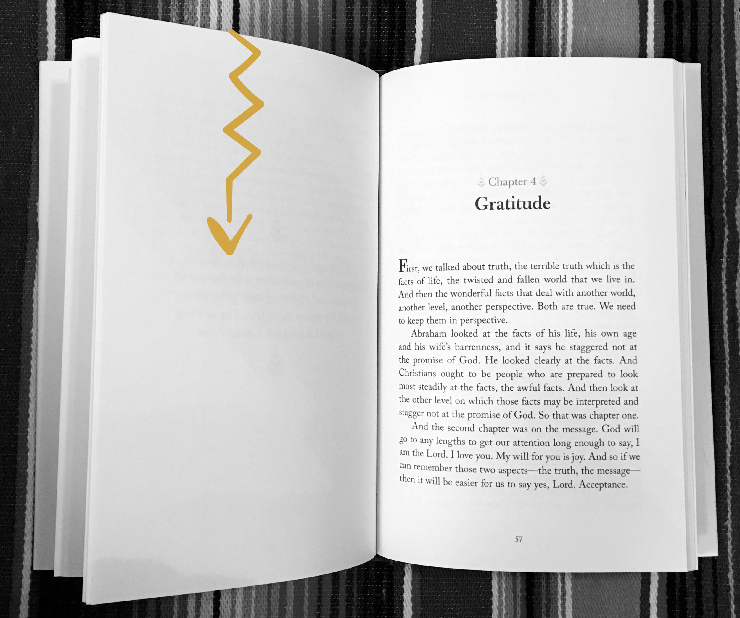
Depending on the content of your book, there may be borders, dividers, bullets, dingbats, dropcaps, etc. that the designer has chosen and designed to match the overall look, feel and message of your book. You may have provided cartoons, illustrations, or other artwork and the designer has chosen how to set it up on the page or integrate it with the surrounding text. If for some reason you don’t like how any of the graphic elements look, mention it in your sample book layout feedback. Your designer should be able to adjust the sample so that it looks good both to you and to him or her—or at least explain why certain graphic styles were chosen or why they work well for your audience or genre.

3. Font sizes

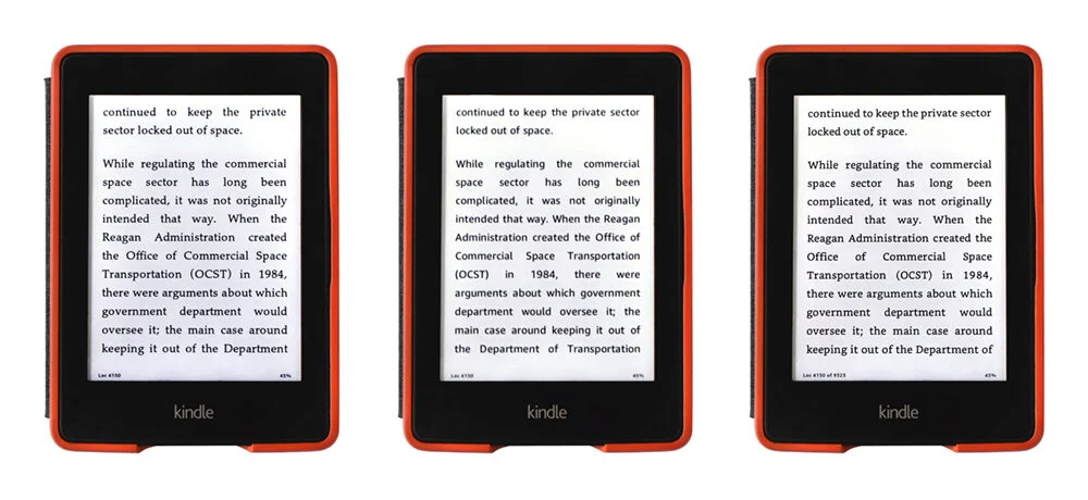
My clients print the sample pages of the pdf that I send them at actual size (100% size) and make sure the font size and spacing looks natural. This setting might look something like this (screenshot below) in Adobe Acrobat or whatever program you are printing your PDF from. (Be sure not to “shrink” or “scale” the pages.)

Screenshot 2020-09-22 at 16.51.19.png

The only exception to printing at 100% size might be if your book is an odd size. I designed a book that was 10x14” and could not be printed at full size on a standard printer. In that case I recommend printing a couple of pages at 100% size (even though this will mean that some of the content of the page gets cropped off/does not print) but then also to print the full sample proof using the “fit” or “shrink” or “scale” setting so that you can see the whole page on one paper, even if it’s a mini version!

4. Spacing

Your book designer has thought about:

  • margins (the space between the edges of the body text and the edges of the page),

  • leading (the space between the lines of text),

  • how much space should be between the text and any other graphics on the page,

  • how much space comes before a new chapter title or heading or between paragraphs,

and created a page that is easy on the eyes and meets industry standards for book layout. Even a small change to a margin or leading can affect typesetting greatly, so if something about the spacing looks odd to you, ask about it now.

5. Headers and Footers

Headers and footers are the smaller text at the top or bottom of the page that contain things like book title, chapter title, author name, or page number, etc. Because there are various ways headers and footers can be populated and formatted, feel free to give your input if you think the content of the headers or footers should be different.


During this important first stage of a book layout, your designer is making both technical and visual decisions that can make or break your book project. Having a professional final product takes good thinking and planning from the beginning, both in image-heavy books and in simple text-based layouts. Settings related to typography and layout are all made at this stage and set the course for the whole project. Your designer has put a lot of experience and know-how into setting up a book sample that not only looks good on screen but will work well for your audience and for the size and style of your book.

Knowing what kind of feedback your designer is looking for at the sample page proof stage helps you know how to check the proof in a way that is both accurate and helpful for your designer.


If you’re reading this article and have a book project that you’re hoping to soon have ready for design and layout, see if you’re ready to work with a book designer!

How to Check Your Full Book Interior Layout Proof

I often work with clients who are partnering with a book designer for the first time. When I send a full book interior layout proof, they often don’t know what kinds of details to watch for. I created this post to give my clients (and anyone else who is interested) a plan to work through while checking a full book proof.

1. Flip through the pdf(s) on screen to make sure there are no major problems.

Take a quick look at the pdf your designer has provided, and make sure there are no major problems that are immediately visible. If you saw and approved a sample layout, there should be no major surprises at the full book layout stage. But in case there is anything that is really off (like a header that is wrong on every page), your designer might be willing to quickly fix this for you before you print off a full proof for a more careful check.

2. Print off a full proof.

I always, always recommend printing off your book interior layout proof at 100% size and checking over the paper version of your book. Even better, ask a local copy shop to print it off for you, cut it down to final size, and add some cheap binding, so that you can get a feel for what the final book will really look like. It is said that 25% more errors are caught when looking at a printed copy (rather than a digital copy) of your book.

3. Check the accuracy of the content.

The text you provided should be reflected exactly in your book layout, unless your designer corrected some glaring errors. If I correct a textural error (like an obvious typo) I flag the text that was changed in bright pink, so that it is instantly clear to my client that a change has been made to the copy they provided.) However, because of the possibility of errors in your manuscript or errors introduced while typesetting, you need to carefully check the content itself one more time now that it is in its final format.

  • I suggest paying a professional proofreader for a final check after the full layout is done. Even if your book has been professionally edited, a proofreader’s job is different; he or she watches for the tiny punctuation or spelling errors that you or an editor might have missed.

  • Read the whole book one more time yourself to watch for any errors, omissions or typos.

  • Double check that the information on the copyright page is complete and accurate.

4. Check the formatting of the content.

Watch for accurate formatting

  • Table of contents - Does the table of contents accurately reflect the contents of the book, both in titles and page numbers?

  • Headings - If you have different levels of headings (subheads, sub-subheads) is the hierarchy correct?

  • Local Formatting - Has local formatting from your original manuscript (like bold, italics, or small caps) been carried over correctly into the body text?

  • Lists or Bullets - Have any numbered or bulleted lists been formatted neatly?

  • Footers or Headers - Do the footers or headers have the correct contents in them?

  • Superscript or subscript - If there is superscript (like 14th or O2) or special characters (like musical symbols or mathematical formulas) do they appear correctly in the final layout?

  • Tables, images and graphs - Is the content of any graphics and their captions accurate?

Watch for consistent formatting

Professional book designers use “master pages” and text “styles” to make the style of your book look consistent. Many of these have to be applied manually. It is your designer’s job to watch for consistency, but you can watch to make sure nothing has been missed. As you check your proof, watch for consistency in the:

  • Margins - Are the margins (the space between the edge of the page and where the text begins) consistent on similar pages?

  • Dropcaps - If there are paragraphs that start with one big letter (called a “drop cap”) are these used consistently?

  • Indents - If your book uses an indented paragraph style, is it indented consistently? The first paragraph after a header or non-body text should not be indented. (The indent really only exists to separate the next paragraph from an identically formatted line of text above it.)

  • Footers or Headers - The contents of the headers or footers may vary depending on the complexity or genre of your book, but they should be consistent. For example, if the top left (verso) header says the book title, and the top right (recto) header says the chapter title, every page should be consistently formatted this way. On some pages there should be no footer or header (usually the pages up to and including the table of contents and the opening page of each chapter have no footer or header, or just the page number).

Tables, images and graphs - If there are tables or graphics in the book, are they formatted in a similar style (fonts, overall look) and with similar amounts of space around them?

5. Respond to your book designer’s questions or notes.

Sometimes I ask a few questions in my email to the author when I deliver the full book interior layout proofs. I often leave a few pink text notes in the book layout itself, to draw the author’s attention to problems or questions that I had while creating the layout. These questions should be answered when giving feedback on the full proof.


A note about image quality: If your book has photos, tables or images, they may not look crisp in your full book interior layout PDF proof because your designer probably sent the pdf in lower quality via email or another file sharing service. Usually the high quality PDF files for printing are not released until your final invoice is paid. However, it is your book designer’s job to warn you if there are images in your book that are lower quality than what is usually recommended for printing (300 DPI). If you cannot provide the images in higher quality, they can still be printed, but they might look fuzzy and/or you may get a warning message from your printer when you submit your PDF(s) for printing.


Hey, eagle eyes! Did you learn something new today? You have probably thought about the accuracy of your own manuscript a lot, but didn’t realize how many details go in to making sure the formatting of your book is accurate and consistent!

Once you’ve gone through this list and throughly checked your printed-out book proof, you’re ready to send any final changes or corrections to your book designer. Changes can be sent using the PDF mark-up tools in Adobe Acrobat, or as a simple typed list (ie: “On page 5, change heading “Be Bald” to “Be Bold”.) Usually I include 2 to 4 hours of free changes to the book interior layout in my layout pricing, depending on the length and complexity of the book. Sending all your changes as clearly and neatly as possible, and all at once, will save on extra fees for inputting changes.

I hope this list has helped you know what to watch for in checking your full book interior layout proof, especially if it’s your first book!

Can I Design My Own Book Interior in Word?

Sometimes I get an email from an author who has done her very best to format her book in Word and is just wondering if I can check her Word file and make a few small design tweaks.

For example, a month or two ago new author Elizabeth sent me her book file, which she had already formatted to a 6x9 inch page size (the final size of her book) and said,

I’m hoping I don’t need much layout help. Obviously I need help with the Table of Contents and Appendix, at least. Anyway, let me know how much needs to be done…
It doesn’t have to be perfect, but I would appreciate if it looked professional.

“Can I design my own book interior in Word?” The answer depends on how professional you want your book to look. If it’s a collection of family anecdotes for distribution to fifteen family members, Word will probably do (and will probably make sense budget-wise). But if you are wanting your book to reflect your professional abilities and perhaps build your platform as an author, speaker, or communicator, a book formatted in Word will usually not look professional enough.

For this particular project, Elizabeth allowed me to take the whole book from Word into my professional book interior layout software, Adobe InDesign, and format it with the more powerful tools that InDesign provides. I created this post to show you some of the clear visual differences between an author-designed book layout from Word and a professionally-designed book layout created in InDesign.

(By the way, I never, ever format books in Word. Therefore I also don’t go into Word to tweak files my clients have designed in there. You might find a freelancer online who is a Word expert who will offer to do this for you, but a professional book designer will work with Adobe InDesign.)


Book interior layout has a lot of small details to it that seem unimportant (after all, we all have access to Word!) but that in the end make a book somehow look clunkier and less relaxing to read. Overall, I took Elizabeth’s book font size down, changed the font, and added more leading (space between the lines).

(Click on any image in this post to see a larger version.)

One of the main things that makes it hard to make a book look professionally formatted in Word is the lack of control over things like where the text starts on the page. You can hit “return” or “enter” a few times to try to make a new chapter open lower on the page, but it’s hard to be sure that all your new chapters are opening in the same position. In professionally typeset books, new chapters often open lower on the page. One of the big differences between the Word layout and the InDesign layout of this book was the position of the chapter titles on each opening page.

When formatting Elizabeth’s books I also added footers with the page number and the book title or chapter name. This is easy to do in InDesign.

Indents, which are used to indicate that a new paragraph is starting, are not needed on the first paragraph of a chapter because it is obvious that a new paragraph is beginning. A book designer recognizes small details like this and cleans up the look of your book when importing it from Word.

InDesign has more powerful controls for making the Table of Contents look just the way it should. As you can see, Elizabeth was having trouble with formatting some of the longer chapter titles and knowing how to include the page numbers. The results from InDesign look cleaner.

Word also does weird (and sometimes ugly) things like automatically make your hyperlinks blue and underlined. This is unnecessary and is a sure sign the book was formatted in Word.

A book designer’s expertise can especially work to your advantage for complex formatting like in Elizabeth’s appendix. Word can get a bit hard to control when you have multiple levels of bullet points, tabs, indents, etc.

Even while cleaning up the formatting of the Appendix, I realized that the way the content was organized was not completely clear, and after my suggestions, Elizabeth went back and reworked her Appendix so that it was more understandable. This is another benefit of working with a book designer, is having another set of eyes go over your formatting / content and checking if it is organized as clearly as possible.

I think it is clear from the images in this post, that there is a dramatic visual difference between an author-designed book layout from Word and a professionally-designed book layout in InDesign. When looking for a book designer, be assured that a professional book designer does not work in Word; look for someone who will work in the industry standard book layout software, Adobe InDesign, if you want a professional final product!


If you’ve gotten this far in this article, you’re probably self-publishing! Check out my articles page to learn more about self-publishing and what it’s like to work with a book designer.

Side-By-Side Comparison of Print and Ebook

I was hired to create the book book interior layout for Space is Open for Business by Robert C. Jacobson and Luca Funari was contracted to create the ebook. The layout of this book was complex both for print and ebook formats because of the sheer length of this technical business book, but mostly because there were so many graphics, pull quotes, charts, columns, and other visuals and special formatting.

I thought this would be a good book to use as an illustration of how a print book and ebook look side by side. While the final ebook does not look exactly like the final print book, it maintains the general look and feel of the printed book, while having all the flexibility and accessibility of a reflowable ebook. Click on any image in this article inspect it more closely.

Many ereaders will show the cover in black and white, as seen below, although that is not always the case.

This gorgeous cover was designed by Richard Ljoenes.

This gorgeous cover was designed by Richard Ljoenes.

The fonts in an ebook will look different than the fonts in the printed book. A lot of the “extras” that can be used in print book formatting are simplified for ebook format to ensure that it reads clean on any and every device. For example, drop caps (the big letter at the beginning of an opening paragraph) are not often used in ebooks, heading fonts may look different, and body fonts can be changed at the whim of the reader. A good ebook adaptation will try to carry a few of the visual elements (maybe the chapter numbers, or something like that) from the print book into the ebook to keep some visual similarity between them both, but overall, the way the fonts and spacing look in an ereader like a Kindle or Nook depends on the reader’s preferences, not the designer’s.

compare print book and ebook.jpg

Below you can see how the same text can be read in three different fonts, just depending on the settings the reader chooses on his or her device.

compare ebook fonts_1000px.jpg

The Table of Contents in an ebook looks quite different than in a printed book, and of course the “page numbers” are quite different because page numbers don’t really matter / exist in a reflowable ebook. The Table of Contents set up on an e-reader is based on the way the software works and is functional but not necessarily beautiful. It might not bear any resemblance to the printed books table of contents other than that the headings themselves are the same.

how will my ebook table of contents look.jpg

As you see below, the wider column and text wrap in the printed book give a different look than the ebook. With reflowable ebook layouts, there is not as much control for wrapping text around graphics, etc. The ebook will look slightly different on each device. So text and captions have to be formatted a bit differently (no text wrap, just on their own line).

compare graphics in print book to graphics in ebook.jpg

One of the hardest things to view in an ereader is something like this two-page chart. In the printed book it is a lot easier to look at and read simply because I was able to use two pages at once and turn the graphic on its side to maximize the use of the space. In the ereader layout, this graphic is harder to read, although on most devices it’s possible to zoom in.

chart in print book vs chart in ebook.jpg

In an ebook, “pages” are seen one at a time and not in a spread like in a printed book. For example, the opening pages of each section will always be on their own page in the ebook and not seen next to the previous page.

print book ebook.jpg

For those who are really attached to the look of their printed book, it can be hard to accept that in some ways the format of the ebook has to be a bit simpler and more straightforward. But people who are accustomed to reading ebooks know that they look different than the printed editions of the books and usually, the visuals don’t matter so much to ebook readers. They have probably chosen the ebook edition for other reasons: accessibility, price point, etc.


If you have a print book that needs to be converted to ebook, or just want to talk about your book project, schedule a live consultation with me or send me a message through my contact form! I am happy to answer any further questions you may have.

Ebook Adaptation Information for Self-Publishers

When my clients need print books adapted to ebook format, I rely on the expertise of Luca Funari, an ebook coder who has been helping me make print books into lovely ebooks since 2017. I asked if he could answer some questions about the process of getting from manuscript to ebook or print book to ebook. It is super important to me that my clients are happy with both their print and ebook products, and Luca goes the extra mile to make sure his books look good and work right on Kindle or other ereader software. In this article Luca shares some answers to basic questions about ebook adaptations. (Check this post if you’re looking for a side-by-side visual comparison of a print book and an ebook.)

Photo by Fraenkly on Unsplash

Photo by Fraenkly on Unsplash

I am getting my book designed for print. Should I make it available in ebook format as well?

This is a marketing decision, and there is no one answer that applies to all cases. See what authors, speakers or content creators in your genre and market do. But yes, most books are released in both formats. Digital ebooks can be sold at a lower price, and purchased from anywhere, which should increase book sales.

Can my print book designer create an ebook for me?

Usually print designers are unable to create ebooks, because ebooks require different procedures and different software than print books. Ebooks are basically like small websites that require an HTML/CSS knowledge rather than artistic skills. This is why Julie works with me, Luca, for ebook adaptations.

Can I create my ebook myself? 

It is possible to create your own ebook file, but the quality of the final result depends on: (1) the complexity of the ebook; (2) the quality of the software you use for the conversion; and (3) your own technical abilities. If you have never done coding or ebook conversion before, the time it will take to figure it out yourself is probably worth much more to you than the cost of paying someone who creates ebooks all the time to adapt your book to ebook format.

At what stage in the book writing process should I (a) contract an ebook designer and (b) send the ebook designer my book?

It’s a good idea to find and contract your ebook designer before you need him or her, to avoid long wait times for your ebook. But you should send the book only when you have the final version, corrected and proofread.

If your book has a print version, it is necessary that the print formatting be completed before starting ebook formatting. This saves you from having to pay double (both the print book designer and ebook designer) to fix any errors found in the book at the end of the project. There should be no more errors in the book by the time it comes to me. When you work with Julie, she quotes on ebook adaptation along with print layout, if desired.

What file formats do I need for my ebook? What are the standard ebook formats and for which platforms?

The standard, free/open ebook format is EPUB. All platforms accept and sell it, other than Amazon, which sells its own proprietary formats. The most common Amazon format is the MOBI format (but I used the plural "formats", because Amazon owns a lot of them—FK8, KPF, etc.) Technically all e-publishing platforms accept other kinds of documents too; most of them accept DOC files, HTML or plain text format TXT.

Self-publishers should submit MOBI or KPF when publishing on Amazon; all other platforms prefer the EPUB format. When I create ebook files for Julie, I always include both EPUB and MOBI ebook files.

What is the difference between “fixed” and “reflowable” format for my ebook? If I am offered both options, which should I choose?

A “fixed” layout ebook is basically a “what you see is what you get” way of converting an ebook. It is used for books where images are the main conveyer of the message and not words (children’s picture books, photo books or comic books).  The fixed ebook layout has been created to adapt these kinds of books to digital devices, although it has its limitations. These books will virtually look exactly the same on any and every device: no surprises, but also no ability to make the text, margins or spacing bigger or smaller if you are reading on a bigger or smaller device. Imagine a full pdf page of your book shrunk down to fit on your cell phone screen: at some point fixed layout ebooks are impractical and illegible.

"Reflowable" ebooks are more like a website, which your phone, e-reader, or computer reads and adapts to your preferred settings, screen size, etc. For example, in the image below you see the same reflowable book being read at different settings: the reader on the left chose to make the font and line spacing bigger, the reader on the right preferred to keep it small.

compare ebook font settings_1000px.jpg

As far as which is better—fixed or reflowble—the raison d'être for ebook technology and digital reading is adaptability, readability and accessibility for those ideas. Ebooks must offer accessibility and readability to as many people as possible, including people with physical disabilities. They should be adaptable to as many devices as possible, to reach as many people as possible. For this reason, I believe that a digital ebook should be readable on many devices and must offer some crucial features: character resizing, image magnification, table magnification, font interchangeability, audio, dictionary, different background colours, and more. Most of these features are only possible in a reflowable text ebook like an EPUB or MOBI file. When the reader changes the character size all the text flows and it becomes readable and accessible to more persons. For this reason an ebook should be reflowable if at all possible. Even books with complex layouts should be adapted to the reflowable format for more accessibility, if at all possible. (If it weren't for these aspects, the PDF format which your print designer can easily export from InDesign would work perfectly for ebooks.)

In this graphic, you can see how a reflowable ebook read on an ereader gives the reader the option to pick the font that he or she prefers—this is obviously a perk of reading an ebook verses a printed book.

In this graphic, you can see how a reflowable ebook read on an ereader gives the reader the option to pick the font that he or she prefers—this is obviously a perk of reading an ebook verses a printed book.

I love the look of the fonts in my printed book. Can my ebook look exactly the same?

For the ebooks I create, I recommend that we allow the reader to specify the fonts on his or her reading device or app, and not worry about matching them exactly to the printed book. This saves time and money. But yes, the font licences can be purchased and embedded in the ebook if the author really wants the look of the book to carry through on all devices.

How much should I budget for ebook adaptation?

Prices vary depending on the complexity of content and the type of layout: fixed or reflowable. For a “fixed” layout ebook, the price is usually per page. The price may go down if there are many pages. "Reflowable" ebooks are more difficult because there are many elements that affect the production time. For example: the length of the text; and the number of complex time-consuming elements in the layout.

Pricing also varies with the quality of the work and experience of the ebook coder. For example, you might find someone online who says they will do a “quick and dirty” conversion of your novel using a software like Calibre. If you want a quick conversion, do not expect any attention to detail or service if you are not happy with the conversion. An ebook adaptation (not conversion) with attention to detail, layout re-adaptation to digital format, image optimization to reduce the file size, attention to platforms requirements (what does Kobo require that Amazon does not, etc?), with various final formats (MOBI, EPUB, etc.) or ebook tweaking to satisfy different platform requirements creates a high-quality final product but costs more.

What kinds of elements are harder to convert to ebook format?

All the elements in your book layout that are not "plain" text increase the production time. A few of the more time-consuming elements in an ebook adaptation are: lists, footnotes, endnotes, boxes, hyperlinks, tables, images, fonts, or multi-column layouts.

These elements add extra time to the ebook coding process because they cannot be handled by some kind of automatic conversion software, and even if the ebook coder starts the conversion process using software, he or she usually has to edit the code to fix different issues that come up when viewing the ebook in different devices or apps.

How long does ebook adaptation take?

Here again, there is great difference in time investment between an automatic conversion of a text-only novel without any attention to detail, which can require one hour, and a good adaptation for a technical book, with great attention to detail, which can require some weeks of dedication. I once had a complex ebook adaptation take me 86 hours!

For this reason, when Julie and I collaborate on an ebook adaptation, we say that it takes somewhere between one and three weeks. A faster conversion might be available for a rush fee, but usually the ebook adaptation is done while the print book is going to press, which means the ebook and print book can be ready to release around the same time.

Can you upload my final ebook files to Amazon or other platforms for me?

In 99% of cases I say “no”.  I prefer not to have your password or have access to your self-publishing account, for liability reasons. This is mainly because the behind-the-scenes area in your Amazon, IngramSpark, Book Baby, etc. account shows your payment information, and allows me to make any change I want to your print or ebook. I always suggest that my clients learn to upload their ebook files themselves.


Many thanks to Luca for sharing the inside story for self-publishers wanting their books converted to ebook. If you’re looking for book interior layout for print and/or ebook, fill out this questionnaire and send me your manuscript for an exact quotation or ask me your questions in a live consultation.

How your Book Interior Design Can Match the Cover of Your Book

When you think about the appearance or design of your book, the main topic of your consideration is usually the cover. But did you know that the interior design of your book can match or clash with the design of your cover?

When ROCK International asked me to help with the book interior layout for their first chapter book for teens, the cover design was almost finalized already. They shared the cover files with me, so that I could match as many visual elements as possible to the chosen design aesthetic. The final result was a book interior that supported the look and feel of the cover in every day.

Here is the cover design by Kayla Krahn:

ROCK International WIJMWHS book.jpg

Nate’s book has a really black-and-white, powerful message and was written for a youthful audience. I think the designer captured both of these vibes in the cover, with the bold red, black and white look and the handwritten or scribbled feel to the text and design elements. In this post I’d like to show how many of the different interior elements in a book can tie in with the look of the book.

First of all, of course, I used some of the same fonts as on the cover. The brush-script font would be overwhelming if used too often, but so I used it as an accent here and there: for the chapter numbers, drop caps, ampersands, etc.

Christian book dropcap.png
book design final page.png

I also created a simplified, black and white version of the main cover elements to use as an interior title page.

book+interior+design+title+page.jpg

I designed bold, heavy spreads to open each new part of the book. (There’s a big gap down the center so that no words would be lost in the spine of the book.) The dark black pages also clearly divide the book into parts that can be seen even from the outside of the book when the book is closed (because the edges of the pages are dark).

book interior design part opener.png

In the question sections at the end of each chapter, and throughout the book, I used the hand-drawn scribble for effect.

Notes page sample book.png

As you can see, there are lots of ways in which the interior of your book can match the look of your cover.

If you have not hired a cover designer yet, make sure to tell your cover designer that you want access to the “layered” or “editable” cover design files when the project is completed. This helps any other designers you will work with (for interior layout, or also for book marketing purposes, etc.) to be able to use elements of your cover design in other designs related to your book! Or work with the same designer for both your cover and interior for a seamless design experience (I offer both book cover and book interior design services).

Your interior is where the manuscript you have poured your love into is put on display. A well-designed interior layout will enhance the reader’s experience which begins at the cover, building on the look and feel created by the book designer and not distracting from it.


Looking for book interior design? Learn more about my book interior layout service or go ahead and fill out my Book Interior Layout Questionnaire to quickly get a quote.

How Can I Prepare an Out-Of-Print Book For Reprinting Digitally?

The author of successful interior design book series wrote to me with a quandary: she’d like to re-release several of her most successful books through Amazon KDP (Print-on-Demand / POD) but her books were printed around 1997, before the digital age. She has no digital files for the photos or book layouts. The printer destroyed the film they used to create the print layouts before offering that she could purchase it. But some of the books are still selling well, and she’d like to reprint them. She wrote asking for an affordable, realistic solution for getting her books recreated and back onto the market.

What follows is what I recommended for her book, in case it helps any others who are trying to bridge the gap between an analog or pre-digital book and today’s digital printing / print-on-demand market.

(Also, note to all printers: don’t throw away an author’s film before asking him or her first!)

Photo by wu yi on Unsplash

Photo by wu yi on Unsplash


The analog book layouts need to be rebuilt digitally and once this format is achieved, they should be good to go for a long time. The same digital format should work whether you print them on Amazon or run a full offset printing of the books somewhere else. It’s really important to make sure the price you get for re-laying out your books includes you receiving a copy of the working/editable InDesign files (not just the print-ready PDFs) at the end of the project, so you can have those files for any future edits or reprints. 

File Preparation

In order to set up the books for printing, I would need:

  • All the text (including cover, spine, copyright page - everything) in a flowing / editable text file format (Word). The formatting can be very simple (it would be helpful to have bold and italics already implemented, but headers, etc. don’t need to be formatted in any special way, since it is clear from the previous book what formatting is needed. 

    • If you don’t have an original digital copy of the text, OCR scanning should be able to capture most of it (scanning with character recognition turned on, ie: scanning the book pages) but it would have to be checked very carefully before being submitted for layout for any errors.  

  • All the images scanned from the originals in high resolution format. (For print, images need to be at least 300dpi at final size). If the images need color correction, retouching or to be cut to white, this should be done already before the book layout begins. I have a high quality photo editor that I can recommend if you need this. 

  • Any logo images or other graphics other than photos and text, in high quality format.

  • A pdf or some kind of scan of every page of every book, that shows a clear page edge on at least two sides so that we can match everything, including margins.

  • The fonts in digital format. I can probably find the names of the fonts if needed, but purchasing them would not be included in the layout costs.

Layout Process

  • I would ask to have one copy of each book (from the last, pre-digital printing) sent to me before the layout begins so that I can more easily check layout visually.

  • I would show you a sample of the first ten pages of the book and then proceed with full layout.

  • Cover and pages would be laid out to match the previous book exactly, unless you need any errors corrected or updates made.

  • Solid ink colors (like the colors of the titles, or solid color backgrounds) would be matched as closely as possible to the printed book, but then could be checked through ordering a sample of the POD book through Amazon KDP. (Color matching with POD is not an exact process. Each book is printed at a different place or at a different time and the color can vary.)

Layout rate

I would charge for this project on a per page rate, with the minimum order size being one full book. In order to give an official estimate, I would need to see the full scan of every page of the book. My price includes cover set-up, two hours of changes to the book after full layout, and final print-ready and editable files .


If you have a similar situation, with an out-of-print or almost out-of-print book that you want to get back into circulation, send me a message. Whether or not you work with me on the final layout, I’m happy to answer any questions you have about getting your book back into circulation.

Indexing Information for Self-Publishers

If you are self-publishing, especially for the first time, you may have questions about indexing. Does your book even need an index? Can you make the index yourself? What does it cost to get an index created by a professional indexer?

Joanne Sprott of Potomac Indexing LLC recently created an index for a book I was designing. She kindly agreed to answer some of the questions you may have about indexing. I hope you find Joanne’s overview of indexing information for self-publishers helpful!

what does it cost to get my self published book indexed.jpg

How do I decide if my self-published book needs an index?

First of all, normally only nonfiction books need indexes. Very few fiction books are indexed. (Maybe something like Shakespeare’s collected plays or some other famous literary works would have an index.)

Length is the other primary deciding factor. Usually only a book with 100 or more pages is indexed. But pages are relative to trim size—the 100 is based on a 6x9-inch trim size common to trade books.

If you meet the nonfiction and more-than-100 pages criteria, then deciding on whether your book should have an index comes down to whether you think it will add enough value to make the cost worthwhile. People do buy books— especially biographies of famous people—based on a browse of the index. In books that teach something, indexes can be valuable to students for writing their own essays or exams. They are also very valuable in scholarly books to guide other scholars through to the element in the book that they are interested in comparing to their own and others’ research and writing.

Can I make my own index (DIY)?

Technically, yes, you can make your own book index. From my experience, though, there’s a certain weird way of thinking that goes with indexing, and most people don’t “get it.” They often waste a lot of time getting lost in making entries for trivial details or passing mentions (such as including every name mentioned in the book!) Authors often have trouble seeing their material from the reader’s point of view and may just outline the book in a slightly more detailed way than the table of contents and stop there. It’s a decent start, but index users are often looking for more specific topics that are scattered in the text; one of the benefits of an index is that it brings together scattered topic mentions that might be lost in an outline approach.

For a more comprehensive guide to thinking like an indexer and doing the index yourself, check out Potomac Indexing’s free indexing guide for authors, which is accessible from the footer area of our website.

How do I find and choose an indexer? Do indexers have specialties?

The best place to find an indexer, at least in the USA, is the American Society for Indexing. They have a “Find an Indexer” option in the left menu that will take you to a page where you can search for an indexer.

Yes, a number of indexers do specialize, although most are intelligent generalists. Medical books, legal books, scholarly books, and technical manuals all have indexers who specialize in those subject areas and vocabulary. ASI doesn’t specifically certify its indexers, but when you look for one in your subject area, you’ll see their experience and training.

Of course, our four partners at Potomac Indexing (we all belong to ASI and have experience in many subjects, going back to the 1990s) would be happy to help you as well. 

What does it cost to get a book indexed?

The short answer is that an index can range from USD$400 to $5,000. Average is more like USD$1,000 to $1,400.

Pricing depends on density of index terms, the book’s trim size, and length of the book. At Potomac Indexing, we normally charge a flat fee based on a per page, per entry, or per word rate, in that order of preference. Every index is a custom job, so we usually ask to take a look at some sample of the book to gauge the index term density. We will analyze word count on a typical all-text page (is it a standard about 400 words per page, or a coffee table book with 1000 words per page?), and then look at how many pages have just pictures, for example, which will reduce that index-term density for the entire book.

As an example, let’s come up with a per page rate for a 6x9 trade book on business advice, almost entirely text, that has 350 indexable book pages.

Wait, you ask, what’s an indexable page? Well, we indexers don’t count any pages we don’t have to read to decide on index terms. So, most of the front matter, from title page through acknowledgments (sometimes we index preface material) is excluded, along with back matter like bibliographies/reference lists (we may index substantive endnote material, but that’s a judgment call; definitely not the purely referential notes).

I would likely quote $3.50 to $4.00 per page for this type of subject matter, which generally is not all that dense with index terms (maybe 2 to 3 terms on average per page). So in this case, your cost would be $1225 to $1400. Not pocket change, but the indexer has to read the book and create a separate organized document called the index, so it takes longer than, say, a proofreading job. 

Yes, we read the book, not necessarily word for word, but nearly, in order to understand its themes and subtopics as well as pick up important people and place names. This is not something a software application can automatically do for us, because it can’t decide on whether a term is important enough to the surrounding discussion to be included in the index. That’s what separates a human-constructed index from a set of search engine results.

At which stage in the book writing process should I
(1) first contact an indexer, and (2) send the indexer my book?

Books designated for print with a static index shouldn’t be indexed until the page numbers are final. Subject lists without page numbers might sound like a time saver, but you have to go through the whole book again anyway to set the final page numbers. It’s more efficient to do all of this once.

That said, if you have an ebook in the works, or you really need to index early from the manuscript (it still needs to be basically finished), you can opt for an embedded index. This is where the indexer not only reads the book and decides on index terms, but also inserts special tags for each index term into the document in whatever program is used to create the book (Word, InDesign, HTML, there are lots of options). Embedded indexes use live links to the tagged location in the book. So, the index automatically reflects any changes that are later made to the book file (or changes to ebook view settings), such as if a key word moves from one page to another.

How long does it take to get a book indexed?

I like to allow about two weeks on average to build and return a finished index. Depending on book length, I could do it faster than this, but that assumes I have an opening in my schedule at just the right time. Normally, indexers are juggling multiple projects that don’t all arrive as scheduled, so the two-week turnaround helps us stay sane. However, if you have an 800-page book, I may need a bit longer to finish the index.


Potomac Indexing LLC (established in 2006) consists of four experienced indexing partners along with access to another forty independent indexers in various specialties, allowing Potomac Indexing LLC to say “yes” to almost every job that comes its way. Potomac Indexing LLC guarantees the quality of the work regardless of which partner or associate indexer does the initial indexing, handling everything from a self-published memoir to a series of accounting guides or drug regulations that come back for indexing year after year. Check out their portfolio to see if they are a good match for indexing your book.


Do you have more questions about self-publishing, indexing, or book interior layout? Feel free to send me a note and I’ll do my best to help you, or to connect you with someone who can help you!

How to Compile a Book from Facebook or Social Media Posts

Do you want to write a book? Do you regularly post on social media? Your book’s content may already be half ready, ideas just waiting to be pulled together from Facebook, LinkedIn, or Instagram in a cohesive format for print. In the following post I explain how a client of mine used Facebook posts to build a memoir. Whether you’re writing a memoir, a travel journal, a business book, a marketing book — don’t forget how much content you may already have available to you on your social media accounts.


A few years ago the publisher of Notes from Susie asked me to provide interior design and layout for a memoir about a lovely woman named Susie. Susie was a prolific note-writer, and when cancer made its presence in her life known, she and her husband took to Facebook to keep her friends and family updated about their battle. Besides sharing what was going on, they shared a lot of lyrics to beloved songs in their posts.

Celebrating Grace, the publisher, pulled this story about grief, health, family relationships, music, and the Christian life together This book is an example of how a touching memoir can be assembled mostly from Facebook or social media posts.

Here’s how you can compile your own book from social media posts.

1. Gather all the information you want to include in your book from your social media account(s).

Copy and paste the text of each individual post that you want to put into your book into a Word document, in chronological oder. This can be a tedious job, and if you are sifting through a huge number of posts, you may want to hire a freelancer to do this busy work for you.

Note the date (and time, if important) of the posts, and if various voices are used, be sure it is clear which person is writing in each post.

(You can see below that Susie’s posts were organized chronologically in her book, and had date ranges as headers, and days of the week as subheaders.)

Download and save any images (or make screenshots of any other visuals) from your social media accounts that you want to include. Label these in such a way that it’s easy to find which text they relate to.

Screenshot 2020-06-16 at 15.11.22.png

2. Decide on a structure for your book.

Consider how best to organise the information from the posts in a way that would be understandable to the reader: chronological, thematic, by voice…. Your story will dictate which order or structure makes the most sense.

Susie’s story was told chronologically, with introductory and concluding material surrounding her and her husband Mark’s notes and posts, which make up the bulk of the book. The breakdown is like this:

  1. Front matter (foreword, acknowledgements, general introduction and introduction to Susie);

  2. Susie’s story (Susie and Mark’s posts, organized chronologically, and divided into three parts)

  3. Back matter (epilogue, reflections from Susie’s children, credits, and reviews).

Don’t hurry this process; having a solid and logical structure to your memoir is one of the most important aspects of making your book clear and easy to follow.

Screenshot 2020-06-16 at 15.12.13.png

3. Edit your story and decide on a title.

Edit and rearrange your material to suit the structure you’ve chosen. It doesn’t make your memoir inauthentic if you have to remove a few posts or add some explanatory material between posts to make them flow. As long as you keep the different kinds of text organized in your file (post, introduction, explanatory paragraph, footnote) your book designer can help you make instantly obvious which parts are which, through smart formatting. As you edit your story, note ideas for the title of your book!

In Susie’s books, the songs had special formatting, as well as pull quotes, copyright lines, etc.

Screenshot 2020-06-16 at 15.11.43.png

4. Add visuals or meaningful touches.

Collect photos to support your story.

  • Scan or collect photos in the highest quality possible, so that they will appear crisp in print.

  • If you are taking photos of memorabilia for the book, set the objects on a plain white background and be sure you have even lighting (no strong shadows) before shooting the pictures.

  • If you are using representative photos from the internet, make sure you have permission to use the images you select, and that the images are high quality. Here are some ideas about where you can find free, high quality images for your book.

  • You may want to insert your images into your Word file, so that you have a visual of where each one appears, but Word will compress the quality of your image. For this reason, be sure to also keep a folder with all original high-quality images in it, for your book designer. Before your story and images are handed over to your book designer, you should note in the Word document where each photo should be inserted. (For example, simply write “Insert Photo404.jpg from folder ‘Early Years’ here.”)

Scan handwritten notes or paper memorabilia to sprinkle throughout the book. Because Susie was such a note writer, her book has quite a few notes from her, and a few notes to her. As always, be sure to scan at the highest resolution possible on your scanning device.

Adding handwritten notes to a memoir.jpg

Add meaningful quotes or other fun touches. Remember to acknowledge the sources of any quoted material, and remember that that if you are quoting extensively from other writers’ work (poetry, prose, lyrics), you need to check if you have permission to reprint that content. (Don’t be like the self-publisher I ran into many years ago, who informed various musicians after printing that she had included their lyrics in her book! She thought they’d be delighted. Instead, one musician threatened to sue her, and his lawyer required the author to cover the musician’s lyrics in each copy of her book with a sticker!😢)

Screenshot 2020-06-16 at 15.12.00.png

5. Get someone else to edit and/or proofread your content.

Once you’ve organized and edited your memoir text and content, it’s time to ask others for their input. Even if you’re just planning to share your book with a handful of family members, be sure to at least have one objective set of eyes go over your entire manuscript. You’ll be surprised how many little typos slip by you when you’re familiar with the story!

If you’re planning to release your book to a wider audience, be sure to have it professionally edited and proofread (these are two separate tasks). If you request it, your editor can also check the accuracy of things like quotations, titles or dates.

6. Make decisions about final format, printing, book designer, etc.

At this point you’ll need to consider where and how you want to print your book, how many copies you need, what your page size will be, etc. You can ask your book designer for advice on these topics if you’d like.

Once your text and images are as finalized as you can get them (and proofread one last time!), it’s time to hand them over to your book designer and her work her magic on the cover and interior design! (Note: usually the designer can start on the cover before the interior is completely finished, if you’d like to get a head start, but the title does need to be finalized before cover design can begin).

Check out my client questionnaire if you’re wondering what kinds of things your designer needs to know to help you with a book cover and book interior layout.

Notes from Susie is a lovely example of how digitally-recorded writing and images—which would be otherwise buried in a social media feed—can live on as a professionally-designed paper book! I hope this post has been helpful and inspired you to invest some time and creativity to make an unforgettable memoir for your family, friends, or wider community!


If you’ve gotten this far, you’re probably pretty keen to compile a book from Facebook or other social media posts! And I’m pretty keen to help you! If you’d like to tell me your story, I’m all ears: let’s talk. Or sign up for my Book Done newsletter to get tips and stories to help you get your book project done!

Should my book have a serif or sanserif body text font?

Recently I sent a client a sample book layout. His is a business technology book, and the book cover designer used the modern sanserif DIN on the front cover. I used the same font in the interior for headings and captions, but used the serif font Minion for the body text. After seeing the proof, my client asked me:

Since the subject matter of the book is contemporary, shouldn’t we have the whole thing in sanserif? 

It was a good question and sounded logical. Wouldn’t sanserif body text give the whole book a modern feel? And haven’t I designed whole books in sanserif fonts before?

Yes, in the last year I designed various books with sanserif body text, but they were:

  • a cookbook

  • a journal

  • a short book about social media marketing

  • a short book with cartoons with short essays about business themes.

I decided to format them in sanserif fonts:

  • because the subject matter was contemporary, BUT ALSO

  • because they were short, easy reads, or the text was in short blocks (like in the cookbook).

For example, look at these spreads from a journal I designed. The text is in short, simple lines or blocks.

But in the case of the book my client’s business technology book, a 90,000+ word book on a technical topic. The text is in long chapters with lots of parts that need to be made as readable and understandable as possible. Serifs actually make text more readable, helping the human eye to identify the letter shapes quickly and easily. As you can see in the sample layouts below, serif text also sets the main body text apart from the other headers, pull quotes, indented quotes, etc. that are set in sanserif font.

To sum it up, should your book interior layout use a serif or a sanserif body text font? Only if the text blocks are relatively short and easy to read. For any long form fiction or non-fiction books your best bet is to go the traditional route, using serif body text to improve readability!


If you’re looking for a book interior layout or just needing some advice about how to get your book into print, feel free to get in touch through my contact page!

How To Choose a Book Designer

You need to choose a book interior designer. The internet is teeming with freelancers who could design your book interior, right? It can be hard to narrow down your choices and pick the designer who is the most suited to take that Word file (or folder of files) and make them into an attractive book.

But maybe the decision is not as hard as it seems at first. Read on for a few ideas how to quickly sift down to a few reliable prospects, and not lose your time on freelancers who won’t get the job done well.

Photo by Mia Baker on Unsplash

Photo by Mia Baker on Unsplash

Choose a designer who specializes in printed book design.

You may not be aware how many different types of designers are out there. Designers have their specialities, like brand (logo) design, web design, interactive design, or print design. Even within the specialty of print design, there are various niches. Some print designers might work with marketing materials (brochures, stationery, folders), others with labels or shopping bags or boxes. As you can imagine, designing something for a box is quite different than designing a long form book. That’s why you need to find a print book designer…although no one calls himself a “print book designer.”

A web designer or packaging designer can lay out a book just like a pasta chef can make your wedding cake: he has the general skills but it will take longer, because he hasn’t done it enough to know the shortcuts. He’ll probably make you a decent cake, but he won’t be able to recommend a wedding caterer or florist, and he might not be able to make that cake topper just the way you’d like it.

In a similar way, a book designer who regularly works with multi-page projects will be much more able to answer your questions, or at least help you find the answers. An experienced professional book designer is ready to handle more complex procedures (like footnoting, endnotes, etc.) that only happen in books. Having worked with dozens — if not hundreds — of people like you, he can anticipate what you need, offer advice (something self-publishers often need!) and connect you to other reliable people in the book industry who do other tasks that you might need (like photo editing, illustration, proofreading, editing, or indexing).

Another thing that should be mentioned is that not all ebook designers have experience with print book layout, and vice versa. Be sure to ask. The creation of a reflowable ebook (mobi or epub format) requires skills that lie more within the web design sphere, and while some print book designers may do both, some may not.

Choose a book designer who can show you samples of previous book designs.

Watch for a designer whose website shows the width and depth of experience he has in book design. Is he or she only showing one or two books in his portfolio, but claiming to be a book designer? Ask to see more samples, preferably pdfs that you can open and flip through. How similar does the book designer’s portfolio have to be to what you are needing? Well, if your book is about racoons, a designer doesn’t need to have a book about racoons in his portfolio to be a good fit. But he should have at least enough books in a variety of genres for you to see the breadth of the his abilities and to get an idea of if he can flex his style to suit various tastes or genres. If everything he shows you involves grunge fonts and death metal themes, and your book is about fairies, you might want to look elsewhere.

Choose a book designer who presents and interacts in a professional way.

Look for a book designer who responds promptly to your initial inquiry, is punctual at meetings, spell checks his emails, and provides your quotation in a way that shows he understands your project and what all it will entail. Watch for someone who is professional (but not overly formal) in communication.

Choose a book designer who is available when you need him.

It’s good to ask early on in your communications with a book designer about how soon he would be available to start on your book layout, and how long it would take. Even better, search for your book designer a few months ahead of time and book him ahead of time so that both you and he can plan time for your project. Some designers may be booked (pun not intended) for the next few weeks, but some may be planning months ahead for new projects.

Choose a designer who is linguistically and culturally similar to your audience.

If your budget is tight, it can be tempting to work with a designer overseas who is willing to work for an extremely low rate. But working with someone who can’t relate to your audience’s tastes or style is not best for attracting the kind of reader you want. Working with a designer that speaks your language fluently means less chance of miscommunication. If your designer is fluent in the language used in your book interior, it means he will (hopefully) tell you he comes across errors. For example, I often catch typos in books I am formatting, even if that is not the job I was hired to do!


If you’ve gotten this far, you’re probably looking for a book layout designer! Look here for more about my book interior layout services or ask me a question.

Creating a Self-Published Cookbook - An Author's Perspective

I recently worked with Krystelle F. Gratziani, the owner of Conscious Cooking, on the design and interior layout of her first cookbook Conscious Cooking: Healthy Recipes for Families. Her clean and crisp self-published cookbook is full of gorgeously photographed original recipes, inspiring some new meals in my kitchen as we worked our way through this lovely project.

Krystelle is a food blogger with an established following, but this was her first foray into print. We had lots of conversations back and forth on the long journey of getting her cookbook into print, which is why I thought she’d probably be willing to share what she learned along the way, to help anyone else who is wanting to self-publish a cookbook!

want to self publish a cookbook.jpg

The best thing about self-publishing a cookbook was…

“…the moment I held the first printed book in my hands! I was so touched, emotional and proud. It was very special to see the final result after spending more than three years working on my cookbook. It was a very emotional moment — I cried!”

The most challenging or surprising thing about self-publishing a cookbook was…

“It sounds funny to say this, but creating recipes and writing the book was the easiest part! The most challenging or surprising part was all the other kinds of work that needed to be done; work that I had no experience in or knowledge of. I had to do a lot of learning along the way and honestly, it was much more work than I had imagined. There was the writing and editing of the content, shooting and re-shooting of food photos, editing of the photos, the design and layout, printing, publishing, marketing and shipping….! I thought that once the cookbook was printed, my work was almost done, but there’s still lots to do, after the book has been released!”

If I were to give advice to someone else who wants to self-publish a cookbook…

“Hire as much help as you can afford to. For this project, I hired a photographer, a photo editor, a book designer (Julie!) , a proofreader and an indexer. The rest I did on my own, but next time I would hire people to help me distribute the book, do PR work, and so on. It's really a lot to coordinate solo.

“Also, be sure to work with experienced people in each field of expertise. It will help your cookbook project be done faster and more efficiently. I used a popular platform to find freelancers of different kinds along the way, and I was very pleased with the results.

“Julie and I worked very hard on the project , and she truly did an incredible job with the book. She was not only very talented and knowledgable, but also very patient and friendly. I couldn't have found a better book designer!”

[Now I’m blushing. ☺️]

author+with+her+self+published+cookbook.jpg

Stages of Self-Publishing a Cookbook

Every author’s journey to creating a self-published cookbook looks a bit different, but these are roughly the steps that are needed. One step does not necessarily finish before the next one starts; for example, your designer can start on a sample interior layout before all the recipes and photos are finalized; that is how I worked with Krystelle. But generally, this is the order in which the steps occur!

  1. Planning the cookbook. (Consider what categories or kinds of recipes you want to have, create a rough outline, etc.)

  2. Creating and testing the recipes. (This is probably the part you already know how to do best!)

  3. Writing the recipes and any other content. (Don’t forget that cookbooks often have a few other resources, stories or information. For example, Krystelle had some material at the front of the cookbook about her food philosophy, food for babies or toddlers, etc.)

  4. Editing the text. (Do this yourself first, but then hire an editor with experience in food editing, if possible.)

  5. Shooting (and probably re-shooting) photos of the recipes. (It can be a costly procedure to have to do a second or third photoshoot because you forgot a few photos, added a few new recipes, or need a photo in a different shape or from a different angle. This is one place where careful planning can save you a lot of money!)

  6. Photoshop or touch-up work on the photos. (If you need a photo editor, send me a message. I recommended the photo editor Krystelle used, and Krystelle was super happy with her work!)

  7. Design and interior layout of the book. (This is where I come in!)

  8. Proofreading. (It’s probably wise to have several proofreaders check it! Just one wrong digit could spoil a whole recipe.)

  9. Indexing. (You probably need to hire a professional indexer for this, and it should only be done once the pages are all in their final positions.)

  10. Printing. (Ask around for a few quotes, and you might want to compare the cost of printing in Asia to printing locally.)

  11. Marketing / PR. (Any author who is self-publishing will tell you how important this step is! Marketing should start before the book is ready, of course, but will continue long after.)

  12. Shipping / Distribution. (Do you want to handle shipping yourself? Do you want to hire a distributor? Which countries will you ship to, and how?)

  13. More Marketing / PR. (As Krystelle mention, this part never really ends!)


Are you planning to self-publish a cookbook, and wondering what the process could look like to work with a professional book designer? You might want to book a live consultation with me. I’m happy to help!

Please note that a custom cookbook design package (full color, hardcover, 150 pages) usually starts at USD$5,000. This does not include the cost of printing. Sign up for my Book Done newsletter to get more stories from people who’ve gotten their book projects done!

Designing and Producing a Journal

Motivational speaker Debra Searle approached me in 2019 to help her design and lay out a journal. Debra is a positive force and adventurer known for her “choose your attitude” message. She has been journaling for years to help herself achieve her goals. She had created journaling pdfs to share with others, and wanted my help to:

  • design and lay out The “Choose Your Attitude” Journal as a product she could sell or include in a goody bag at events where she speaks

  • liaison with a printer in China for production of her “Choose Your Attitude” Journal, helping to make sure the printer understood what she wanted and produced it according to plan.

I was happy to help Debra’s beautiful journal vision come to life. In this post I will talk about the four main parts of the project, sharing a few insights to help others who may also be wanting to design and produce journals.

Photo copyright Shoal Projects Limited

Photo copyright Shoal Projects Limited

Design of the Journal 

Debra has two main audiences: 

  • corporate crowds (for example, when she speaks at an HBBC event), and 

  • females around Debra’s age range (who may follow her on social media or watch her “Choose Your Attitude” show). 

She wanted to produce two journals that were the same inside but had different covers. The general look and feel of the journal needed to suit both audiences, and suit her current branding…which involves a lot of teal!

After I understood her audience and her goals for the journals, the first step was to create cover designs and sample layouts for the interior. She provided Word files with the text and simple layouts showing what she wanted. I designed a few simple covers for each journal, as well as a sample of about 10 pages of the interior. I chose a clean, open san serif for most of the book, and added some interest with a handwritten font called “High Tide” (also a nod to Debra’s background, rowing solo across the Atlantic).  Debra’s team gave me ideas like what you see on the left (below) in their draft, and I created an interior that matched their vision but also matched the overall look of the journals.

Screenshot+2020-03-02+at+20.47.15.jpg
Screenshot 2020-03-02 at 20.50.41.png

For the journal that needed to have a broader appeal, Debra chose a grey color and I designed a straightforward cover without too much “flounce”. For the more feminine journal we used teal and the handwritten font on the front. In the end, this is how the journal covers looked:

Photo copyright Shoal Projects Limited

Photo copyright Shoal Projects Limited

The design aspect of this project also involved designing icons to match the key themes on the journaling pages, and designing a belly band that would wrap around the journals. This was the main design on the belly bands, which were made to suit both journals.

bellyband journal design.jpg

Journal Design Tip: Designing an interior and belly band that matched both covers saved a lot of money at production time.


Full Journal Layout

Once we had established a look for the journals, I created the full interior in the same matching style. It included, in order:

  • Title page

  • Copyright page

  • About the Author

  • Introduction

  • Quick Start Guide - a two-page visual guide to how to use the journal pages

  • How To Guide - a more detailed explanation of how to use the jouranal pages

  • Goal Setting section

  • Journaling pages - The heart of the book, the same journaling page repeated many times

  • A logo and “ad” in the back sharing where the reader could get another copy of the journal

Journal Layout Tip: Be sure to test and re-test your journal contents before your get the journal laid out professionally. Even though Debra an her team were very organized and had done a lot of planning and testing, we still ended up having at least ten rounds of proofs before the journal interior was perfect and ready to print. This kind of back-and-forth on a project like this is not unusual. We were all pleased with the final product that we sent for printing.

Photo copyright Shoal Projects Limited

Photo copyright Shoal Projects Limited


colour comparison.jpg

Journal Production and Printing (in China)

Debra also hired me to liaison with the overseas printer whom I have worked with before. I exchanged over 40 emails with the printer, discussing the details of producing the journal. These emails related to:

  • Pricing - Some back and forth as the project specs changed a few times

  • Samples - Before placing the full order, we asked for two “dummy” journals to be made with a rough version of the cover design and blank sheets inside (the actual final paper). One cover had a grey PU (leather-like) cover (no ink), and one had a hardcover with teal ink. These dummies gave us a feel for the size, weight and look of the final product. We also asked for physical samples of the different PU materials, so that Debra could feel the different materials and see the color swatches in person. With the printer I use, requesting samples like these can cost around $100 to $200 to produce and airmail to my client in about a week, but is worth every cent to be sure that the final product is what we are expecting them to be!

  • Production Details - As I wrote in my article How to Communicate Clearly with your Overseas Printer, it’s really important to be clear and direct in communication with the printer. Because we wanted two journals that were so similar but also different, I knew it could be a confusing project. I created some visuals to help make sure all the production details were clear. For example, they both journals had ribbons bookmarks, pockets in the back, etc. But the grey one had rounded corners and rounded spine, and the teal one had a hard cover with square edges and a squared spine. In the end, both journals had all the detailed finishing work done correctly, with the exception that they had been individually packaged in plastic bags - something we had not wanted!

Journal production details like a back pocket and pen loop required extra attention to detail both in our order and in the production at the factory.Photo copyright Shoal Projects Limited

Journal production details like a back pocket and pen loop required extra attention to detail both in our order and in the production at the factory.

Photo copyright Shoal Projects Limited

Journal Production and Printing Tip 1: Always pay the extra $100-$200 to get proofs or samples sent to you when printing in China. Ask to have samples of the actual final paper or material (ie: PU, ribbon, back pocket, post) as well as a printed proof of the final product, if possible.

Journal Production and Printing Tip 2: If you’re printing a product (journal, book, etc.) overseas, you are likely doing so to get a much more affordable product. Expect that about 10% of the final products will not be sellable; be pleasantly surprised if more of them are! 😉


Journal Shipping (from China)

When shipping a book abroad, there is a lot to be considered. Overseas printers can ship to the client’s door (more expensive) or nearest port (less expensive, but you have to get it through customs, etc. yourself). They can ship by air (much more expensive) or by sea.

Debra used a shipping broker who picked up the journals from the production facility in China and ensured that the journals arrived at her warehouse in England. The warehouse also took care of some shipping / receiving / distribution duties with the final products.

Journal Shipping Tip 1: Before transferring the last 50% payment to the printer in China, we asked to see photos of the final products. This is always a good idea when working with a production house so far away.  We received various photos of the journals that showed that they had indeed been produced — below are the photos we received before Debra sent the final payment.

printing+in+china+ask+for+a+reference

Journal Shipping Tip 2: We learned with this project that soft cover rounded-corner journals shipped much better than hardcover square-corner journals. The squared corners got more beat up in transport.

Journal Shipping Tip 3: It’s pretty complicated dealing with shipping from abroad. It’s usually better to print locally for small quantities or simple products, to save dealing with international shipments.


Photo copyright Shoal Projects Limited

Photo copyright Shoal Projects Limited

I hope this article about designing and producing a journal has been helpful, whether you’re planning to print locally or abroad! Shout out to Debra for the beautiful pictures of her final product!

If you’re considering producing a journal, read this case study by my client Felix, who used his podcasting platform to develop and sell a motivational journal. Or sign up for my Book Done newsletter to get more stories from people who’ve gotten their book projects done!

NEW OFFER: Book a one-hour brainstorming session with me to get a head start on your journal planning and production! I’ll save you a lot of trouble by sharing what I’ve learned through trial and error with my journal design clients, sharing which printer we have used most successfully, and whatever else you want to know!

Can I Send My Book Designer My Manuscript in Parts?

In recent months, when facing the crunch to provide me with book manuscripts for large book projects, several clients asked me some variation of this question:

Is it possible for us to deliver to you the manuscript section by section?

I guess it seems to make sense, I must work from beginning to end of the book, right? So why can’t they send me pages 1-100, and later pages 101-200, etc.?

manuscript ready for formatting.jpg

I always have to tell my under-the-gun client the “bad” news that I request the whole manuscript to be delivered for formatting at once.

But really, it’s not “bad” news; it’s in the client’s best interests and in the book designer’s best interests as well.

It’s in the client’s best interests because if some parts of the manuscript are still being edited, it’s common that changes to the end of the book can also affect the beginning. An editor, at the end of a read-through, could decide to make a change that ends up affecting earlier pages in the book. A manuscript that an author thinks is ready for formatting can then be called back for some significant changes. It’s best for the author, editor, or proofreader to work on the book as a whole and give their final approval to the whole thing, not to a section at a time. To make a global change to the body text that affects various parts of the book can be easy when the author is toying with a Word file on on his or her own laptop, but it gets expensive when the book (or in this case, part of the book) has already been typeset (laid out).

And it’s in the book designer’s best interests because there are a lot of tasks in book formatting that are done globally to the whole book at once. A lot of this is what book formatters call “cleaning up” the text. Some of the global tasks I do are:

  • flowing the full text into my file, using specific import settings to not lose formatting from the Word document

  • checking and correcting spaces (For example, a common change is to remove double spaces after periods and make them single spaces.)

  • checking if hyphens and dashes have been used correctly and if not, correcting them (Do you know the difference between a hyphen (-), en dash (–) and em dash (—)? If you don’t, you’ll be glad that I do.)

  • removing extra hard returns and manual indents and instead assigning paragraph styles in InDesign that achieve the same results in a cleaner way

  • assigning character and paragraph styles, to control the formatting of the book on a global scale

It is much less efficient to do all of this clean up multiple times, and possibly less accurate as well, if the designer forgets one of the cleanup steps for part of the manuscript but does it for another part. Although every book designer works differently, I think it’s safe to say that book designers don’t generally work 100% from front to back of the book, perfecting the layout of one chapter before moving on to the next.

When major changes happen to the manuscript after the full layout is completely typeset, they become expensive for the client and possibly also hard to schedule for the book designer (if up to 2 hours of changes to the book layout are expected after full layout, and that becomes 10 or 15 hours, the client may find herself or himself with a long delay to receive the finalized layout!)

Years I ago I had a client who had me design and format several books in a series for him, only to come back with major changes to the original manuscripts, over and over. There were large gaps of silence (over six months at a time) when I assume he was once again rewriting, testing and editing his manuscript. Then I would hear from him again, asking for an update to his layout. This was costly for him, and frustrating for me. Eventually one time when he resurfaced asking for my help, I was on leave, and I must admit that I was happy to turn over the files to him and ask him to engage another book designer (I gave him a few contacts to try). He and I both would have been better off if he had waited to send me the book manuscripts when they were truly finalized.

The long and the short of it is that no, you can’t send your book designer your manuscript in parts, because it makes for a messy, expensive and time-consuming workflow. But I know, if you’re a visual person, you’re dying to see what your finalized manuscript will look like as a book! As I wrote in this article, two “visual” tasks you can get your book designer to work on before the full manuscript is ready for layout are the design of your book cover, and a sample interior layout.


In case you can’t tell, I’m a complete book design nerd. I’m happy to answer your questions about your book project. Do you want a live consultation?

Planning Content and Preparing Files for a Journal

After writing a post to help those looking into Designing and Producing a Journal, I wrote a follow-up article about how to Produce a Journal in a Small Quantity. I got a response to those posts from an American creator who is planning a journal and needed to know how to prepare his ideas and files for me to format for printing. This post will share with you what I shared with him, so that it’s easy to work with a professional book designer to get your journal into print.

Your book designer needs two or three files from you to begin to design and lay out your journal, and this is what they should contain.

File 1: Main content of the journal - just one copy of each page

Journals are unlike most other books in that they have a lot of repeating pages. In your file, you may have repeated the pages multiple times to see how they look when repeated. But before sending the journal to your designer for design and layout, you should just include one copy of each unique page or each piece of content. For example, maybe you want to have 50 pages with grid lines, or 20 notes pages in the back. Your designer just needs to see one of each kind of page, otherwise it can be unclear if there are differences between different pages.

File 2: Journal outline

Next, prepare a text file with an outline listing all the planned page numbers or page ranges, and what should appear on each page. This is a very simple example, but this gives you the idea:

  • Title page (page 1)

  • Copyright page (page 2)

  • Intro letter (page 3)

  • Background Story (pages 4-5)

  • How to use this Journal (page 6-7)

  • Habit tracking page (page 8)

  • Monthly goals page (pages 9)

  • Daily pages (pages 10-40)

  • REPEAT pages 8-40 five more times (41-200)

  • Summary goals pages (page 201-202)

  • Order page (page 203)

  • Closing page (page 204)

Of course, every journal is different, and your content might be more complex. But an outline like this is invaluable, both in your planning and for your book designer to know which pages should repeat, when and how!

Remember that if your book is printing digitally, the final page count should be a multiple of four, and if it’s printing on a traditional offset press, it should (probably) be a multiple of sixteen — double check with your printer if you’re not sure how your journal will be printed.

File 3: Other filler material

Although many pages in a journal may be similar, they may have different quotations or decorations or something to differentiate each repeated page a tiny bit. If you want, for example, a different quotation on each of the daily pages (in the example above, that would be 30 x 6 = 180 quotations) it’s best to just list these 180 quotations in a separate simple text file in the order in which they should appear.


What else to tell your journal designer

Your book designer also needs to know about your style and/or your brand, to give visual direction to your journal project. For pages that are more complex visually, sharing a picture of a rough sketch you’ve made or a screenshot of a similar page gives your designer a starting point to understand what you’re wanting to achieve! If there are any other journals that you like or want your journal to sell next to, screenshots or links to similar journals are useful for your designer to see the kind of final product you’re picturing. You can share this visual direction in a document file with graphics in it, or through a folder with jpegs in it.


I hope this article has aided you in your journal design journey! I’d be happy to work on more journal cover designs and interior layouts. If you’re my type, let’s talk about your journal and get it into your audience’s hands! Or go ahead and book a one-hour brainstorming session with me to get a head start on your journal planning and production! I’ll save you a lot of trouble by sharing what I’ve learned through trial and error with my journal design clients, sharing which printer we have used most successfully, and whatever else you want to know!

Custom Book Interior Layout to Match Your Branding

Last year I designed a book interior for Kirryn Zerna, a keynote speaker and branding expert. Her self-published book, The Stand Out Effect, teaches how to stand out on social media in order to create a successful business or brand. Kirryn has a distinct and consistent brand (as anyone writing a book on social media should!) and my goal was to make her book interior layout match her brand and also the topic of her book. 

Author’s Brand Mood Board

After my initial consultation with Kirryn, I learned more about her brand. Below you can see a kind of “mood board” that shows the look and feel of her brand (these are screenshots from her website and social media profiles, as well as a few of the files she shared with me for the book). What words would you use to describe her brand?

book+professional+speaker+communications+professional.jpg

Author’s Brand Description

I would use words like: bold, bright, confident and striking to describe Kirryn’s brand. (Which words did the mood board bring to your mind?) For her visuals, she uses yellow, black and white as a consistent colour palette, and mostly geometric shapes (squares, circles) as well as stars. ⭐️

On-Brand Custom Interior Layout Solution

After Kirryn told me that her business cards are square instead of the standard oblong shape, I asked Kirryn to request that her printer quote on two different options for printing:

  1. A traditional oblong format book, with a black ink interior

  2. A square book format with black and yellow ink.

The square shape would go with her personal branding and also be reminiscent of social media platforms like Instagram which have popularized the use of squared graphics. As I expected, the price difference for the unusual shape and color was too prohibitive for a first book, so we went with an oblong shape with a black and white interior. (Make this book a best-seller and then her next book will be square with splashes of yellow! 🙃)

But there were still many ways to keep her book on-brand without using yellow or a square format. Below are some screenshots from the final book interior layout created for Kirryn. Can you see how the unique book interior elements tie in with her brand?

book+layout+matching+your+brand.jpg

I designed a stand out interior for her stand out brand by:

  • using her bold brand typeface as the display (heading) typeface in the book

  • using a sanserif typeface for this fun, easy read on a casual subject like social media

  • using bold geometric shapes like circles for the pull quotes and chapter numbers, and bold black bars for subheadings

  • redrawing or reworking certain visuals (like the bullseye graphic at the centre, above) to make the graphics match the style of the rest of the book and her brand

  • adding some fun extras like small stars as dividers on her copyright page (why not?) or and a fun “thanks for reading” page on the last page with her website and book hashtag…tying in again to the ”online influencer” theme of her book and branding.

By doing some planning before the book design started, I achieved a book layout that is bold, bright, confident and striking, just like Kirryn’s brand. Her book’s content is memorable, and I hope the book’s layout is as well!


Kirryn told me that she felt I had treated her book as if it were my own, which was some of the sweetest praise I could hear. I hope each of my clients feels the love that I put into making their layout suit their personal or brand style. If you want your book interior design to match your brand, use my book project questionnaire or book a live consultation to tell me more about your book.

Producing a Journal in a Small Quantity

After my last post about designing and producing a journal in China, I got an e-mail from Alex, who lives in NYC and wants to design and produce a journal locally. She isn’t sure that the quantity she needs is high enough or the demand is great enough that she place a large order or print overseas. She’d like to just make a few journals first and see how it goes. Maybe you can relate. In this follow-up post, I share some of the answers I gave her about producing a small quantity of journals. I hope they help some other entrepreneurial journal-creators, too!

Photo by Hannah Olinger on Unsplash

Pros to producing a journal in a small quantity

You can keep your costs low.

Of course, the main reason you might want to produce just a few journals first is to see if there is indeed a market for them before shelling out a lot of money for a pile of journals that will collect dust in your garage.

You can easily try out different styles or looks.

Not sure if your audience likes yellow or green better, or script or block print? A short run allows you to have the liberty to produce just a few of each style of journal, if you wish, and see how they sell.


Cons to producing a journal in a small quantity

The per journal cost is high.

Set-up costs for printing are high, but once a print shop starts printing and binding, it doesn’t take much longer to make a few more journals — which is why the price usually starts to come down for greater quantities. Your profit margin will be significantly smaller. You will probably pay two to four times as much for each journal as you would pay when printing in a large quantity and/or overseas.

Finishing options will be limited.

Some features that make a journal feel high touch may be unavailable for low quantities (like deboss, emboss, foil, leather or PU / faux leather material, etc.) because the set-up is complicated (read: expensive) enough that it doesn’t make sense to do when you are only printing a small run of journals (ie: 25, 50, 100).


Finding a journal printer or producer locally

As far as finding a local supplier or printer for custom journals, what you need depends on what kind of journal materials, printing and binding that you want. For example, do you want:

  • regular softcover, regular hardcover, PU (faux leather) cover, real leather cover…?

  • black and white interior or full color interior?

  • glued binding, stitched (sewn) binding, spiral binding…?

Or maybe you want to decide these details based on what your local printers can do for you. Try googling phrases like:

  • “full service book printer”

  • “short run book printer”

  • “short run journal printer”.

You can add the name of your city or state / province to your search and see what you find. Hopefully you can get an idea from the printer or journal producer’s website if they are low or high end. However, there are a lot of printers with out-of-date websites who can do perfectly good work, so be careful about judging a book by its cover! More important than their branding or marketing is a printer who understands what you’re asking about, or answers emails or calls quickly and thoroughly. Sometimes I ask for references if I’m having a hard time getting a feel for the printer’s experience/background.

A few good questions to ask a local journal printer are:

“Have you produced journals before?”

It’s always easier to work with someone who has done this exact kind of work before.

“Can I see samples of previous journals you have created? Is it possible for you to create a real mock-up of my final journal product after I give you my digital files and instructions?”

Giving you a real mockup is usually hard to do, at least for an affordable price! But the printer should be able to give you samples of previous books or journals to have or to look at, and swatches of materials or paper or colors. Printers will usually give you samples like this before you commit to working with them.

“Will you produce the entire journal in-house, or will you outsource part of the process?”

Some smaller print shops will tell you they can make journals, but they might be outsourcing to a bigger printer, which means they probably can’t give you as good a price as a company that is doing it all in-house. For example, if you live in a small town with a small print shop, they might tell you they can make journals but actually be getting the journals from a bigger city or from an online provider. There’s nothing wrong with this, but it’s fair for them to tell you their process.

“This is what I am envisioning, but if you can suggest ways to make small adjustments that will either give me a BETTER or MORE AFFORDABLE final product, could you do so?”

Sometimes a few tips from an experienced print representative could save you hundreds of dollars or give your product a more professional finish.


Finding a journal printer or producer online

If you’re finding the price of printing a small quantity of journals locally prohibitive, or simply not finding a local supplier, you might widen your search and just look for any online custom journal source within your country, or look for “print-on-demand” printers (like Blurb or IngramSpark) and maybe even build your journal around their preset sizes and styles to keep the price reasonable. For example, Blurb offers this “notebook journal” product which can be ordered in any quantity. Just a note that lots of online printers say that they offer “custom journal printing”, but by that they only mean that the covers are printed with a custom design, but insides are blank or lined. If this is the case, you might be able to contact them and ask what it would cost to have a custom interior.


Making a journal as a product seemed so easy in your head, right? Let me know if you need any help with design, pre-press checks of your journal files, or finding a printer! Or book a one-hour brainstorming session with me to get a head start on your journal planning and production!

How to Make Your Book Look Longer Than It Really Is

I recently ordered a book by one of my favourite authors. It is a book that was published posthumously; it is the transcript of some talks she gave many years ago, that were unearthed and transcribed after her death.

The book was not cheap — I believe I paid 18€ for it — and when it arrived, I was surprised at how brief the text itself actually was. The publisher was successful in making the transcript of one author’s speeches into a book, although the word count was low.

Using photos of the book in question, here are some ideas for making your book look longer than it really is!

1. Start with ample margins.

Setting up the page with ample margins is always the first step to creating a roomy book interior layout. This book has about 0.75” inside and outside margins, 1.1875” top margin (not counting the header), 1.0” bottom margin (not counting the footer/page number). Plenty of room for note-taking, or dog-earing.

generous margins full book corner_grey yellow copy.jpg

2. Be generous with the body font size and leading.

Making the body font size bigger has to be done tastefully.…otherwise the book will look like it was typeset by a five-year-old! The book on the left below is one that I formatted and has a body text size of 10.75 over leading of 14.75 — I’m guessing that the font this publisher used (on the right below) was about 12 point over 16 or 17 point leading. (Leading is the space between the lines on which the text sits.) Even a slight increase in font size or leading makes a significant difference in how many words will fit on a page.

Make your book look longer by picking a bigger font size_grey copy.jpg

3. Always start new chapters on a righthand page.

In this book, no matter whether the previous chapter ended on a righthand page or a lefthand page, the new chapter always starts on a righthand page. This means that there are a few completely blank pages throughout the book. (Although starting chapters on a righthand page is fairly standard in non-fiction books like this one, it is not always done if the page count needs to be decreased.).

start new chapters on the right hand side grey copy.jpg

4. Sprinkle pull quotes and full page quotes liberally throughout the book.

Another way in which the typesetter of this book made it thicker and longer than it had to be was by adding pull quotes with liberal spacing above and below, and stylized full-page quotes, throughout the book. Take a look below at the examples. These elements give the book a relaxed feel; the designer wasn’t trying to cram as much as he or she could onto each page.

generous+space+pull+quotes+grey.jpg
add full page quotes_grey copy.jpg

5. Opt for a hardcover book with a dust jacket.

A hardcover book is of course thicker and heavier than a soft cover. The dust jacket adds another layer. If your book has a short but important message, and you want it to carry some heft, this is another idea that this publisher used to give this author’s last book more weight on a bookshelf.

6. Add notes, advertising or resource pages in the back of the book.

This was not something that this publisher did, but this is one more thing I’ve seen done to make a book slightly longer. If your book is being printed on an offset press, the pages are probably printing in groups of 16 pages on one sheet of paper. You can ask your printer for advice, but usually that means if your book page count is not a multiple of 16, a few sheets of paper will be blank in that printing flat. You might as well use that extra paper to add info about other books you’ve written, the Facebook group you lead, or worksheets that you usually give out at events where you share your material.


Do you have a book that you want to print? Let’s talk about how I can help you get it off your laptop and into your audience’s hands!

Can My Traditionally-Published Book Be Self-Published on Amazon?

transition book from publishing house to self published.jpg

Do you want to take a book that was published traditionally and transition it to a self-published book sold on Amazon KDP (formerly CreateSpace)? Here’s what you should consider.

Do you have the legal right to self publish the book?

Check your original contract with the traditional publisher. If they only had rights to the manuscript for a limited amount of time, after that time is up, you may be free to self-publish.

Recently I received an inquiry from a professor whose academic book had been traditionally published, but the rights of the publishing house were expiring in about a month’s time. He wanted to have his book ready to release on Amazon shortly after it ceased to be available through the publishing house. He told me right away that he had the rights to the book, so the next question I asked him was…

Do you have the digital book files?

You might be in possession of the actual final interior PDF that the publisher used to send your book to print. It’s rare, but you might even have the editable files (probably from Adobe InDesign). Or you may only have the original text files (from Word or another text-editing program) that you gave to the publisher for formatting. If your book designer has to reformat the interior of the book, this will be a bigger financial investment than if you just pay for pre-press adjustments to a PDF that is already formatted.

The best way to find out how best to transition your book files to Amazon is to show a book designer all the related digital files that you have — PDFs (high or low resolution, watermarked or not, password-protected or not), Word files, etc. (Remember, if you made changes to the book after the layout stage, those may not be reflected in your original manuscript files!)

Usually a republished book needs a new cover design; you can ask your book cover designer to come up with completely new cover concept, or use (for example) the same color scheme for the new cover to keep some continuity between the two editions of your book.


Books self-published through Amazon KDP are subject to Amazon’s limitations for paper quality, paper color, and cover (softcover only). Amazon KDP is not really ideal for books with a full-color interior; Amazon is best suited to books with a black-and-white interior.


Have you read this far and still think you’re ready to move your book onto the Amazon platform and sell it independently? Let’s talk and find out what it would take to get the files you have up for sale on Amazon. For the client I mentioned above, it just took a few weeks to get his book moved onto Amazon KDP.

Creating a Book Series with Amazon KDP - A Book Designer's Perspective

In my last post, I related what speaker, writer and presenter Elizabeth Milovidov, the owner of Digital Parenting Coach, learned through creating a book series published through Amazon KDP. If you missed that post, be sure to read an author’s perspecive on creating a book series with Amazon KDP. Today I want to share some do’s and don’ts which I learned, as a book designer, while creating so many matching books for Amazon’s print-on-demand publishing arm. Some of these insights apply most to those creating a series of books, and some apply to any book design that’s being produced through Amazon KDP.

book series amazon kdp.jpg

DO use masters and styles in InDesign for anything and everything possible

Creating this book series taught me more than ever the importance of using masters or styles for any and every aspect of the book design. While the books are all ultimately created separately, if the following InDesign tools are used, it will make a series of books much more consistent:

  • Master pages - to set page sizes, margins, footers, headers to be consistent throughout all the books

  • Paragraph styles and character styles - so that each book has the same text styling

  • Common linked graphics - for some of the common pages in the front matter, that is pages at the front of the book that appeared in every book in the series, I used the same linked PDF file for each of those pages.

DON’T use a lot of drop shadows or layers in InDesign

I learned the hard way that when books are exported from InDesign using the PDF export settings recommended by Amazon KDP, some layers and graphics flatten poorly. I had to manually flatten a few graphics in Photoshop, and import those Photoshop files back into InDesign, which was a hassle and so 2003. Be sure to look through your PDFs, after exporting using Amazon’s PDF export settings, and make sure nothing flattened weirdly.

DO watch out for the crease

Every book printing on Amazon KDP has a crease on the front and back covers about 1/4 inch away from the spine. It’s not hugely obvious, but it looks better if you can avoid having the crease hit an important element on your cover.

DO make the spine the same color as the book’s front and back covers

IMG_9815_e-2.jpg

One of the cons of having books printed one-off by Amazon KDP is that there is not a lot of attention to detail given to making sure the books’ actual spines line up perfectly with the printed spines. For this reason, if the spine is a different color, sometimes a bit of the spine’s color wraps around the front or back cover, or a bit of the front or back color ends up on the spine. In our case, we were getting white strips on the spines or purple strips on the white front and back covers. The best way to avoid this problem would simply be to design the whole cover in one color, or at least design the whole area around the spine in one color.

DO order a copy of your book before releasing it

One of the huge pros of print-on-demand is that you can see one copy of your final product before printing any more copies! You can order what Amazon calls a “test print”, ie: a sample book, to see exactly how it looks. So do it! Order a test print of the first book in your series before formatting the rest, if possible, to make sure you’re happy with all the master styles (like margins, font sizes, etc.). Or if nothing else, at least order one copy of each book in your series before releasing them into the wild.

DON’T expect every print of your book to look exactly the same

Amazon prints their POD books around the world at various facilities. This is, of course, how they can ship so quickly to every corner of the earth. When I ordered Elizabeth’s “Conversation Starter” series from Amazon.de in Germany, they were printed in Wrocław, Poland. Another Amazon KDP book I ordered a few years ago was printed in Leipzig, Germany. But the same book, when being ordered from the USA or Canada will be printed at a different facility. There can be minor variations in color on the cover, the grey tones in the interior may print lighter or darker, etc. I recommend avoiding trying to print colors like teal (which with slight variations can look too green or too blue) or neon (this never prints as bright in CMYK as it looks on your screen). In case you can’t tell, Amazon KDP / print-on-demand is not for people who are extremely particular about color, nor is it ideal for books with a full-color interior.

book series amazon kdp.jpg

While I had created books for Amazon KDP before, this project was the first time I created so many books that all matched and were released as a series. I hope these tedious but hard-won insights will be helpful to you if you’re preparing to design or release your own book or book series using Amazon’s self-publishing arm.


Are you planning to publish a book or book series through Amazon KDP? Book a live consultation with me, or shoot me a message and I’ll share more about working together on a book series published through Amazon KDP.